10 CRO Low-Hanging Fruits that will Immediately Boost your Conversions

Conversion rate optimization is complicated; even seasoned optimizers can’t always guarantee results.
It's not because they are not good at what they do, but because some factors that impact conversions on a site are beyond their control.
However, in some instances, some (not all) websites might have easy fixes and quick tasks that can make an immediate impact on a website’s conversion rate.
These simple tasks are usually referred to as low-hanging fruits.
Here are 10 CRO low-hanging fruits that will give you an immediate impact on your site:
Disclaimer: All of the CRO low-hanging fruits mentioned in this article will only work if you have a good product/service, sold at a fair price, for a specific audience who can’t wait to make progress in their lives, and spread the word about it.
1 Set up a Quick Survey
Set up a very short visitor survey that will appear a minute after a visitor lands on a page. This survey should ask one particular question:
Is there anything stopping you from purchasing today?
The answers you get from that will form a great goldmine of insights and ideas that will help you find low-hanging fruits to quickly improve your website.
The whole idea of this survey is to find out the roadblocks that are stopping conversions on your site.
2 Complicated Login Requirements
A secure password doesn’t have to look complicated. It doesn’t need to have eight different characters, one uppercase letter, one number, and a symbol.
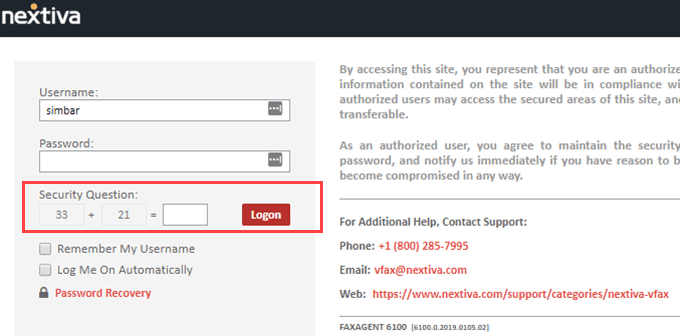
Nextiva used to make the registration process so complicated to the extent that a user would have to pull out a calculator to answer one of their security verification questions.
3 Not Optimized for Multiple Browsers
Chrome, Firefox, and Safari count for 86.9% of the total browser market share.
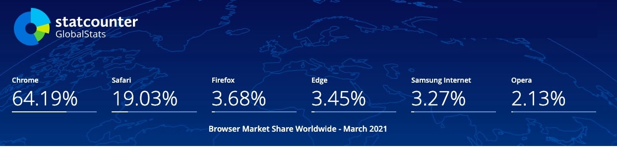
But the remaining 13,1% shouldn’t be ignored. Users access your website using various devices, browsers, and operating systems.
If you don’t give them a seamless and flawless experience on all browsers and devices you might be losing a lot of conversions.
4 A message mismatch between ads and landing pages
A disconnect between ads and landing pages happens all the time.
An ad carries one headline, but the landing page has an entirely different one.
If your ad promotes a 14-day free trial of your product, your landing has to run with the same message or offer.
There has to be a consistency between what you use to draw your audience to your landing page and what you’re going to use to make them convert.
A message between ads & landing pages doesn’t just block conversions, but it scares the heck out of visitors.
5 Too Many Offers
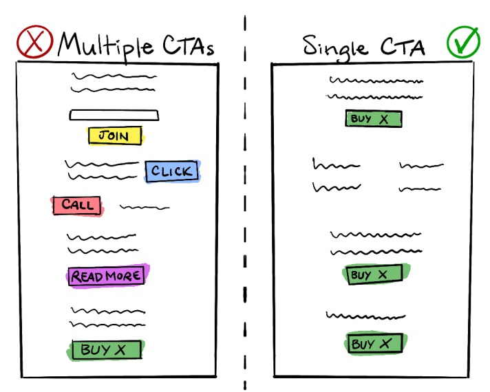
Not so long ago, we used to subscribe to the theory that more choices are better for customers. The belief was that more options would eventually translate into more sales.
But that's a huge mistake.
People have a paradox of choice, too many options can cause them not to take action.
6 Long Registration Forms
Registration forms are an area that happens to be a common friction point within landing pages.
The more information you ask, the more friction your visitors experience, and the more hesitant they become. We refer to this state as a psychological resistance.
Less work = less friction = more conversions.
If collecting detailed prospect information is necessary, you can reduce friction on long registration forms using multi-step forms. A multi-step form is a longer form broken down into smaller chunks.

7. Lack of Credibility
Lack of credibility has killed many conversions on different websites. And it still does even up to this day.
As an end customer, I need to see proof of what your business is promising. Even better, I want to see what your previous customers have gained from using your product/service.
Add testimonials, customer ratings, security seals, or even trust signals to ensure customers that your website is legit and safe to purchase from.
8. Limited Payment Options
There’s a wide range of payment methods available to online shoppers. Why are you only providing card payments? 🤨
Providing a variety of payment methods matters because it’s a way of appealing to as many customer preferences as possible. It's also a smart way of avoiding one of the reasons why people abandon their shopping carts.
9. No Guest Checkout Option
In a study conducted by the Baymard Institute, 35% of respondents chose a mandatory account as the reason why they abandon their carts.
Presenting a sign-up form during the checkout process increases the number of steps covered before making the payment.
Just add a guest checkout option or allow customers to sign-up using their social media accounts.
10. Slow-loading Website
Speed kills on the road, but it thrills on websites.
Crazy that we still have websites that take more than 5 seconds to load. An ideal website load time should be 3 seconds.
That's it from me folks. Any other conversion low-hanging fruits to add? Let me know in the comments section.
