7 lessons about web accessibility I wish I learned before
Some entrepreneurs might think accessibility is only about including users with permanent disabilities, and that UX is something you need to take care of in the future, but not on early stages of building.
But, in my experience as a founder, it's a terrible approach if you want to stand out in your industry. You need to design your MVP with users in the center to make the foundations of your business scalable.
After building a directory of online communities for over a year, I've found that even when we promote communities that foster accessibility and inclusion, our site has accessibility issues. I suddenly realized that someone using a screen reader might not be able to navigate through all of our listings and join a community. And someone who is color blind might not be able to understand the text on buttons.
You can imagine that's not easy to fix when your product is already live for over a year. It will take a lot of resources -and time- to make it work.
Understanding user behavior from a broader point of view
Have you ever been busy and needed to use your phone with one hand, or been driving and required to listen to an urgent message using voice-recognition software?
In such cases, you're experiencing a temporary disability, even without noticing it. It happens to all of us, every day. And without the help of assistive technologies such as screen readers, we could never be able to keep performing the tasks we are used to so easily.
Studying how the user might interact with the product using different approaches and including assistive technologies can help you cover many scenarios as possible. And it's not only because we want to be inclusive with people with permanent disabilities, but also because accessibility gives you the power to design for different moments in the life of your customer and build loyalty.
And it's worth mentioning that only in the US, one in four adults live with a disability, and many companies fail in providing accessible digital products. Imagine the growth you can experience if you're the only one in your market building accessible products.
The best thing you can do is use assistive technologies yourself! I promise it will change your perspective as a product designer.
What does accessibility mean to your business?
Accessibility is behind a complete and well-structured design, and pretends to offer functionality beyond the most obvious use cases. It's how you learn to think with the user in the center. It teaches you how to prepare your product to be used by a wide range of people with different needs and behaviors.
And if you're not building with accessibility in mind, let me tell you that you are losing potential clients for sure.
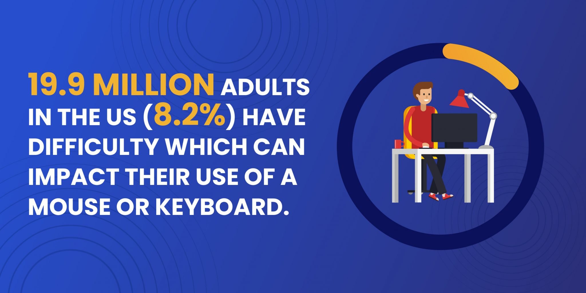
Image source: ddiy.co
Imagine that you own a typical food app, and one of your most loyal customers happens to be temporarily disabled. This affects his ability to move and navigate through your app, and it turns out he can't even make an order because your product is not accessible to him. He recover from the injury, but the experience with your platform was so bad that he turned to your competitor with better accessibility features.
The worst part is probably that you might never know what the problem is, and why your customer decided to leave. Still, there are a few cases when users let you know about your accessibility issues. That's what happened to @mattkandler, the founder of Happyfeed. After the feedback received, Matt reached a crucial conclusion:
"Accessibility is easy to forget about when you are focused on getting those first users and building an MVP but seems like it could create some extra-loyal users." You can read more about his accessibility discovery journey in the original post.
Community and brand accessibility are also important to make your business more accessible, but I won't cover them in-depth today. You can learn more about how to make brands and communities more accessible in our blog.
7 Accessibility best practices you should know about
Now that we covered the reasons why accessibility is key to the success of your digital project, here are seven lessons I wish I learned before starting building my business:
1. Color matters
Build your brand's color palette carefully. Contrast is a serious issue, and if your colors aren't picked with accessibility in mind, then your texts and web components won't work for some people. Contrast is the key. Use a color contrast checker!
2. Label everything
Craft descriptive meaningful titles. It's important to give proper titles to buttons, images, and videos. This is not only helpful for users who need screen readers. It's also great for SEO because it helps search engines understand what your content is about. Besides, your forms must be labeled and provide useful feedback to catch errors while trying to fill them with data. Don't rely only on colors to warn people about errors. This is literally considered illegal ****in some scenarios.
3. Structure navigation properly
Help users understand where they are and where to go next. Orientation is key to user retention, so designing consistent navigation is a must. Also, defining a solid category structure will save you a lot of pain in the future, especially when dealing with large sites. Breadcrumbs and sitemaps are also great resources.
4. Responsive design goes first
Use responsive design to your favor. By building for all technologies and screens, you have the chance to adapt your thing to the situation your user is in. It's helpful to ask: why would my persona use mi product on mobile, tablet, or desktop? Is he/she hurrying and needs to perform an action fast?
5. Accessibility for developers
Provide structure and meaning in your code. This way, you can ensure interactive elements are keyboard accessible and help users navigate intuitively.
6. Don't forget about security
Address security concerns. This is extremely important if you're building a product that deals with sensitive data. Imagine the legal problems you can face if you own a financial app that says sensitive information out loud when a user with voice-over technology signs up.
7. Give options
Provide options to access your content. Adding a simple audio transcription to your blog posts can make your content more accessible.
How to know if your product is accessible?
If you're looking to gain an overall look at your site's health, then try out WebAccessibillity. But you can also request a free, in-depth report from Boia.org
There's also a web evaluation tools you can use to check specific issues like colors or markup-
