Clarity Converts: Got my first 4 signups in 24 hours. After the 4th landing page iteration in two weeks.
FjordKit.com has been live for two weeks now, and in that time I've iterated the landing page four times.
Here's the breakdown.
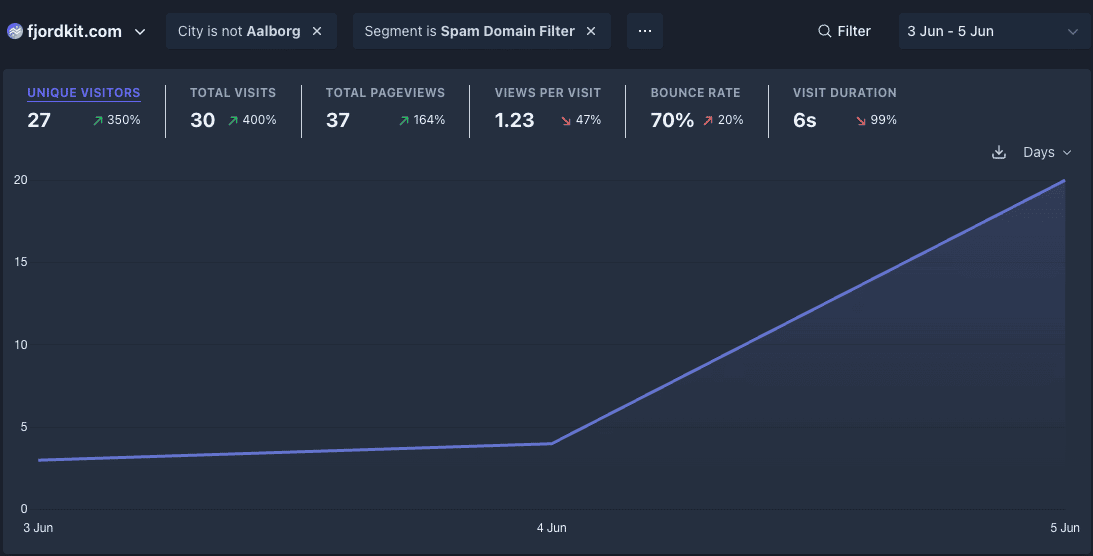
First iteration (June 3 - June 5)
The first iteration was pretty default and bland. Text-only.
I was biased by what seems to be the standard in todays startup / side project space.
The numbers also clearly said, that this landing page wasn't good.
27 unique visitors, 70% bounce, 6s avg. engagement, 0 conversions.
Something had to be done.

Second iteration (June 6 - June 9)
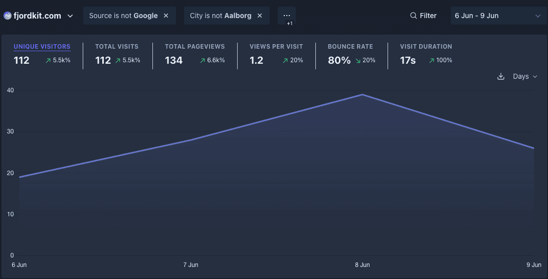
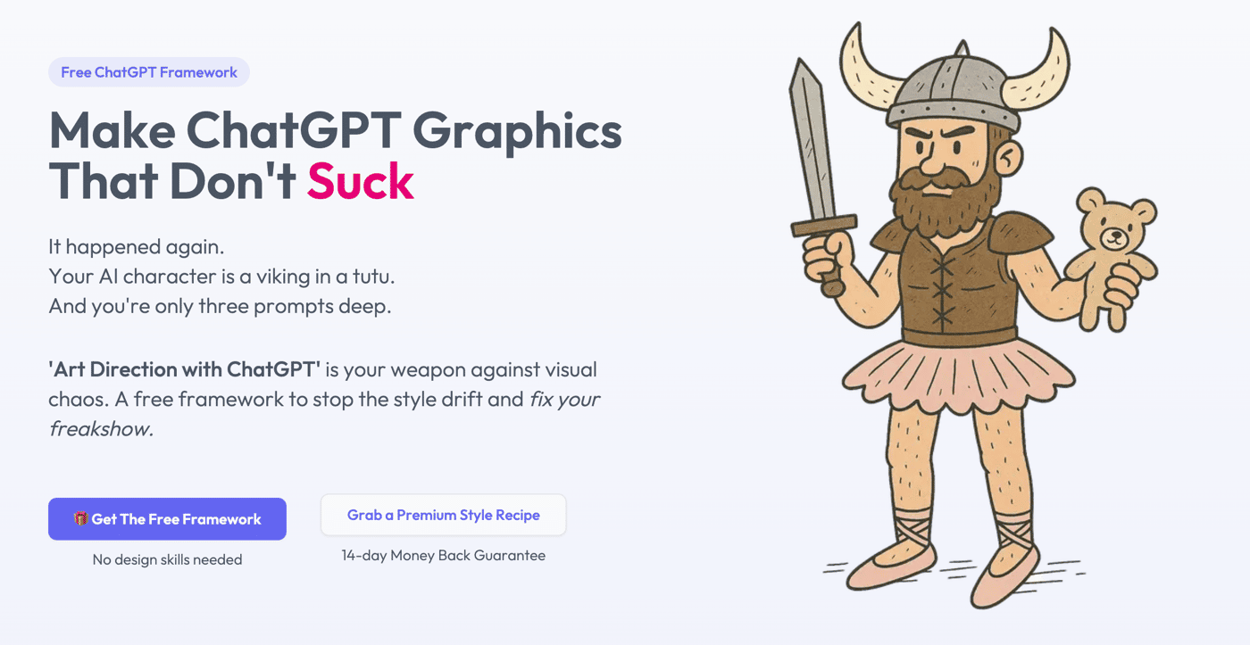
This is where I decided to give my landing page more character. I rewrote the entire landing page to humor-driven copy, and added a memorable viking in a tutu — visualising the problem I was offering a solution to.
The results were better, but still not satisfactory.
112 unique visitors, 80% bounce, 17s avg. engagement, 1 conversion.

Third iteration (June 10 - June 16)
There was still work to do, so I decided to visualise the problem, and why my solution was better, in a much more interactive way.
I also gave the hero a slight overhaul (the viking was way cooler, wielding a teddybear and a sword).
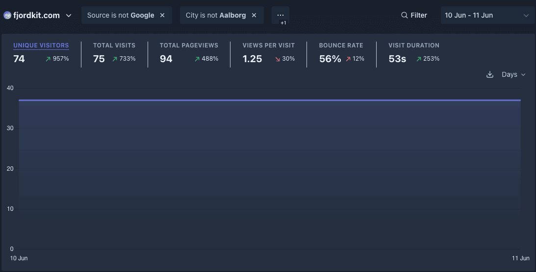
The comparison component really helped on engagement, and visitors played around with the component.
But the conversion rate was still diminishable.
148 unique visitors, 55% bounce, 37s avg. engagement, 3 conversions.

Fourth iteration (June 16 - Now)
During the second week, a Reddit user reached out to me and gave me some very valuable feedback.
I had way to many CTA's on my site, and they were all labelled differently.
Furthermore, my theory was that there was too much cognitive load:
Multiple different CTA's
New concepts to learn (Art Direction? Style Recipes?)
In my attempt to be generous, and offer a no-strings attached freebie, I removed the value perception of my product, and increased cognitive load.
Here's what I did
Refactored to one single coherent call-to-action
Added a testimonial section, with actual comments people made about the project
Changed the product name
from 'Art Direction with ChatGPT'
to 'ChatGPT Style Consistency Toolkit'
Gated the free toolkit behind a soft "paywall", so an email is now required to gain access to the toolkit.
What this achieves
Reduces cognitive load with a product name that instantly tells what it is
One single action the user can take
Added social proof as the final missing link
Increases the value perception of the free offer
So far this pivot made me 4 signups in just 24 hours.


In conclusion
I'm super excited to see where the new landing page iteration will take my product for the coming weeks, and I've learned a ton during the past few weeks.
What I learned for the first two weeks
Personality and humor > boring and default
If your product is complex, its name should spell out its value
Too many actions -> Too much friction and cognitive load
Show, don't tell — especially with visual products
Show up.
What I gained from showing up
8 users in total (of a niche product)
Valuable feedback from various communities and users
304 unique visitors in the first two weeks
I'm very happy with that.
Tell me, what change did you do, that increased your engagement or conversion the most?

