Guide to Churn Prediction : Part 4 — Graphical analysis

TLDR
In this blog, we’ll explore and unlock the mysteries of the Telco Customer Churn dataset using descriptive graphical methods.
Outline
-
Recap
-
Before we begin
-
Statistical concepts
-
Descriptive graphical analysis
-
Conclusion
Recap
In part 3 of the series, Guide to Churn Prediction, we analyzed and explored the Telco Customer Churn dataset using the descriptive statistical analysis method and gained an overview of the data.
Before we begin
This guide assumes that you are familiar with data types. If you’re unfamiliar, please read blogs on numerical and categorical data types.
Statistical concepts
Let’s understand some statistical concepts that help us in further analysis of the data.
Distribution
A distribution shows how often each unique value appears in a dataset. We visualize distributions by plotting various graphs such as histograms, density plots, bar charts, pie charts etc.
Distribution graphs
These are graphs that are used to visualize distributions. We’ll use histograms or density plots to visualize continuous data distributions.
Normal distribution
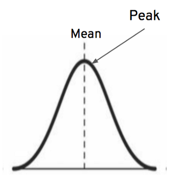 Normal distribution graph
In normal distribution, data is symmetrically distributed, i.e., the data distribution graph follows a bell shape and is symmetric about the mean. Normal distribution is also known as gaussian distribution.
Continuous data distribution shapes
 Source: GIPHY
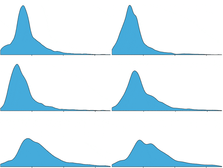
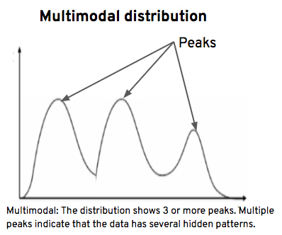
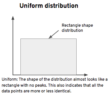
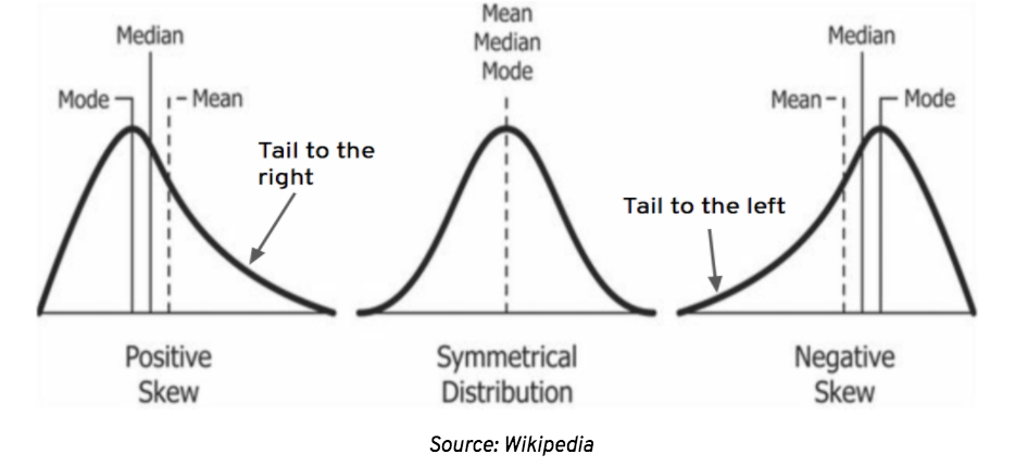
Continuous data distribution is expected to follow normal distribution. However, in real time, continuous data is not normally distributed, and its distribution graphs can take any of the following shapes:
-
Positive skew: This is also known as right-skewed distribution. The distribution graph has a long tail to the right and a peak to the left.
-
Symmetrical: This is also known as normal or gaussian distribution. The distribution graph resembles a bell shape, and the shape of the distribution is precisely the same on both sides of the dotted line.
-
Negative skew: This is also known as left-skewed distribution. The distribution graph has a long tail to the left and a peak to the right.
Descriptive graphical analysis
Descriptive graphical analysis is yet another method of exploratory data analysis. It’s the process of analyzing data with the aid of graphs. This analysis provides us with in-depth knowledge of the sample data.
Descriptive graphical analysis is further divided into 2 types:
- Univariate graphical analysis: Uni means 1, so the process of analyzing 1 feature is known as univariate graphical analysis.
- Multivariate graphical analysis: Multi means 2 or more, so the process of analyzing 2 or more features is known as multivariate graphical analysis.
In this blog, we’ll go over univariate graphical analysis.
Univariate graphical analysis
 Source: GIPHY
The main purpose of univariate graphical analysis is to understand the distribution patterns of features. To visualize these distributions, we’ll utilize Python libraries like matplotlib and seaborn. These libraries contain a variety of graphical methods (such as histograms, count plots, KDE plots, violin plots, etc.) that help us visualize distributions in different styles.
Now, let’s perform univariate graphical analysis on continuous data features.
Import libraries and load dataset
Let’s start with importing the necessary libraries and loading the cleaned dataset. Check out the link to part 1 to see how we cleaned the dataset.
1 import pandas as pd
2 import matplotlib.pyplot as plt # python library to plot graphs
3 import seaborn as sns # python library to plot graphs
4 %matplotlib inline # displays graphs on jupyter notebook
5
6 df = pd.read_csv('cleaned_dataset.csv')
7 df # prints data set
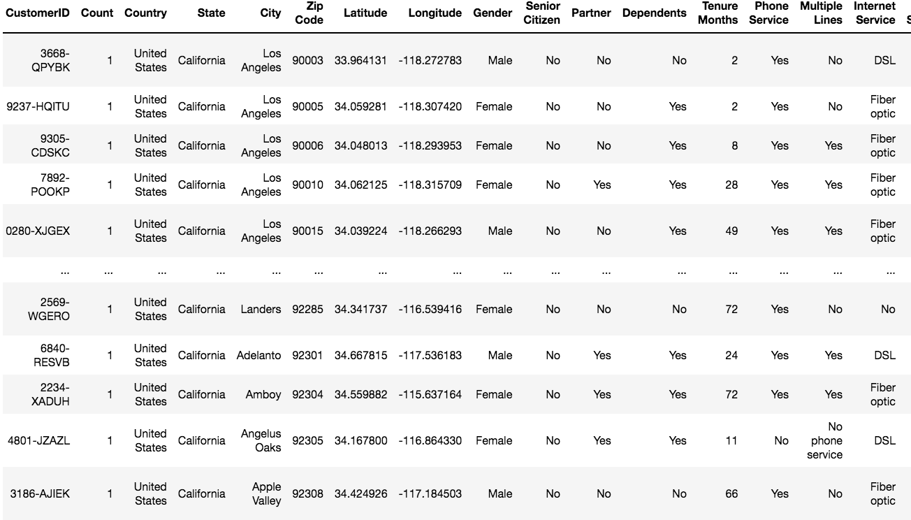
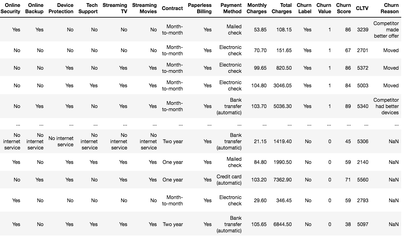
Cleaned dataset
Identify continuous data features
Continuous data features are of float data type. So let’s check the data types of features using the dtypes function and identify continuous data features.
1 df.dtypes
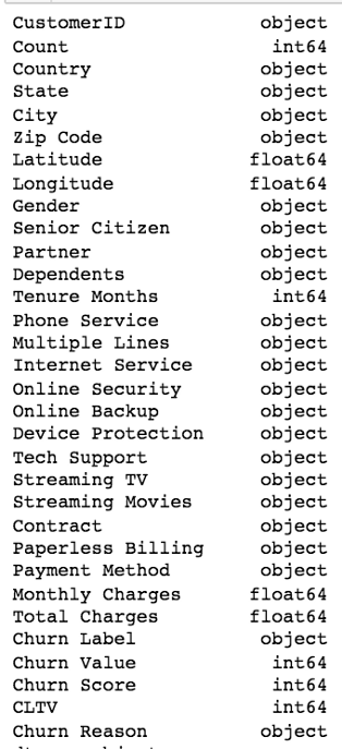 Data types of features
Observations:
“Latitude,” “Longitude,” “Monthly Charges,” and “Total Charges” features are of float data type, so they are continuous data features.
Create a new dataset
Create a new dataset df_cont, with df_cont containing all the continuous data features and display the first 5 records using head() method.
1 df_cont = df[['Latitude','Longitude','Monthly Charges','Total Charges']]
2 df_cont.head()
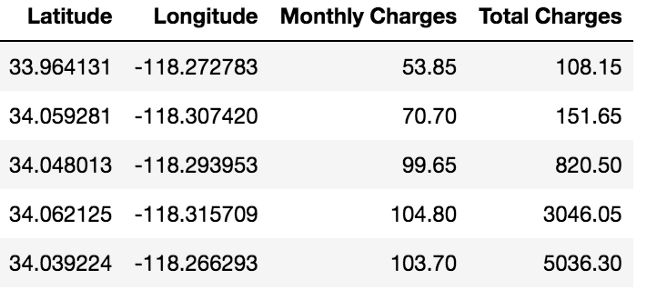 Continuous data features
Distribution graphs
We can visualize continuous data feature distributions using graphical methods like histograms, displots, KDE plots, etc.
Histogram plots: These are graphical representations of the frequency of individual values in a dataset. Each bar is a bin that represents the count of observations that fall within the bin.
1 fig = plt.figure(figsize=(14, 8)) # sets the size of the plot with width as 14 and height as 8
2 for i,columns in enumerate(df_cont.columns, 1):
3    ax = plt.subplot(1,4,i) # creates 4 subplots in one single row
4    sns.histplot(x=df_cont[columns]) # creates histogram plots for each feature in df_cont dataset
5    ax.set_xlabel(None) # removes the labels on x-axis
6    ax.set_title(f'Distribution of {columns}') # adds a title to each subplot
7    plt.tight_layout(w_pad=3) # adds padding between the subplots
8 plt.show() # displays the plots
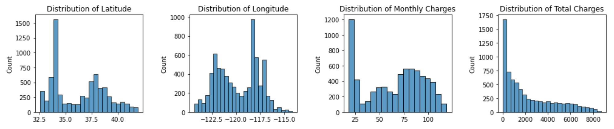 Histogram plots
KDE plots: Kernel density estimate (KDE) plots are smoothed versions of histograms that help us understand the exact shape of distributions.
1 fig = plt.figure(figsize=(14, 8)) # sets the size of the plot with width as 14 and height as 8
2 for i,columns in enumerate(df_cont.columns, 1):
3    ax = plt.subplot(1,4,i) # creates 4 subplots in one single row
4   sns.kdeplot(x=df_cont[columns]) # creates kde plots for each feature in df_cont dataset
5    ax.set_xlabel(None) # removes the labels on x-axis
6    ax.set_title(f'Distribution of {columns}') # adds a title to each subplot
7    plt.tight_layout(w_pad=3) # adds padding between the subplots
8 plt.show() # displays the plots
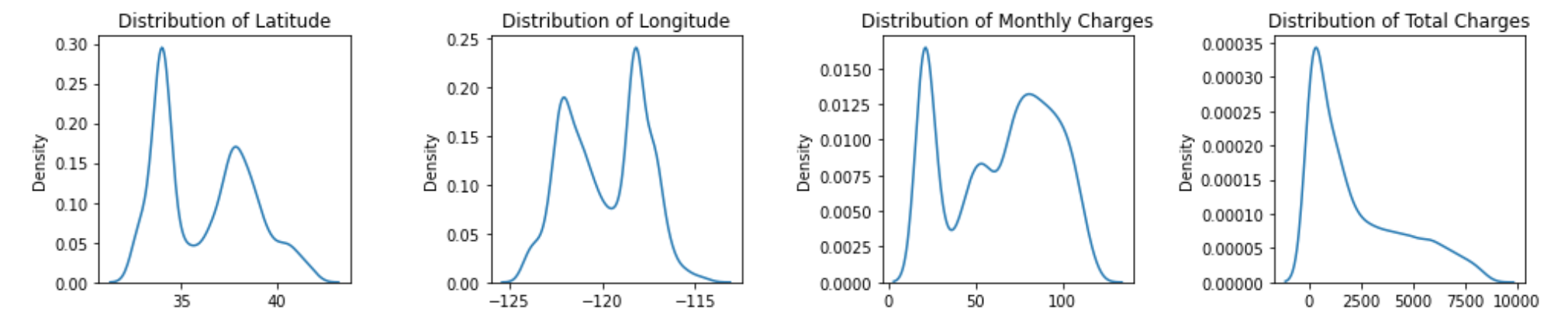 KDE plots
Observations:
None of the features are normally distributed.
Now, let’s take a closer look at all distributions.
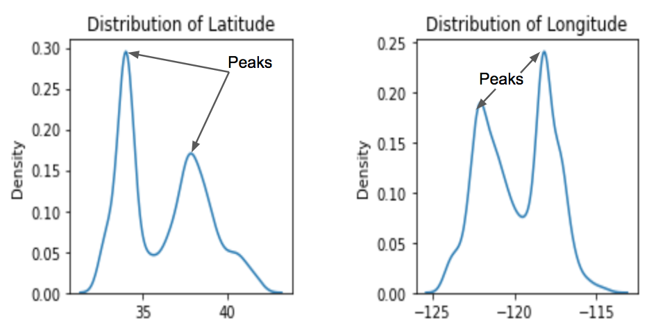 KDE plots of “Latitude” and “Longitude”
Observations:
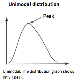
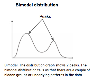
“Latitude” and “Longitude” data distribution shapes show 2 peaks, therefore their distributions are bimodal.
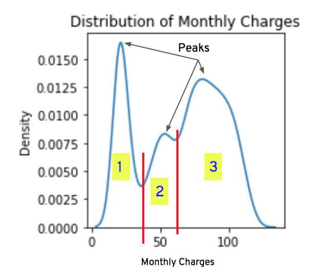 KDE plot of “Monthly Charges”
Observations:
- Customers’ current monthly charges vary between $0 and ~$120.
- The data distribution shape shows 3 peaks, so it’s a multimodal distribution. This indicates that there may be 3 distinct customer groups. We can divide customers into groups based on the amount they pay. For example, customers who paid less than $40 can be formed into a group.
- Approximately 75% of the customers paid more than $40.
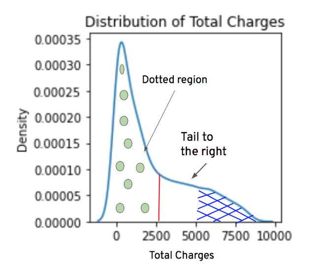 KDE plot of “Total Charges”
Observations:
- Customers’ last quarter total charges vary between $0 and ~$8000.
- The distribution has a tail to the right, so it’s a right-skewed distribution.
- The dotted region’s area is large. This indicates that in the last quarter, most of the customers paid less than $2500.
- The blue-shaded area is very small, this indicates that very few customers paid more than $5000.
Conclusion
Machine learning algorithms perform better when continuous data features are normally distributed.
 Source: GIPHY
Therefore, before feeding data into machine learning algorithms, it’s recommended to perform univariate graphical analysis to check the distribution shapes of continuous data features.
That’s it for this blog. Next, in the series, we’ll perform uniform variate graphical analysis on discrete and categorical data.
Thanks for reading!!
