I got tired of constantly checking Square sales on my iPhone, so I tried putting it on Apple Watch
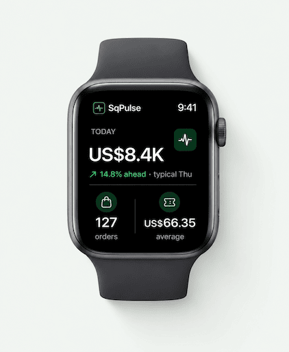
If you use Square for your business, you probably know this feeling.
You’re working, talking to customers, walking around the store, or doing something else — but you still want to know:
How are sales going today?
So you pull out your iPhone.
Then you do it again 20 minutes later.
And again.
Square Dashboard is useful, but sometimes I don’t need a full dashboard. I just want a quick look at sales, recent activity, or an alert when something important happens.
That made me wonder:
Why can’t Square sales data be something you can glance at instead of something you have to stop and check?
I started thinking about Apple Watch
For this kind of information, Apple Watch actually makes a lot of sense.
You don’t need to open a laptop.
You don’t need to take out your phone.
You can just look at your wrist for a few seconds.
That idea eventually became SqPulse, an Apple Watch companion for Square sellers.
It focuses on making Square sales data easier to check throughout the day, especially when you’re away from your computer or don’t want to keep opening the Square app on your iPhone.
You can find it here:
SqPulse: Sales & Alerts
https://apps.apple.com/app/sqpulse-sales-alerts/id6808631305
The bigger question
I’m still curious how other Square sellers handle this.
Do you actively monitor Square sales during the day?
Do you mostly use:
Square Dashboard on your computer
Square on iPhone
notifications
or do you just check everything at the end of the day?
I originally thought this was a pretty small problem, but the more I use Square, the more I feel that “quick access” is very different from having a full dashboard.
Would be interested to hear how other Square merchants monitor sales when they’re away from the counter.

This is great work — what's the biggest thing you'd do differently if you started over?
The "quick access" vs "full dashboard" distinction is sharp and real. A merchant behind the counter doesn't want to unlock their phone, open the app, and wait for it to load every time they want to know where today's sales stand. Glanceable on the wrist is a completely different use case. SqPulse looks genuinely useful for any Square seller running a physical location. The comparison-to-typical-day feature is a particularly nice touch — knowing you're 14.8% ahead of a normal Thursday gives you real context, not just a number.
It's a really cool idea! If the alerts are right on time instead of being a few hours late, this is something majority of us can get behind!!
Ha, this is basically the exact same behavior I see with a finance tracker I built. People (including myself) check their balance way more often than they actually need new information. Glanceable is a really underrated idea for stuff like this. Did the checking behavior actually drop once it was on the watch, or did it just move from phone to your wrist?
The "glance instead of check" distinction is the whole product, and I'd protect it fiercely. The failure mode I've seen with wrist/companion apps is that the moment you add "alerts when something important happens", you are now defining "important" for someone else's business — and every alert is a decision you've just handed back to them, twenty minutes at a time, which is the exact loop you built this to break.
Where I've landed on the apps I build: the glanceable surface should answer one question with no interaction ("how's today going?"), and anything that interrupts should be something the owner explicitly asked for, once, with a very small set of options. Silence should be the default state, not the absence of a setting.
Curious how you're deciding what earns a notification vs. what waits for the next glance — is that user-configured, or do you pick defaults?
I think that’s exactly the tension.
I’m trying to keep the alert set deliberately small — things like sales falling behind the normal pace, large sales, refunds, or hitting a goal — rather than turning every transaction into another interruption.
Long term I think thresholds should mostly be controlled by the seller. The Watch should stay quiet unless something genuinely deserves attention.
The quick-glance vs full-dashboard split rings true. We did the same with our own numbers: payment events moved to their own feed, separate from ops alerts, because a glance only works if that channel carries nothing else. (Disclosure: I'm building Mythex; that feed is our own revenue.)
One thing I'd test with Square sellers: alerts for what's missing, not only for what happened. "No sale in the last 2 hours during opening hours" tells an owner something a stream of sale pings won't, like a card reader that quietly went offline.
That’s a really interesting one.
“No sale for 2 hours during normal opening hours” could actually be more useful than another sale notification, because it signals that something may be wrong rather than just confirming normal activity.
I hadn’t been thinking about “absence of activity” as its own alert category, but I am now.
One refinement if you build it: learn "normal" per seller instead of asking for opening hours. A coffee cart and a bar have very different quiet gaps, and a fixed 2-hour rule will either fire every afternoon or never. Something like "no sale for twice your usual longest gap at this hour" stays quiet until it matters.
The distinction between "quick access" and "full dashboard" applies to more than just Square data. We build SEO tools and hit the same tension — people said they wanted comprehensive reports, but what drove repeat usage was an overall score they could check in thirty seconds. The detailed breakdown mattered for fixing things, but the quick read brought them back.
For a wearable, the question is whether the glance changes behavior or just satisfies curiosity. A number that says "you're 15% behind yesterday at this hour" is actionable — it might prompt changing a display or running a flash discount. A raw total on a smaller screen is convenience but not a new capability.
Have you tracked whether sellers who get watch alerts actually do something different compared to end-of-day checkers?
Not enough data yet to answer that honestly.
But I agree that this is probably the more important metric. Fewer phone opens sounds nice, but the real value is whether the glance tells the owner something useful enough to act on.
That’s also why I’m increasingly interested in “sales pace vs normal” rather than just showing a raw sales total.
A useful edge case to test is a poor-signal day: sellers may need a last-updated timestamp and an obvious stale-data state so a glance doesn’t create false reassurance. Does SqPulse surface data freshness, or only the latest total?
Good edge case.
A watch glance only works if the seller can trust that what they’re seeing is current. If the data is stale, that needs to be obvious rather than silently showing the last number.
I’m reviewing how prominently SqPulse communicates freshness because I agree that a last-updated state matters a lot on a wearable.
The glance-first wedge makes sense, but I’d measure the behavior after the glance rather than just fewer phone opens. Does the seller change staffing, reorder, or respond to something? I’d test live alerts against a scheduled digest with an alert cap—otherwise a wearable can turn “checking the phone” into “checking the wrist.” A useful card could show sales since the last glance, the comparison period, and one actionable exception, rather than another mini-dashboard. The strongest signal would be fewer phone opens without more missed decisions.
I agree with the “checking the wrist instead of checking the phone” failure mode.
The direction I’m leaning toward is fewer passive numbers and more exceptions: is today unusually slow, was there an unusual refund, did something move significantly away from the normal pace?
If nothing needs attention, ideally the watch shouldn’t demand any attention either.
The compulsive check-your-phone loop for revenue is one of those things that sounds trivial until you've lived inside it. It's not just the time — it's the ambient anxiety between checks that adds up.
The wearable move makes sense as a friction reducer. The real question is whether lowering the friction to check means you check less because you feel in control, or more because the barrier is gone. The data split here is usually psychological — people with higher revenue anxiety tend to check more, not less, as access gets easier.
One thing worth testing: a scheduled daily summary rather than live data. The dopamine from the check often comes from the ritual, not the number. A well-timed daily report on the watch might actually reduce the compulsive checking more than instant access does.
How has the checking frequency changed since you moved it to the watch?
That’s the interesting part.
SqPulse already gives you the live numbers on the Watch, but I’ve intentionally added alerts for things that actually change the state of the day — falling behind normal pace, large sales, refunds and goals — so ideally you don’t need to keep checking at all.
I haven’t measured whether overall checking frequency goes down yet, though. That’s something I’d like to understand with more real usage.
The distinction between a glanceable signal and a full dashboard really resonates. For merchants away from the counter, I’d want configurable thresholds so the watch stays quiet during normal sales but surfaces anomalies, refunds, or an unusually slow day. That feels like a strong fit for a wearable because it preserves attention instead of creating another dashboard to monitor.
Yes — that’s essentially what SqPulse already does.
It surfaces sales falling behind the normal pace, large sales, refunds and daily goal events, while the Watch itself gives the quick sales overview.
The goal was specifically to avoid putting the entire Square dashboard on a tiny screen and instead surface the things that deserve attention.
The glance-first framing makes sense—especially for merchants who only need a signal that something changed. I’d make the alerts configurable by order value or time window, and surface battery/notification reliability prominently since a missed alert undermines the whole promise. A small daily summary could also help without recreating the full dashboard.
I’m with you on that.
SqPulse already has large-sale alerts, refund alerts, daily goal events and sales-pace alerts, so I’ve been trying to keep the notification side focused on meaningful events rather than every transaction.
The time-window configuration and daily summary idea are interesting additions though — especially if they help keep the Watch quiet most of the time.
Distribution is what I would worry about more than the UX here, because Square sellers are not browsing the App Store for watch apps, they are inside Square all day. Getting listed in the Square App Marketplace puts you in front of them at the moment they are already thinking about their numbers, and it is a channel almost no indie watch app bothers with. Second thing I would do is charge from day one, because a merchant running a register will pay $5 a month without blinking, and free users will never tell you which alert actually mattered.
Distribution has definitely turned out to be the harder part.
Building the product was relatively straightforward compared with figuring out where Square merchants actually discover tools like this.
The Square ecosystem/App Marketplace is something I’m looking closely at for exactly that reason — the users are already there rather than searching the App Store for a Watch companion.
And SqPulse does already have a paid Pro tier, so I’m also trying to learn which features merchants actually value enough to pay for.
The glanceable format is the interesting wedge. Have any Square sellers actually checked sales more often on the Watch than they did on iPhone?
It’s still too early for me to have enough data to say that confidently.
But I actually don’t think “checking more often on the Watch” is the goal.
SqPulse already surfaces today’s sales, orders, average ticket, location performance and alerts on the Watch. Ideally that means a merchant can glance once or get an important alert and avoid pulling out the iPhone repeatedly.
So I’d rather see fewer interruptions overall than simply move more checking from phone to wrist.
That distinction makes the real value proposition more interesting — reducing interruptions rather than increasing checks. If you’re open to it, what’s the best email to reach you on?
The glanceable format makes sense, although I’d test whether it reduces checking or simply moves the checking habit from phone to wrist.
I reckon the stronger job is not “show me today’s sales faster,” but “tell me whether today is behaving unusually enough that I should act.” Sales pace versus a normal day, a refund spike, or an unexpected quiet period may be more useful than the raw total.
What does a seller actually do differently after looking at SqPulse? That action may reveal which alerts deserve the limited watch screen.
That’s actually much closer to what SqPulse already does than the title of my post probably makes clear.
It doesn’t just show the raw total — it compares performance with a typical day and already has alerts for sales falling behind the normal pace, refunds, large sales and daily goal events.
So the direction is really becoming:
“Don’t make me watch the dashboard. Tell me when my business deserves my attention.”
I think that may actually be the better way for me to describe the product.