The biggest mistake I almost made while building tiny tools
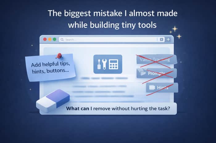
When I started building small browser tools, I thought the main challenge would be technical.
Speed. UI. Features. Performance.
But the biggest mistake I almost made had nothing to do with code.
It was this thought:
“Maybe I should add more things so the tool looks more valuable.”
And that’s where I almost went wrong.
Because tiny tools don’t lose users when they lack features.
They lose users when they look like they want something back.
I almost added:
- usage tracking
- helpful tips
- onboarding hints
- feature highlights
- small prompts to “explore more”
All of it sounded reasonable. Professional. Responsible.
But when I stepped back and looked at it from the user’s point of view, I realized something uncomfortable:
None of this helps them finish the task faster.
It was serving me, not the user.
That’s when I understood a key difference:
Big apps need to look valuable.
Tiny tools need to feel effortless.
The moment a tiny tool starts trying to prove its value, it creates doubt.
So instead of adding things, I removed them.
And the tools started feeling lighter.
Faster.
More trustworthy.
The lesson for me was simple:
If a feature doesn’t help the user finish their task faster, it probably doesn’t belong in a tiny tool.
This changed how I evaluate everything I build now.
I no longer ask:
“What can I add to improve this?”
I ask:
“What can I remove without hurting the task?”
Curious if other builders have felt this too —
Have you ever added something that looked “important”…
but later realized it was only important to you, not the user?

The pairing of 'runs locally' + 'no API keys' is undervalued positioning. It speaks to the technical buyer who has already been burned by SaaS tools that changed pricing, added rate limits, or went down at the wrong moment.
The one-time purchase model makes sense when the tool does a defined job well. What's the job this tool does?
Good point. The job is simple: open the tool, finish the task (compress, convert, merge, etc.), and close it — no accounts, no limits, no surprises.
A simple test I now use for this:
Before adding anything, I ask myself:
“If I remove this, will the user still be able to finish the task just as easily?”
If the answer is yes → it probably doesn’t belong.
I’ve removed things that felt “important” as a builder — tips, hints, explanations, extra buttons — and every time the tool felt lighter and more trustworthy.
For tiny tools, clarity beats completeness.