The national gas price average hides the number that matters
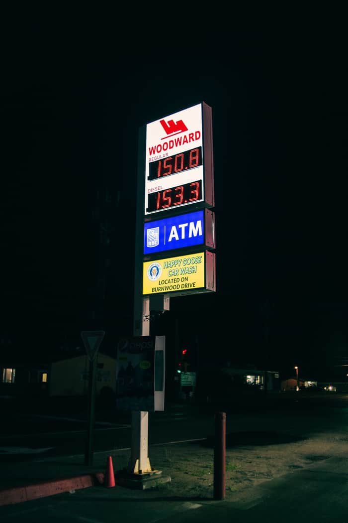
For a long time the one number I never questioned was the gas price average. The national figure on the news, my city's average a few cents under it, and that felt like enough to reason about. Then, while building a tool that pulls prices station by station, I did something I had never bothered to do by hand. I lined up every station in a single ZIP code, side by side, same grade of fuel. The cheapest and the most expensive were not a rounding error apart. The gap was wide enough to change where I would actually stop to fill up. The average I had trusted for years was real, and it described none of the stations I could drive to.
An average of things that don't move together
Prices at the pump are set one station at a time: the brand, the lease, the delivery contract, and whatever the place across the street did yesterday. Roll all of that into a single city or national figure and the spread, which is the only part that changes a real decision, is the first thing you throw away. A $3.40 average can be a whole block of stations sitting at $3.40, or it can be half of them at $3.15 and half at $3.65. Those are different worlds for anyone routing drivers, pricing a delivery, or deciding whether the cheap station is worth the detour. The average cannot tell them apart. The stations can.
What I actually wanted was every station as a row
The thing I kept reaching for was not a nicer chart. It was the raw rows: one line per station, with the name, the address, the cash price, the credit price, and the time each price was posted. Give it a ZIP, a city, or a set of coordinates and hand back every station near it with live prices, and the boring questions finally get answers. Which station is actually cheapest for cash. How far the credit surcharge really reaches. Whether the place on the route home is worth two extra blocks. None of that survives the averaging. All of it is obvious once each station is a row you can sort.
That is the shape of what I ended up publishing on Apify: you give it a location and a fuel grade (regular, midgrade, premium, diesel, or E85) and it returns the live per-station prices around it as structured rows you can drop into a sheet or a pipeline. In the first eleven days of this month it returned about 166,000 station rows for the people using it, at a tenth of a cent per row, so a full ZIP of thirty-odd stations costs a few cents to pull in full.
One check is worth almost nothing. The series is the product.
A single pull is a snapshot. It does not know the cheap station was thirty cents higher last Tuesday, or that one location has crept up every day this week while its neighbors held flat. The tool hands you live prices; it does not hand you history. So I stopped treating it as a lookup and started running the ZIP codes I care about on a schedule and keeping every pull. After a couple of weeks you have the thing the national average will never give you: a per-station series that shows who moves first, who follows, and where the real floor sits. The lookup is raw material. The dated series you keep is the asset.
The failure that looks like an answer
Price data has one specific trap. The dangerous failure is not an error you can see, it is a station that quietly stops updating. Its last price just sits there looking current, and if you trust it you send someone to a number that expired days ago. That is why every row carries the time the price was posted. A stale timestamp is not noise to bury; it is the signal. Treat a station that went quiet as a claim to check rather than a fact to trust, and treat an empty result the same way. Empty almost never means nothing is there. It usually means something changed and nobody wrote it down.
A few questions I get a lot:
- How do I get gas prices by ZIP without the official app? Feed it a ZIP, a city, or coordinates and read back the stations around it. No consumer app account in the loop.
- What are the alternatives to the big consumer apps for programmatic data? Most price feeds return national or wholesale numbers, or map metadata. The gap this fills is live retail, per individual station, by ZIP.
- Does it separate cash and credit? Yes. Each row carries the cash price and the credit price, with the time each one was posted.
- Can I watch several cities at once? Run one location per pull and schedule as many as you want. The value is in keeping the rows, not the single check. The technical version is on Dev.to and a shorter setup walkthrough is on Peerlist.
So here is what I still argue with myself about.
When you are standing at the pump, do you trust the posted price, or only the number lit up on the sign? Do you plan off the cash price or the credit price, given how far apart the two have drifted lately? And if a station you rely on goes quiet for a week, is that no change, or the most interesting thing on the page? For anyone working with local pricing data of any kind: where do you draw the line between a stale reading and a real one?
