We spent six months turning a personal workaround into something worth inviting people to try
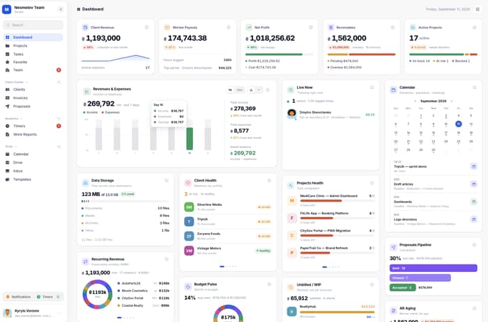
Six months ago Melororium was a single workspace with the basics: tasks, time tracking, client records, invoicing. It worked for the three of us. It was not something I would have asked anyone else to run their team on.
That changed this week. We opened it up for anyone who wants to test it, and I want to walk through why it took six months to get here instead of six weeks.
The first real gap showed up in week three. I blew past a client budget by roughly three weeks of work before anyone noticed, because nobody was watching the number until invoice time. Not a bug, a blind spot. I had built a tool that tracked what happened, not one that warned you before it happened.
That became Budget Guardian: set a budget on a project, get warned at 80% of the cap instead of finding out at the invoice. Invoice Generator turns logged hours straight into a PDF with payment status attached, and Invoice Tracking follows each one through sent, viewed, paid, and overdue, so nothing quietly sits unpaid for a month before anyone checks.
Deadlines had the same problem from a different angle. We kept finding out a task had slipped the day after it slipped, usually from a client asking where something was. Project Alerts closes that gap now: six alert types, bottlenecks, deadline risk, budget warnings, overdue escalation, idle projects, and a morning digest, landing in Slack, email, or the inbox inside the app.
Recurring Projects clones a project on a schedule, so nobody rebuilds it from a stale template every time a retainer client's month resets. Smart Templates does something similar for one-off launches: start from a saved board structure and every deadline re-maps itself from the real start date, not the date the template was built two months ago.
Clients needed a way in that was not email. Proposals turned into one of the pieces we use the most: a client accepts through a public link, no account needed on their end, and it converts straight into a live project. No re-entering scope that already got signed off in a document somewhere else. Public Status Page answers the other half of that: a read-only link clients check themselves, no login, so the "quick update?" email at 6pm on a Friday stops showing up at all.
The team side needed work too. Smart Onboarding builds a role-based checklist the moment someone new joins, because our own second hire spent her first morning asking three different people what she was supposed to be doing. Remote Team Scheduler puts each person's local time on their own tasks, since half our early testers are spread across three time zones and kept scheduling calls half the team was asleep for. Backup & History gives us a one-click export of the whole workspace, plus the ability to roll a task description back to an earlier version when someone asks what it used to say before it got edited three times.
None of that is finished, and I do not want to pretend it is. Client Portal, a branded space where clients see their own project without us building them a status page by hand, sits around 39% done. An AI assistant that turns a rough task description into a structured plan is at a similar stage. A real chat layer inside tasks is further along, close to half done, and multi-currency recurring invoicing is in the same range. We are not shipping any of those as ready. They are what comes next.
Pricing did not move through any of this. One price for the whole team, whether that is 4 people or 25, not a per-seat charge that climbs every time someone new joins. It kept the roadmap honest in a way I did not expect going in: there is no seat count to gate a feature behind, so nothing gets held back to justify a higher tier.
So here is the actual news, past all the feature names above: the demo is open. Not a waitlist, not a beta form that goes nowhere. If you run a small team and want to see whether six months of fixing our own blind spots turns out useful for yours, no card required:
What's the one operational thing your team still does by hand that you wish ran itself?

What stood out to me is that the strongest features came from specific moments when your own system failed not from trying to make the product appear bigger.
As co-founder of SynDiary, I’m facing a similar positioning question. A personal-data hub can do many things, but a long feature list does not tell someone why they should begin today. We need to identify the first moment that makes a person return, while keeping the larger purpose visible.
Did one feature become the reason early users came back not simply the feature they liked most when you demonstrated it?
The strongest part here isn’t the number of features, it’s that most of them have a very specific failure behind them.
“We exceeded a client budget before anyone noticed” is a much stronger reason to care than “project management with alerts.”
I’d probably lean even harder into those before/after stories on the landing page. They explain the product faster than another feature grid ever could.
Hi Kyrylo, I test products before launch as a QA engineer, and your post made me open the site to see what a 4-person team gets. One thing a buyer will trip on: the post says one price whether the team is 4 or 25, with nothing held back behind a tier, but the site lists Starter at $29 for up to 4, Agency at $59 for 15 and Studio at $119 for 25, and Budget Guardian, Proposals and Project Alerts start at Agency. Those are the features the post leads with. What happens after signup, like inviting past the cap, I can't see from outside. Thanks for sharing the honest roadmap percentages.
I like how the features came directly from problems you actually experienced instead of being added just to make the product look bigger. The budget warning and client status page especially feel like they solve problems that are easy to overlook until they become painful.
Thanks, yes, every one of these came from a problem we actually hit ourselves, not from trying to make the feature list longer. Budget Guardian exists because I blew past a client's budget by three weeks of work before anyone noticed. Public Status Page exists because clients kept emailing "quick update?" at 6pm on a Friday. Neither would have made the list if we hadn't lived through the annoying version first.
Wow really great
Great breakdown. What feedback have you had from early users?
Early feedback keeps circling back to one thing: they want something Slack-like built into the same workspace, so the team can message and jump on a call without leaving for Discord or Slack. A chat layer inside tasks is already in progress, about halfway built. Calls haven't made it onto the roadmap yet, that's the gap this comment is pointing at.
Interesting take. Would you still recommend this approach to someone starting today?
The part I keep thinking about is opening a demo with no waitlist. We did the opposite and gated a beta, and the people who signed up were the least motivated ones because signing up cost them nothing and took a week to pay off. Open demo forces the first two minutes to carry the whole thing. Curious whether you watched where people drop inside the demo, or only whether they came back.
Good question, and it's actually the opposite of what you'd expect: opening it with no waitlist has converted well so far, people who click through are trying it, not bouncing at the door. I haven't broken down exactly where inside the demo people drop off yet though, you're right that's the stronger signal. Right now I'm mostly watching whether they come back.
peptides18's point is the one worth building the whole feature around. The cheap proxy for progress is probably tasks-closed-vs-total, but that has its own failure mode: a project can be 80% done by task count while the one task left is the hardest, most expensive one (the thing that always blows budgets in services work). Might be worth weighting by estimated hours per task rather than raw task count — closer to done-by-effort than done-by-count, even if the estimates are rough.
That's a sharp point, and it's a real gap right now, our tracking is closer to done-by-count than done-by-effort. Weighting by estimated hours per task instead of raw count makes a lot of sense, especially for services work where the last task is often the expensive one. Rough estimates would still beat what we have now. Might be worth building.
Solid lesson. Which channel has worked best for you so far?
Honestly too early to say. This post is basically the first real test of a channel for us, IndieHackers is where the actual conversations are happening so far, but I don't have enough data yet to call it "the one that worked." Ask me again in a month.
Budget Guardian is the only thing on that list I would put on the homepage. I ran a services business for almost twenty years, and the pain that actually made owners rip out a tool was never task management, it was finding out a project went underwater after the work was already delivered. The rest of what you shipped is table stakes against Harvest and Productive, so lead with the one feature that protects margin and let people find the other nine after they are already inside.
That tracks with what pushed me to build it too, task management wasn't the thing anyone complained about, finding out a project was underwater after the invoice already went out was. Good point on leading with it instead of listing everything at once, that's worth changing on the page.
Love the approach of building to fix your own blind spots first. The 'Budget Guardian' feature hits close to home—we've all blown past client budgets before realizing it.
I especially respect the flat-rate pricing model. Per-seat pricing always creates friction for small agencies when they need to add temporary freelancers to a project.
Out of curiosity, how do you plan to handle the infrastructure costs if a team scales to 50+ or 100+ users on the flat rate? Is there a hard cap or a 'fair use' policy?
Congrats on opening the demo, the feature set looks really solid for 6 months of work.
Fair question, and the honest answer is I haven't locked that in yet. Right now "unlimited" means unlimited, no hidden cap. If a team actually gets to 50 or 100+ users, I'll figure out the right policy when that's a real problem in front of me instead of guessing at one now.
The eighty percent warning is the right feature and its whole future depends on what it compares against. Eighty percent of budget spent on a project that is also eighty percent delivered is not a problem, and if the alert fires there anyway people mute it after the second time and you are back to finding out at invoice. What makes it trustworthy is comparing spend to progress rather than to the cap alone, even something rough like hours logged against tasks closed. Otherwise the feature built to remove a blind spot becomes another notification people learn to dismiss.
Right now it's spend against the cap, not spend against progress, so you're right that it doesn't catch the case where 80% spent lines up with real progress. Comparing against something like hours logged versus tasks closed would make it a lot more trustworthy, even a rough version of that. That's the direction worth taking it, not there yet.
What stood out to me is the distinction between tracking what happened and actually preventing the problem in the first place. The 80% budget warning is a good example of turning a painful personal experience into a useful workflow rather than just adding another reporting feature.
I also like that you’re openly showing what’s still unfinished. That makes the six-month journey feel much more realistic than presenting everything as “launch ready.”
I’m curious which feature early users end up relying on most consistently once they’ve had a few weeks with the product.
Too early for me to say with real confidence, the demo only opened this week. Budget Guardian and the invoice status tracking are the two I'd bet on becoming the daily habit, since those are the ones solving a problem people are already annoyed by before they even open the tool. I'll have a better answer in a month.
The part about building around “blind spots” rather than just adding more tracking really stood out to me. There’s a big difference between a tool telling you what already happened and a tool helping you notice something before it becomes a problem.
I also like that you’re being explicit about what isn’t ready yet. Six months of development can easily turn into a giant feature list where everything sounds finished, so showing what’s still at 39% or 50% makes the launch feel much more grounded. Curious to see which of these features ends up becoming the one people use in ways you didn’t originally expect.
Too early to say with any confidence, the demo just opened this week. I'll have a better sense once people have had a few weeks in it.
The breadth is clear, but which workflow are early testers repeatedly relying on enough to make Melororium part of their normal process?
Budget Guardian and the invoice status tracking are the two I'd point to, they solve something people were already annoyed by before they opened the tool, so the habit forms fast. Still early days to call it a confirmed pattern though.
That’s enough of a usage pattern to dig into. What’s the best email to reach you on?
The week three thing stuck with me. You had time tracking and still blew the budget by about three weeks because nobody looked until the invoice. The 80% warning is the part that actually changes the job. Public status page so the Friday 6pm "quick update?" email dies is the other half I kept nodding at. Did clients actually stop writing, or do they still email and then glance at the link?
Honestly haven't tracked that closely enough to give you a real answer, just early testers so far. Good question though, worth actually checking instead of assuming.
Six months is the real validation — most quit at month 2. The pivot from personal tool to invite-only means you found acute pain, not polite interest. That's the signal that compounds.
Yeah, that's basically the exact moment for me too, it stopped being a nice-to-have I could shrug off.