Where should the approval gate sit in an AI course workflow?
I'm building Course Atelier in Seturon, and the hardest design choice hasn't been what the model should write. It's when it should be allowed to start writing.
A prompt can produce a polished course outline quickly. But that outline can hide decisions nobody has checked: who the learner is, what they should be able to do, and where different learners need different paths.
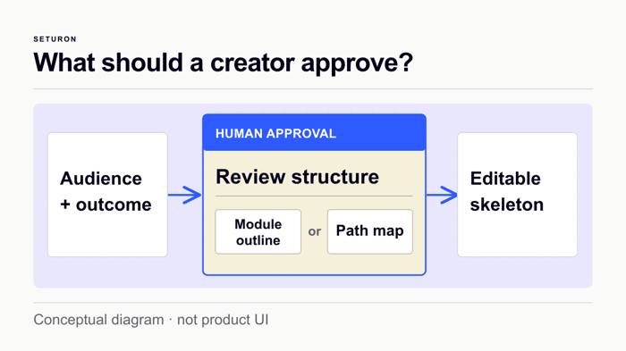
The workflow we're testing puts a pause before lesson generation. Mira's guided discovery captures the audience and intended outcome. The creator then reviews a proposed course structure and explicitly confirms it. Only after that does Structural Sprint generate an editable course skeleton.
Seturon is an adaptive learning platform, so the structure matters beyond a list of lessons. An opening diagnostic and decision points should determine which learning path a learner follows. We're still validating the complete production flow and what creators can reliably inspect; I wouldn't claim better learning outcomes or saved time from this build.
My current product question is what to show at the approval step. A module outline is easy to read, but may hide a wrong route. A full path map is more revealing, but can overwhelm someone creating their first course.
If you've built an AI workflow with a human approval gate, what did people actually need to see before they trusted the next step?

The approval gate problem is trust calibration. Show too little and people approve on faith. Show too much and they rubber-stamp because cognitive overload feels the same as confidence.
What worked in our SEO auditing tool was showing the decisions, not just the output. When we scan a site against 100+ ranking factors, dumping the full list causes analysis paralysis. Instead we surface the 3-5 highest-impact issues with a one-line explanation of what each one costs. The user acts on what matters and can expand the full list if they want to verify.
For your course builder, the equivalent might be showing the branching decisions rather than the full path map. "Learner who fails the opening diagnostic goes here instead of here" is a reviewable claim. A complete tree of every lesson and path is just an artifact that looks thorough.
The gate should surface choices, not completeness.
I’d test the gate by measuring rework rather than preference: compare how often creators revise the outline after seeing a path preview, and where errors are caught. That would show whether the richer view earns its cognitive cost—are you planning a sequential usability test?
That's the test I want to run, but we haven't run it yet. I'd give creators the same brief with a few seeded structural errors, then compare an outline-only gate with an outline plus 2–3 representative learner routes. I'd track consequential errors caught before generation, time to approve, and rework after the first lesson preview—not just which screen they prefer. Sequential sessions could also show whether a second view helps because it's better or simply because the creator has learned the course. Does that cover the rework signal you had in mind?
I’d put the gate immediately before the expensive, hard-to-review step, and show evidence rather than a polished wall of generated text. In an AI website workflow, the useful review artifact is: intended audience/outcome, the scope or sources used, 2–3 representative outputs, and an explicit “couldn’t verify” list. Let the human edit the premise, constraints, or source scope before generation; don’t make them line-edit every sentence. I’d also log what gets corrected at the gate—those recurring corrections are the best candidates for product defaults and tests.
I’d make the gate answer one concrete question: “Would I ship this structure to a learner?” A compact outline plus 2–3 representative paths seems easier to scan than a full map; I’d keep the full map one click deeper for people debugging edge cases. I’d also log edits at the gate, since repeated changes will tell you which assumptions the generator is getting wrong.
I’d treat the approval as a compact contract rather than forcing a choice between two views. Show the audience, promised outcome, and the few decision points where the learner path branches, with the full path map available on demand. I’d also test the view with a deliberate “wrong assumption” scenario—change the audience or goal and see whether the structure changes—so creators can judge the gate without wading through the entire course.
The full path map vs module outline tension you're describing is really a trust calibration problem.
The person approving doesn't actually need to understand everything. They need to see enough to catch the wrong thing. What that means in practice: show them the branching logic at the decision points, not the full path. One or two forks with the conditions that trigger them. That's the bit that's most likely to be wrong and most costly to fix later.
For first-time course creators specifically, I'd lean toward the minimal view by default with a "show me more" option. The full path map shouldn't disappear — it should be accessible for the people who want it. But defaulting to it will cause decision paralysis in the majority who don't yet have the mental model to evaluate what they're looking at.
The thing people actually need to see before trusting the next step is usually not more information. It's a specific question: "Is this the right audience and outcome?" If that's answered yes, everything downstream feels reviewable rather than overwhelming.
I’d show the smallest artifact that lets a creator catch a wrong assumption: audience, intended outcome, and the module or path map with one representative learning objective. A full outline can invite premature editing, while a bare yes-or-no hides why the structure was chosen. You could also let the creator approve the structure but flag uncertainties for the model to resolve during skeleton generation.
I’d make the approval artifact a compact “course contract”: audience, promised outcome, 3–5 modules, and one example of the diagnostic branching. That keeps the decision concrete without asking creators to parse a full path map. After approval, show a preview of the first generated lesson so they can catch tone or difficulty issues before the rest is written.
I’d show traces rather than the full map.
Give the creator three or four representative learner profiles, then show each diagnostic answer, the route it triggers, what gets skipped, and the outcome that path is meant to reach. That makes a wrong branch or meaningless diagnostic visible without asking someone to understand the whole graph.
I’d also surface exceptions separately: answers that change nothing, paths with no next step, duplicated routes, and outcomes with no assessment. The full map can remain available for advanced inspection.
To test the approval view, I’d deliberately seed a few structural mistakes and measure which version helps creators catch them before generation. That gives you error-detection evidence rather than preference feedback.
The approval step is the real product decision. Have creators caught different structural problems with the path map versus the simpler module outline?
Not yet — I don't have enough creator feedback to claim that one view catches more errors than the other. My working hypothesis is that a module outline exposes missing topics and awkward sequencing, while a path map exposes routing mistakes: a diagnostic answer that changes nothing, a learner sent down the wrong branch, or a path with no clear next step.
I'm leaning toward a readable outline with a small route preview for each learner profile, rather than the full map by default. The test isn't whether creators like the map; it's whether they catch a consequential mistake before approving lesson generation. Have you found a smaller view that does that job?
The consequential-mistake test is the part I’d be most interested in digging into. If you’re open to it, what’s the best email to reach you on?
Happy to discuss the test design. I couldn't find a private-message option on Indie Hackers. You can DM me on X at @naraHeTc (linked from my IH profile), and I'll send you my Seturon work email there. If X DMs don't work for you, let me know here and we'll find another route.
I don’t use X. You can reach me at hello@beryxa.com — send me a note there and I’ll reply.