
FjordKit
ChatGPT Style Consistency Toolkit
About a month ago, FjordKit went live.
As your run-of-the-mill newbie, bringing their first product to market, I was expecting fireworks and a tsunami of users. Of course that didn't happen. You know how it goes.
My initial plan
The project is a Notion-based ‘Style Consistency Toolkit’, designed to get more predictable image generation output from LLM’s, mainly ChatGPT, through Style Recipes.
Style Recipes are simply instruction sets that utilise meta-prompting, and instructs the model to consistently output images in the style described in the recipe.
This allows the user to use natural language to describe exactly what they want. Especially powerful in combination with a reference image.
The initial user-acquisition plan
I decided to use the toolkit as the lead magnet, and once users had a taste of what they could do, I'd convert them into paying for Style Recipes (priced at €29 a piece including a launch discount).
Wrong. After 807 visitors and ~72 toolkit downloads, I had no sales.
This left me feeling somewhat deflated, and I started questioning my product-market fit.
Rethinking the value
Now I'd spent the first couple of weeks iterating my landing page, and got it in a state that kept users engaged, and with quite good conversion rates.
But something wasn't working.
Clearly people found the product enticing, and I had a lot of positive feedback. The funnel also seemed to be working.
Then a realisation started to dawn on me.
Maybe the Style Recipes are not worth what I think they are. Does this look like an AI gold-rush cash grab?
This shifted my mindset. Instead of monetising instantly, I could build a community first.
I have other ideas and plans for this project down the line, so why not open source the core value offer?
So I made the decision. I open sourced the Style Recipes and made them pay-what-you-want.
Community feedback
I announced the decision to go open source on July 1st, and got a great response.
Signups nearly doubled in a day, and I received positive feedback.
Then about 30 hours later, someone voluntarily paid €1 for a Style Recipe.
What I learned
The past month has taught me a lot of valuable lessons.
Here’s what I’d do differently, if I had launched to day.
Don’t force monetization before understanding usage
Paywalls can block feedback loops
Open source + soft monetization = frictionless market testing
A warm audience is more valuable than a product with a price tag
What’s next for FjordKit
I’m excited about where this journey takes me next, and building a community is a whole new world for me.
For the next month, this is what I’ll be doing.
Consider launching a Commercial License for businesses
Build a Discord community around the project
Commit to keeping core value free for personal use and community-led
Long tail content and new Style Recipe drops
If you’re in the same boat as me
Don’t mistake your IP for your value
Focus on usage > conversion in early days
Open up → learn → adapt → monetize later
Curious about the toolkit?
Check it out on FjordKit.com
I hope you’ll find it useful, and that I’ll see you in the Discord community.

FjordKit.com has been live for two weeks now, and in that time I've iterated the landing page four times.
Here's the breakdown.
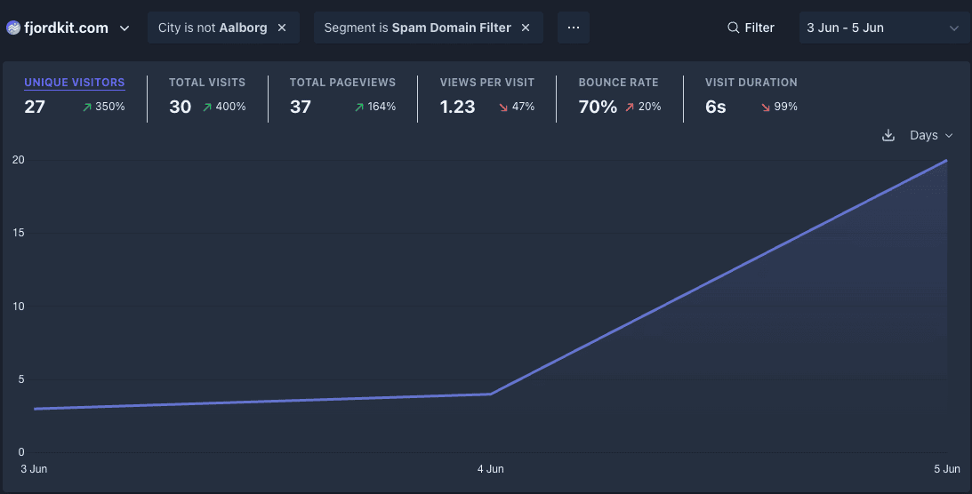
First iteration (June 3 - June 5)
The first iteration was pretty default and bland. Text-only.
I was biased by what seems to be the standard in todays startup / side project space.
The numbers also clearly said, that this landing page wasn't good.
27 unique visitors, 70% bounce, 6s avg. engagement, 0 conversions.
Something had to be done.

Second iteration (June 6 - June 9)
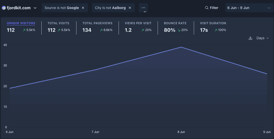
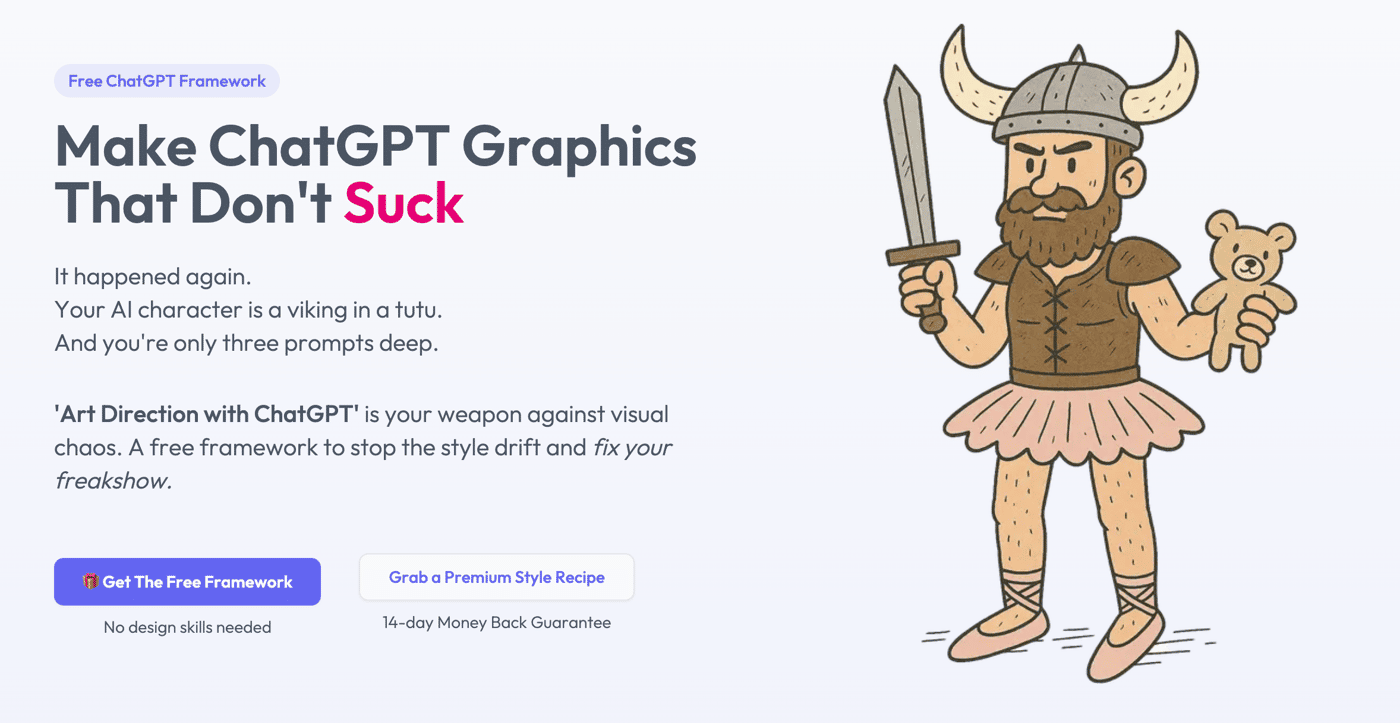
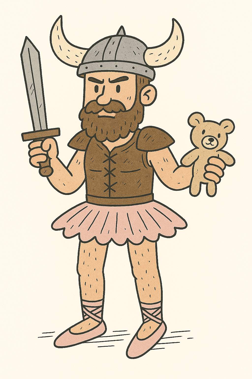
This is where I decided to give my landing page more character. I rewrote the entire landing page to humor-driven copy, and added a memorable viking in a tutu — visualising the problem I was offering a solution to.
The results were better, but still not satisfactory.
112 unique visitors, 80% bounce, 17s avg. engagement, 1 conversion.

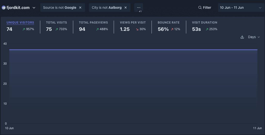
Third iteration (June 10 - June 16)
There was still work to do, so I decided to visualise the problem, and why my solution was better, in a much more interactive way.
I also gave the hero a slight overhaul (the viking was way cooler, wielding a teddybear and a sword).
The comparison component really helped on engagement, and visitors played around with the component.
But the conversion rate was still diminishable.
148 unique visitors, 55% bounce, 37s avg. engagement, 3 conversions.

Fourth iteration (June 16 - Now)
During the second week, a Reddit user reached out to me and gave me some very valuable feedback.
I had way to many CTA's on my site, and they were all labelled differently.
Furthermore, my theory was that there was too much cognitive load:
Multiple different CTA's
New concepts to learn (Art Direction? Style Recipes?)
In my attempt to be generous, and offer a no-strings attached freebie, I removed the value perception of my product, and increased cognitive load.
Here's what I did
Refactored to one single coherent call-to-action
Added a testimonial section, with actual comments people made about the project
Changed the product name
from 'Art Direction with ChatGPT'
to 'ChatGPT Style Consistency Toolkit'
Gated the free toolkit behind a soft "paywall", so an email is now required to gain access to the toolkit.
What this achieves
Reduces cognitive load with a product name that instantly tells what it is
One single action the user can take
Added social proof as the final missing link
Increases the value perception of the free offer
So far this pivot made me 4 signups in just 24 hours.


In conclusion
I'm super excited to see where the new landing page iteration will take my product for the coming weeks, and I've learned a ton during the past few weeks.
What I learned for the first two weeks
Personality and humor > boring and default
If your product is complex, its name should spell out its value
Too many actions -> Too much friction and cognitive load
Show, don't tell — especially with visual products
Show up.
What I gained from showing up
8 users in total (of a niche product)
Valuable feedback from various communities and users
304 unique visitors in the first two weeks
I'm very happy with that.
Tell me, what change did you do, that increased your engagement or conversion the most?
FjordKit.com has been live for a few days now.
Not much traffic started trickling in… but engagement for the traffic that did? Non-existent.
And honestly? The copy didn’t feel like me.
So I'm switching gears
I’ve gone all-in on humor-driven copy.
Fear sells, sure. But fun sticks. And I’d rather make someone smile than push another anonymous “AI-powered” product.
I also added some visuals using my own product:
FjordKit enables you to make graphics with ChatGPT that don’t suck. So naturally, I added a tutu-wearing Viking wielding a sword and a teddy bear.
The update went live yesterday — and already one visitor spent almost 8 minutes on the site, clicking around 4 pages. Still early, but definitely a sharper signal than before.
And that’s my whole bet right now:
Delight > Default
If you’ve ever rewritten your landing page to sound more like yourself, I’d love to hear it.
Drop a link or screenshot. Let’s compare weird pivots.
For the past month, I've been working on a framework / method, that aims to solve a specific problem:
Generating consistently styled illustrations, and keeping e.g. character identity consistent through multiple prompts.
I've been testing, refining, and putting a lot of late hours into the project.
Yesterday I finally reached the point where felt it was good enough to release.
I'd love some feedback, and super excited for the hard part of the journey — distribution.
If anyone wants to try out the Style Recipes I've made, I'd be happy to provide a free copy :) Just shoot me an email at hello@fjordkit.com
The idea
ChatGPT is great at generating illustrations, but if you've ever tried to use it for content, e.g. website illustrations, visuals for blog posts, social media etc, you've probably also experienced how much output can drift from prompt to prompt.
I wanted to fix that, so I could generate content that looked intentional and consistent.
And save hours of prompt trial and error.
The product
The outcome of my efforts are two-fold:
A free framework I'm releasing for everyone to use.
A paid extension of the framework in the form of Style Recipes — a set of ChatGPT directives, that consistently makes ChatGPT output illustrations in a certain style.
The free framework also offers a light version of a Hand-drawn Doodle Style Recipe, so you can try it out, modify the Style Recipe yourself if you like — or get one of the pre-made recipes.
Example: Flat Vector Style Recipe
Once you've set up your ChatGPT project, you can simply just upload a Seed Character, and ChatGPT will utilise meta-prompting to generate the illustration.
Here's some examples:


Comment