
The more I read about interfaces and copy, the more I see people claiming that interfaces must be user-oriented, and it’s time we changed our approach to designing digital products. Both statements are correct; however, only a few have a clue what makes an interface user-oriented or how we should improve them.
Clumsy is an excellent word to describe lots of interfaces. Clumsy because they make us feel awkward when we don’t know how to perform some task. Clumsy because wordiness has taken over logic. Finally, clumsy because they want to be creative — and creativity often makes people think, which is a big no-no.
Some big fellas, like Facebook and Airbnb, decided to get things done and reconsider text to make it helpful and understandable. So instead of clumsy texts, they’ve switched to plain, concise, and easy-to-understand copy. Just as UX designers are creating better interfaces, UX writers are creating better copy.
This article originally posted on Product Tribe blog.
What is so special about UX writing?
Using fancy words to bring people to a product is normal. Using the same words to keep them is not. When we browse a new website, we embark on a journey, and we definitely need guides. Just as we do on a real journey, we experience emotions with each tap, click, scroll, and swipe.
Good microcopy (a little piece of text on the interface) can help us navigate and do stuff on a website. It shows care and understanding about our feelings at every step of the user flow.
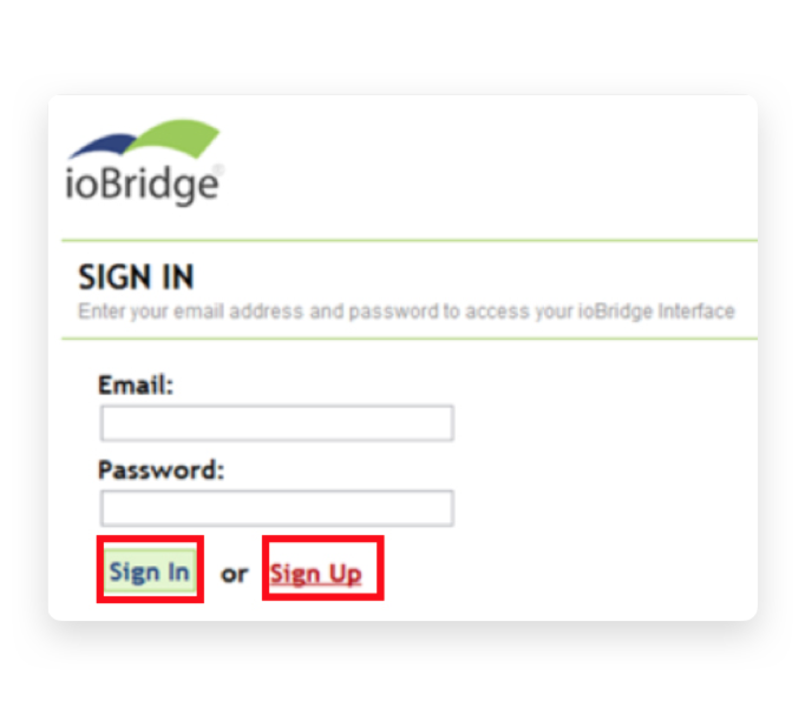
Here’s how Airbnb cares about its users:
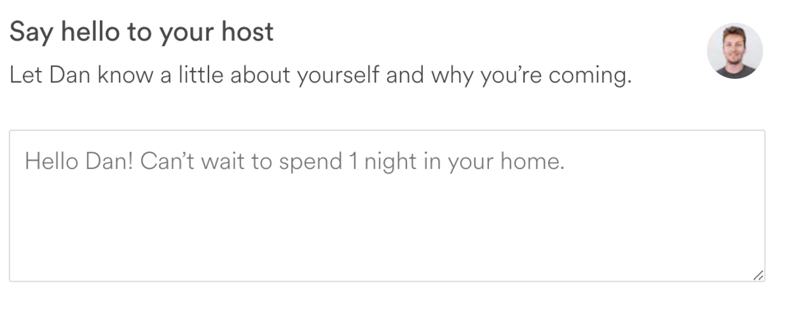
Airbnb shows its users what sort of message the host expects to receive.
What should I write? — we wonder. Airbnb focuses on traveler’s concerns and doubts. The box explains that travelers don’t have to tell the story of their life, but rather say hello to the host. The purpose of this form is to seem friendly. It’s the result of good UX writing.
UX writing is catching on
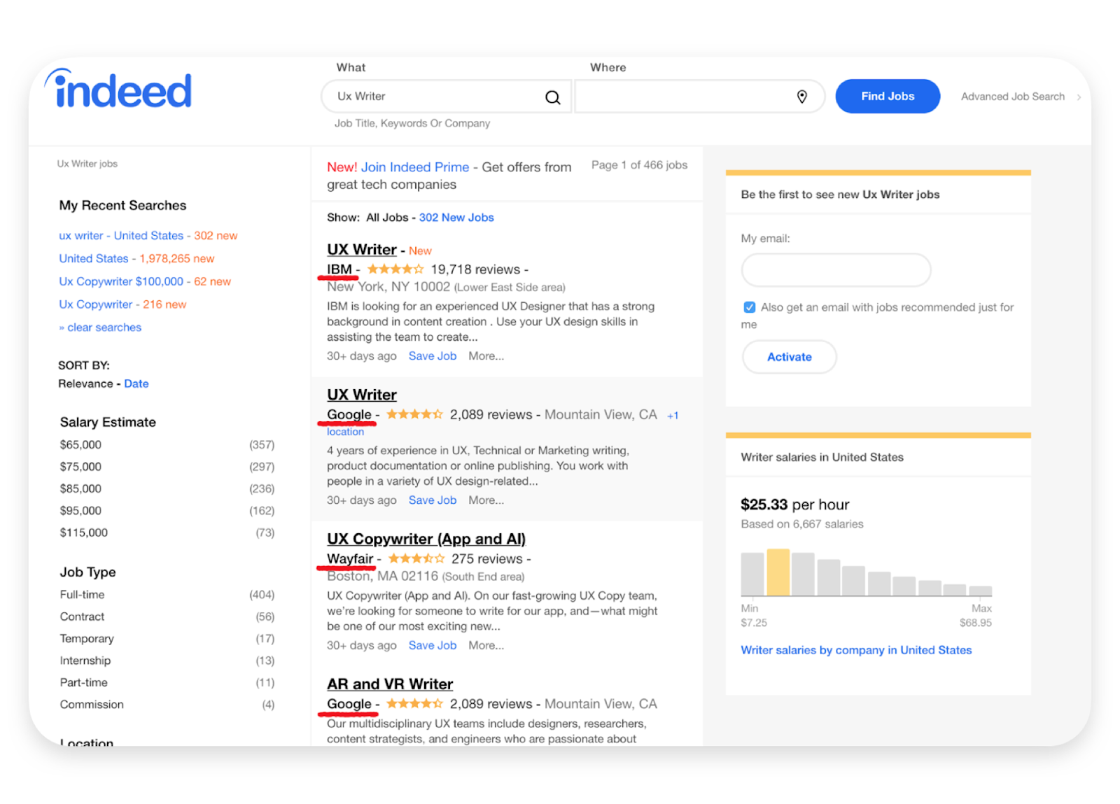
One may think that UX writing is a hyped-up way to refer to copywriters who create microcopy. Well, no. It’s not a trend, but a new discipline, and big companies are willing to pay to have UX writers on their team. Here’s the result for ux writer on Indeed:
As with most digital trends, big companies start it, and smaller ones follow it. I believe in 2018, UX writing will define itself as a separate field of study. Since the right microcopy can influence the business (i.e., increase profits), many enterprises are going to hire experienced UX writers.
During the Google I/O 2017, Maggie Stanphill, senior UX writer at Google, explained the possible business value of having UX writers on the team. After they changed Book a room to Check availability, the engagement rate increased by 17%.
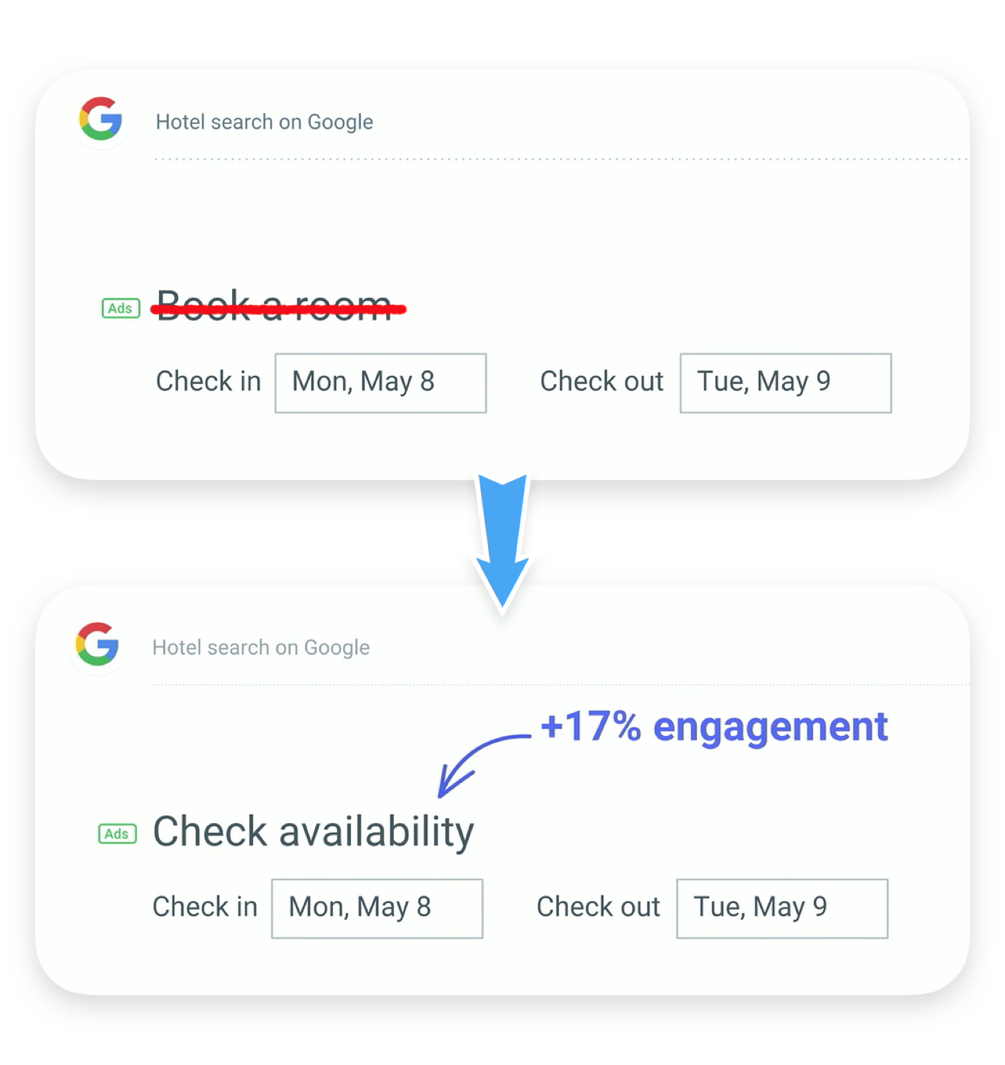
As Stanphill explains:
“We found that it was far too committal at this stage in the decision-making process. So we switched it to Check availability, and what we found what that this was meeting the user where they were in their mindset. They were still considering rooms, and they wanted to understand what dates were available, and what prices were in that date range.”
It proves that the ability to understand user’s emotions and intentions to create the right microcopy can influence business profits.
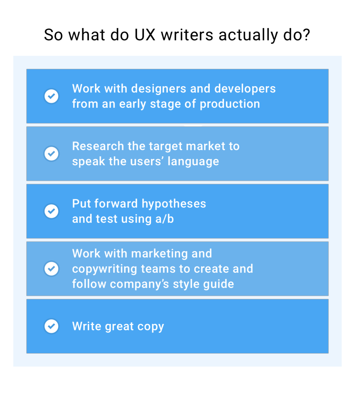
So what do UX writers actually do?
While the job of a copywriter is to write texts to attract new customers, UX writers deal with existing users. Put simply, a copywriter’s primary aim is to help users learn about the product and try it. UX writers make sure their experience with the product is a positive one.
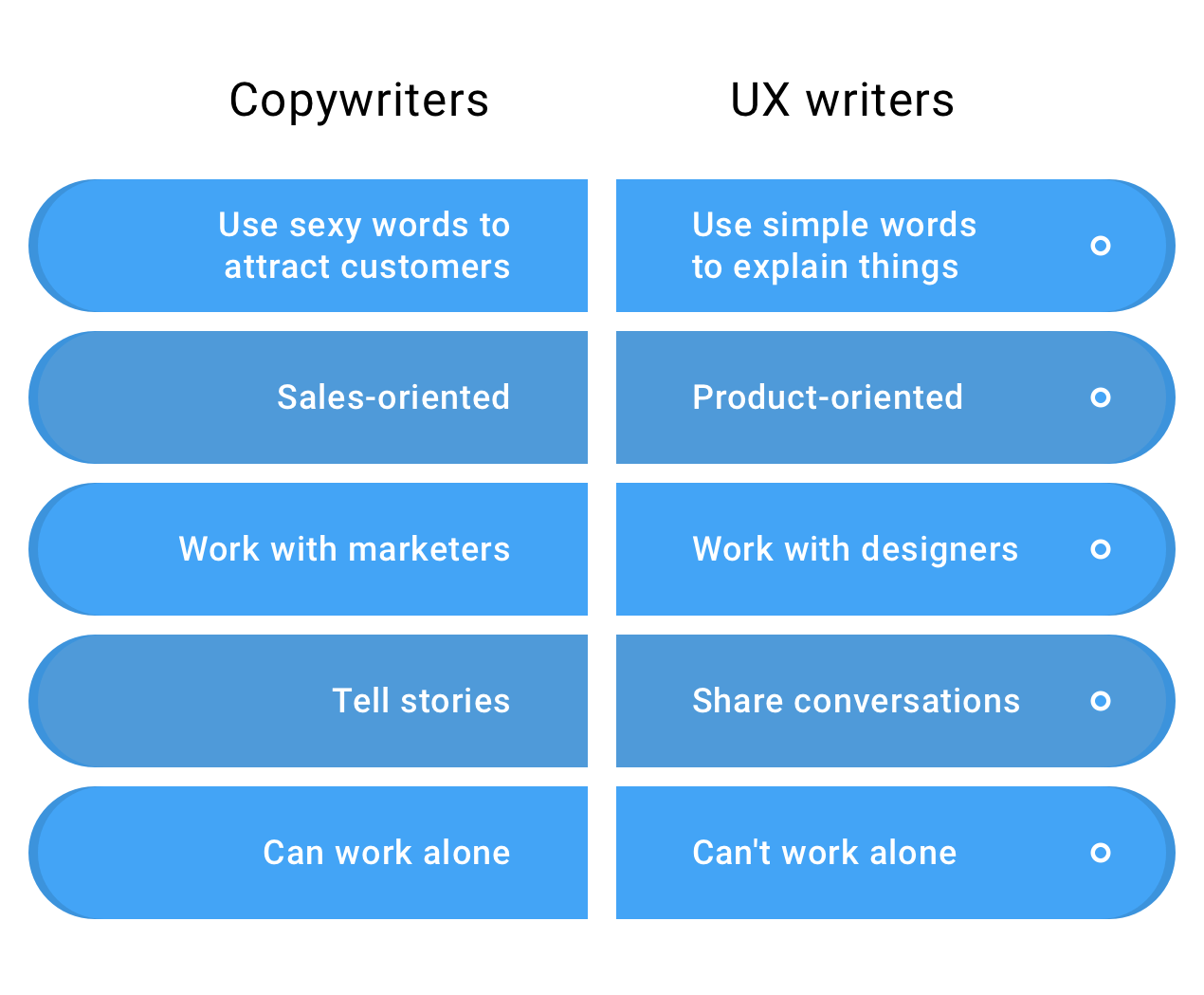
UX writers create positive experiences from the moment users visit a website or open an app. They mend pain points of their user flow with words. Together with designers, they create products as we see them.
Why did UX writing appear?
Simple: because we can no longer tolerate interfaces like this:
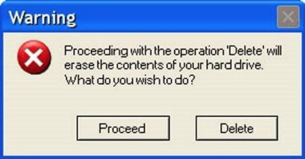
Writing copy on interfaces used to be the job of whoever could write the best in the office. Now that UX writing has emerged, users see more clear and concise copy.
The unit of the UX writer’s work is microcopy. It’s that piece of text on an interface that helps users do stuff. Microcopy can include:
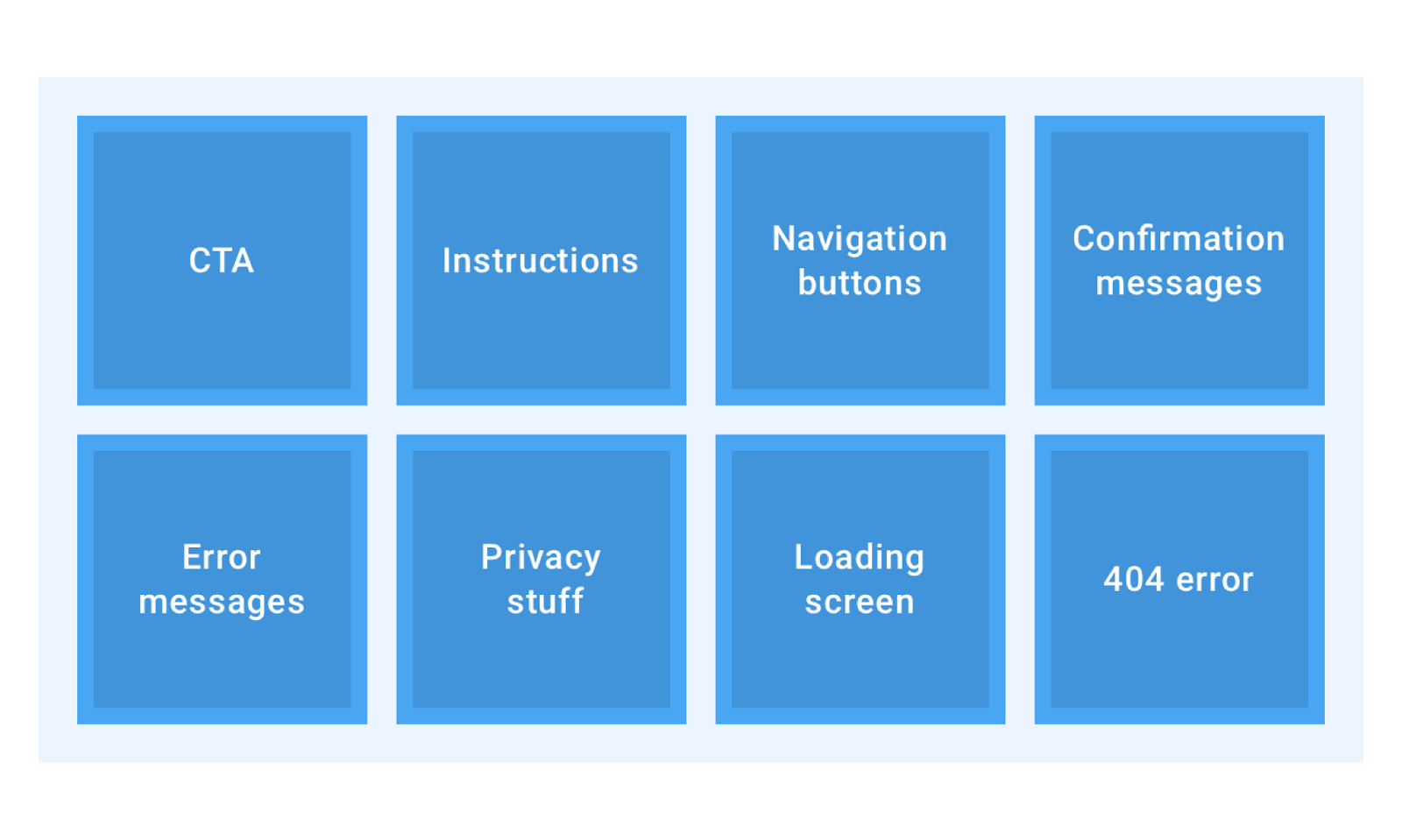
It’s hard to define every type of microcopy, because it’s unique to each website and app. Here’s an example of great microcopy by Pixar:
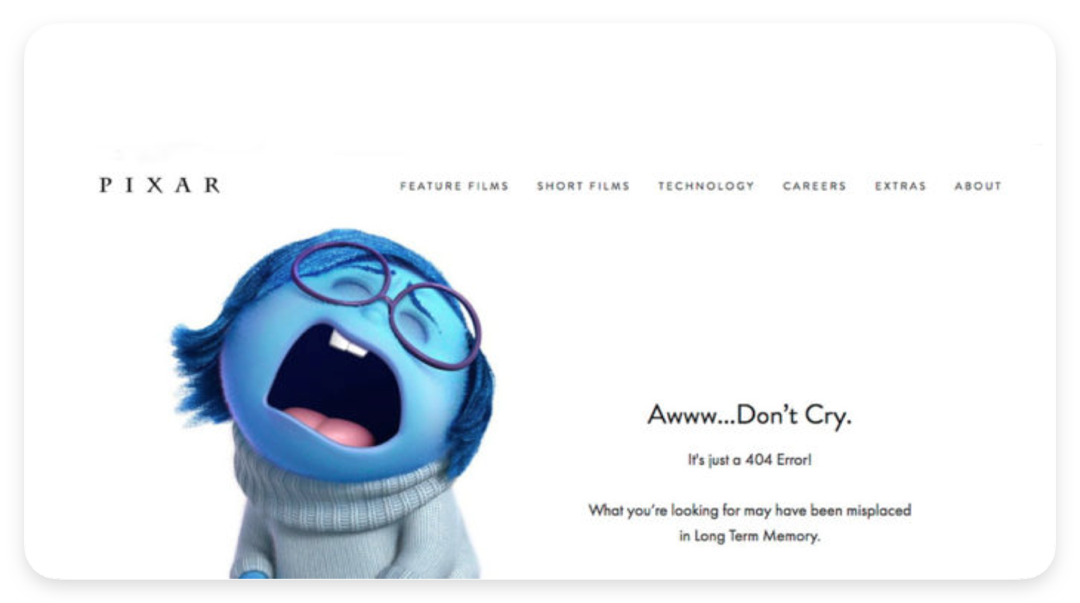
404 page is the worst thing that can happen to a user browsing on a website. A page that doesn’t exist is a bad experience. Luckily, the right words can save the situation. Pixar turns a frustrating experience into a funny one by using some graphics and words of sympathy. That’s how UX writing works.
How to become a UX writer
The skillset of the UX writer includes (a) UX design and usability, (b)wireframing, and © interfaces. It’s also helpful to know the essentials ofbehavioral psychology and decision-making.
Why learn design if you’re going to write?
To design means to create, right? Well, to write is also to design. It’s just that you use words, not a graphics editor. Unless you understand usability, you can’t create a journey that’s clear; unless you can use Sketch, you can’t work along with designers.
Remember, UX writers focus on users’ emotions, and their primary job is to ensure everything on an interface is clear, informative and doesn’t make users ask How do I…? questions. It requires excellent empathy and knowledge of user behavior.
UX writers must have a high command of the language. It doesn’t mean you have to use complicated vocabulary to show your proficiency — in fact, it’s the other way around. Good UX writers always bear in mind that the users may not be proficient in English, so the words must be simple.
A big part of creating the best copy takes research and testing. To understand how users may behave on your website or app, you must answer the following questions:
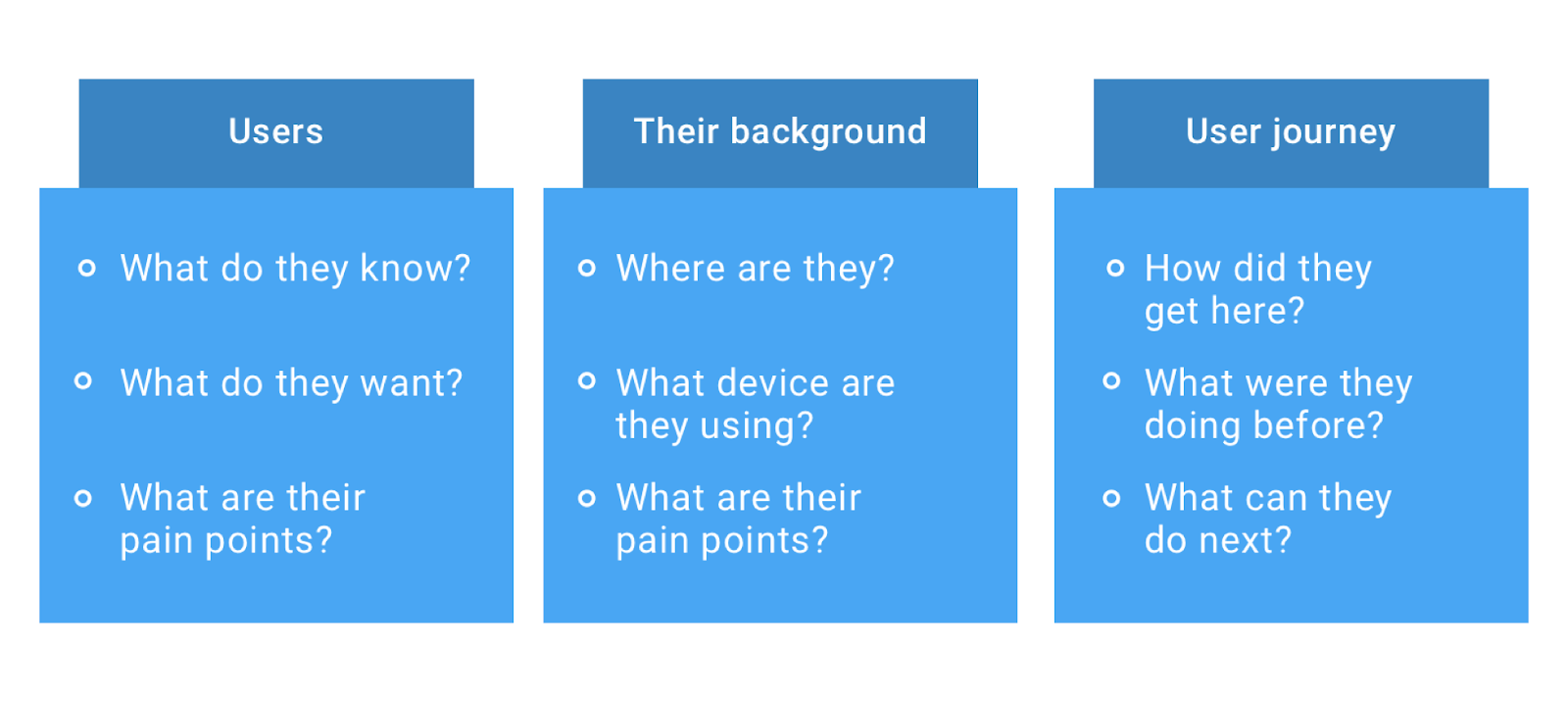
It’s easier to predict what users want to achieve and how to help them do it best after you’ve answered these questions.
Do’s and Don’ts of UX writing.
I have already mentioned that UX writers share conversations with users. Here are some tips on how to do it:
Don’t let users make a mistake — or better, don’t use confusing language. Remove idioms and complicated words. If you’re targeting the global market, it might be challenging for users to understand differences like this:
Instead of Sign Up, it could be Register or Create an Account. Then everything would be clear.
Google has their own principles of writing good microcopy. Good microcopy must be clear, concise, and useful. Here’s how they applied their principles to the Sign In error:
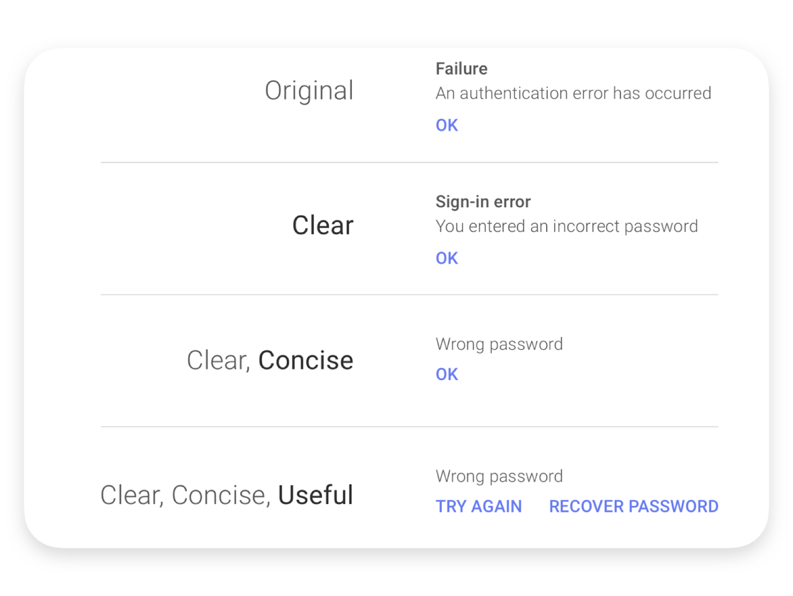
Having applied the three principles, they created a new message. Wrong password is a more natural way to speak than An authentication error has occurred.
Don’t use professional jargon. Ask yourself, Do my users know what those words mean? Unless you’re sure, change the copy until a kid can understand it.
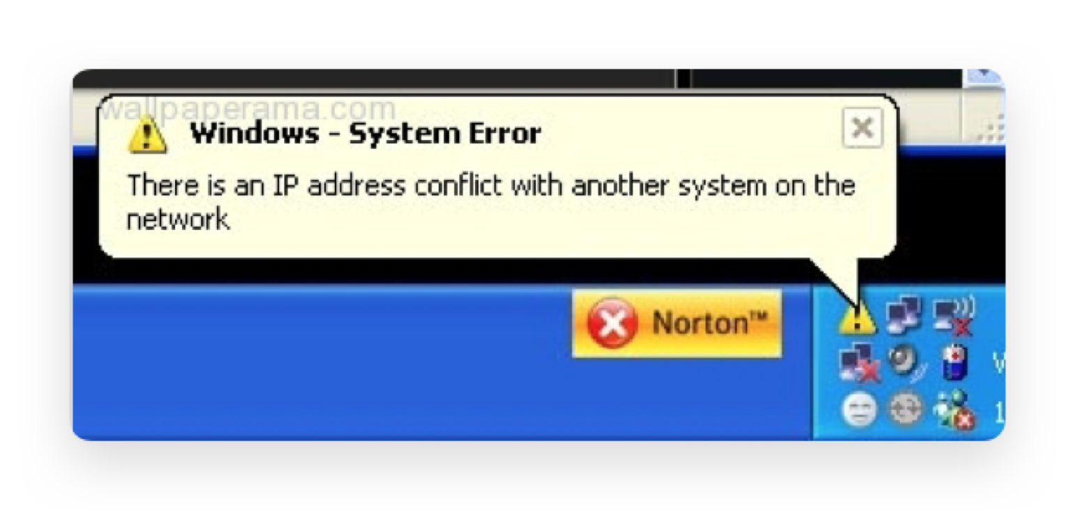
Developers believe that everybody knows what an IP address is. Well, some users know that IP stands for Internet Protocol, but nobody has any idea what it actually is. Such messages make users feel dumb. Instead of a conflict between systems, they could’ve written The Internet isn’t working because [blah-blah].
Make it easy to translate. When you’re building an interface, take into account that it won’t always be in English. It should be easy to translate the interface into various languages.
I suggest you always consider German. German is famous for its long words, the average being 12 characters. Technical terms tend to have over 20 characters. If you can translate the microcopy into German and not change the entire interface — it’s a good one.
Be consistent. This one’s simple — don’t use synonyms. Pick a word, and stick to it. If each button of the registration reads Next, don’t write Proceed orContinue.
Inconsistency confuses users, and makes them think that clicking Next and Proceed might have different results.
Labels must be nearly invisible. This also has something to do with the simplicity of your language. If you can’t remember the text on a button — it’s good microcopy. Users shouldn’t focus on reading buttons on interfaces; instead, their actions should feel intuitive.
Best UX writing practices
In this part, I’ll share some examples of the best microcopy I’ve come across on the Web.
Good microcopy…
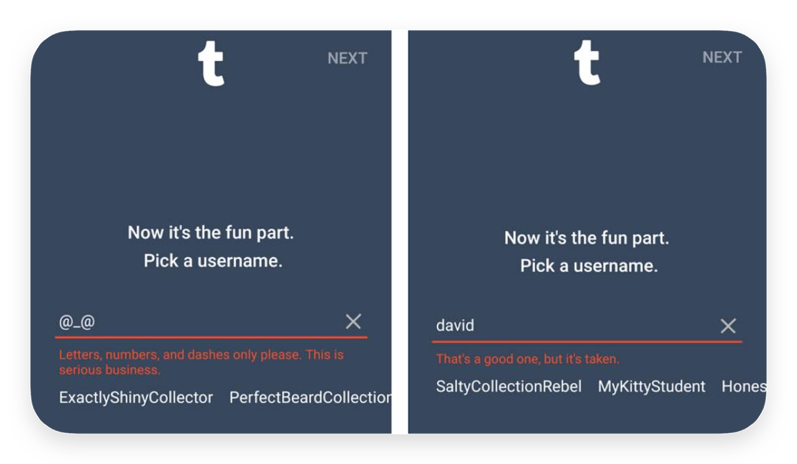
…is human-oriented. Tumblr uses witty language to inform users that their username is taken. Instead of the offensive This username is taken — which means You’re not creative enough — Tumbler gives a compliment: It’s a good one, but it’s taken. People at Tumblr realize it’s a bad experience when somebody has already used your unique username, so they mend this pain point right away.
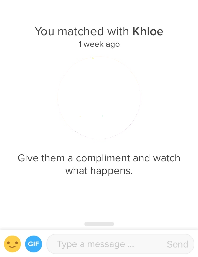
… encourages users. One of the most challenging tasks people face when meeting new people is how to introduce themselves. Tinder helps users to write to their prospective match first to start a conversation. Just give them a compliment. So simple!
…prevents concerns. There are some conventional buttons like Continue and Yes, I agree which may be confusing, and thus concerning. Where will this button take me? To prevent unknown consequences, companies tend to explain what is actually going to happen.
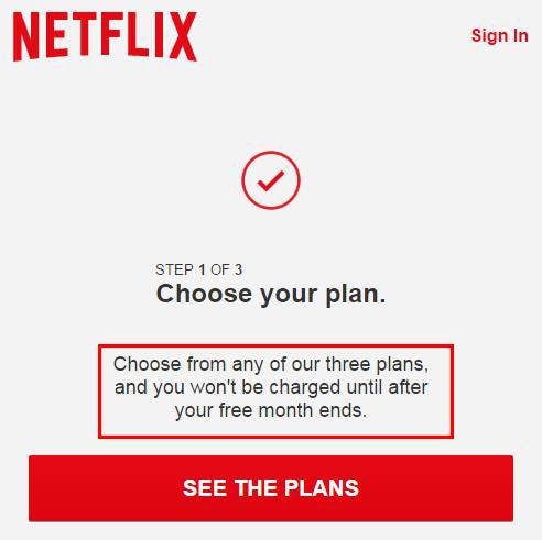
When you first sign up for Netflix, you can choose one of three subscription plans. Netflix also offers a free month and asks to provide your card information. Luckily, the microcopy explains that if you cancel your subscription before the trial month is over, you won’t be charged.
…explains. When using digital products, I often see unnecessary labels, button, and forms, and so I ask myself ‘Why would I need that?’. I rarely get the answer, but when I do, it’s due to a piece of text on the interface.
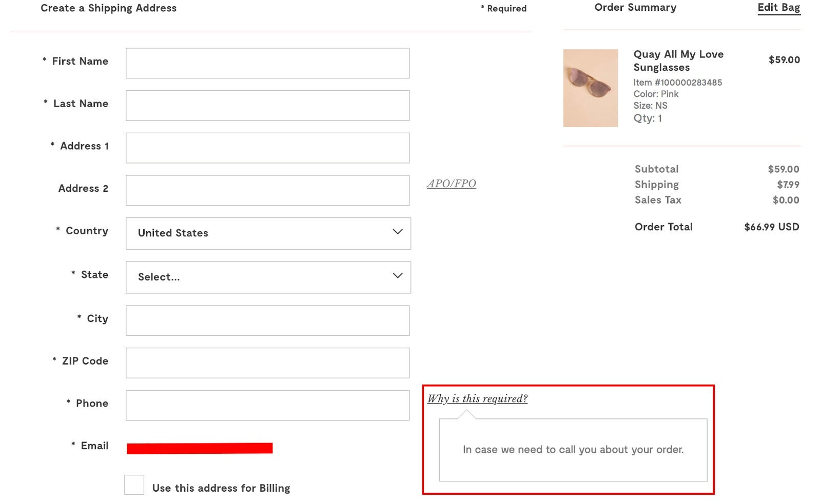
ModCloth, an online retail company, has a typical checkout page: name, surname, address, and suddenly phone. However, one might ask, Why is this required? The label explains that it’s there so that if they need to check some details, they can call me.
Rule of thumb: explain everything that must be explained.
All in all, the amount of good microcopy on the Web is rising, and the above are just a few examples I liked in particular. Pay attention to the interfaces you use every day, and you’ll notice even more.
Bottom Line
UX writing has appeared as a separate discipline because of recent changes in the way users engage with digital products. Standing between conventional copywriting and UX design, UX writing has become an essential part of the product development process. Unlike creative copywriting, UX writing deals with users after they have tried a product; UX writing’s primary task is to make sure every step of the user flow facilitates the user’s needs.
My last piece of advice: be empathetic. No witty word can help you increase your engagement and conversion rates unless you think hard about what your users feel and want at each step of their user journey. Your task is to guide them and be invisible at the same time. Try various products and ask yourself: what am I feeling? Is everything clear? If the answer is obvious, the microcopy is great. Take a look at it, learn from it. That’s how we can raise the bar for web & app interfaces. And there will be peace.
If you find this post useful, please tap vote button and leave your comment 😊
Originally posted on Product Tribe blog.
You can also read this article on Medium and follow me there.
Very detailed and systematic presentation of information. This mini guide can help many who are new to this niche.
UI/UX designer here :)
Interesting post! I actually (respectfully) disagree that Airbnb's "Say hello to your host" has good UX copy. The answer they suggest does not actually respond to the instructions listed.
They write: "Let Dan know a little about yourself and why you're coming." and their suggested response is: "Hi Dan, can't wait to spend a night at your place.".
What? See the disconnect there?
That suggested response has nothing to do with the instructions they've provided and frankly, just confused me (and I suspect others). I think the user would have been better served with an actual sample response even at the expense of it being longer in character count.
Let Dan know a little about yourself and why you're coming.
"Hey Dan! It's a pleasure to meet you. My name is David and I'm a 28 year-old professional looking to enjoy the wonderful sights of Paris. My SO and I will be travelling together for this week-long trip and we're very excited to be spending a few nights in your wonderful home."
Add or subtract to this to meet UX timing requirements but the point remains the same, which is: suggested inputs should represent an ideal user-input that actually follows the instructions listed.
Just my two cents :)
Great article. Will share it to our team since copy is a really important part of our work!
Great article and nice examples @Anastasiia 👏