
Just a week ago we’ve launched HoverSignal, a free and simple tool that helps you add social proof to your website.
At the beginning we’ve created a massive landing page with all that recommended stuff: reviews, examples, video etc. After that, we’ve searched for some beta users by sending messages and emails to people we know, simply showing them the URL and asking what they thought about it.
The reaction was always the same: “Looks nice, but I don’t get it. How exactly will this tool help my website?”. After a few minutes of absorbing this feedback we asked everyone: "What’s stopping you from implementing this tool right now?" The answers were quite the same, again: “I don’t know how this will look on my website" or "will the designs match?", or "what exact message is it supposed to be sending?”
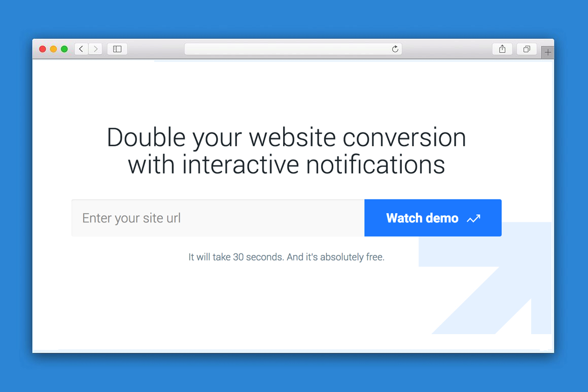
So, we decided to start from scratch and create a virtual fitting room right on the main page. We’ve deleted everything we had on our landing page leaving a single form, showing the users of the website how exactly our product works.
We forced our landing to be part of the onboarding process, so every visitor can watch our tool in action and understand why they should try it.
A few days later we’ve shown our new version to the same people and the reaction was much more positive. We’ve also repeated our previous paid ads campaign and the conversion rate went from 2,7% to 4,2%.
I’m not sure that this approach could be implemented in every industry, but if you have the ability to show your customers how your product really works – do it as soon as possible. Don’t make users read about it. Show.
That clickbait headline though.
Cool stuff nevertheless.
I though I was the only one who felt it was click bait.
Expected to see a page that was converting over 50%
If you want to find out if the new version actually performs +50% better than the previous one, you should run a proper A/B test.
By running the variations serially (instead of in parallel) like you did now, you've invited all sorts of external factors into the mix (like quality of the traffic that is coming in) and therefore you're comparing apples to oranges from a statistical point of view :)
Really nice way to do a landing page for visual products
Small Typo: recieved -> received (Request for Email Coupon Giveaway widget)
Hey Mike, I'm building a similar tool, but for a totally different market (mine is not even in English).
We can share notes, if you like
Sure. PM me on twitter
Just FYI, your sign up page does not work and is over HTTP rather than HTTPs. Would love to sign up on the free plan and trial it.
Fixed. Thank you.
Incredible!
@mikepogolsha I'm just curious to know, roughly how much are you spending on your paid ad campaign? Anytime I'm working on something new, I run a handful of campaigns myself. Generally, I spend ~$200 to test some big variations. I'm curious how much others spend at such an early stage. Thanks for your help!
Out approach is quite the same. We spend now around $300 a week while testing different channels.
Awesome - thanks for answering and good luck collecting sign-ups!
Very effective!
Hover Signal does look cool. But where does it get it's data from? Like 20 people registered today. Where does it get this data from? Or is it all just random, inticing the user in?
pretty cool
thanx )
This comment was deleted 3 years ago.