5 Tips to improve your logo before launching
A breakdown of how I designed and animated the Newsletter OS logo for today's product hunt launch.
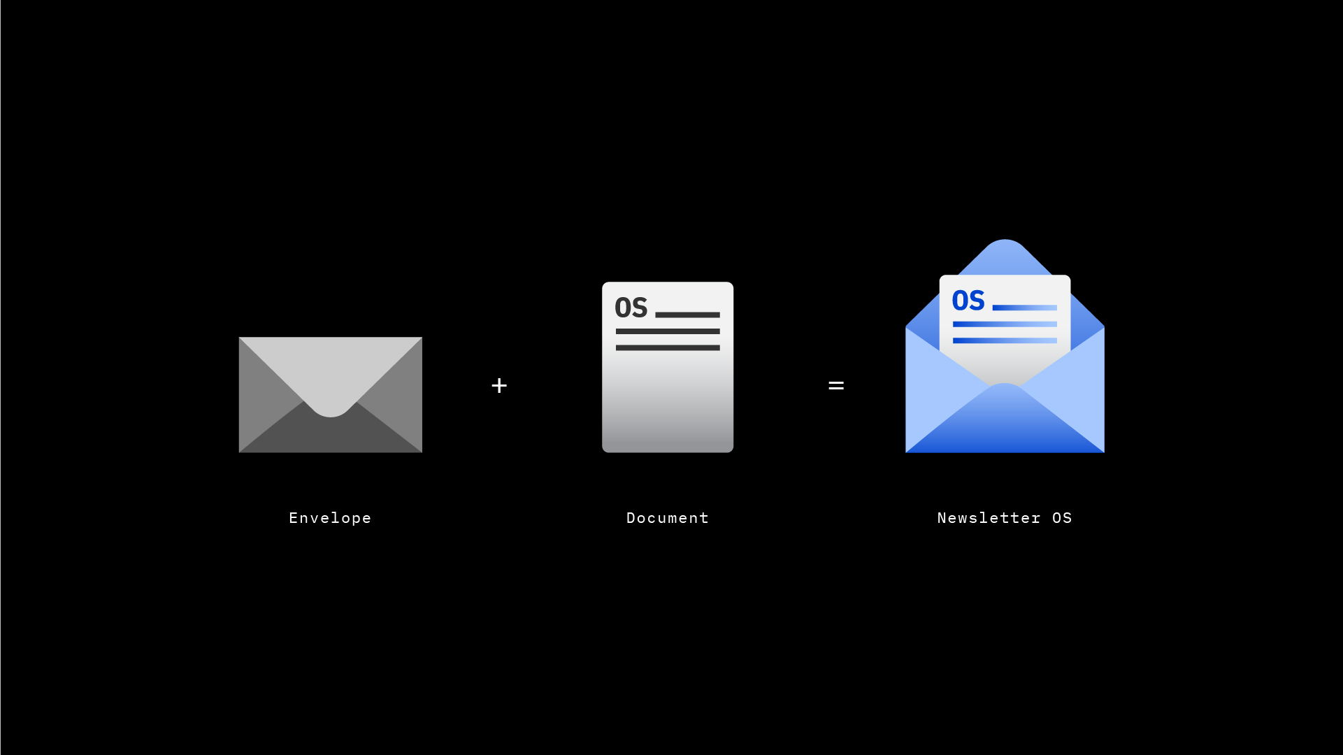
1. What's your story?
• Your logo represents the story behind your brand
• Newsletter OS = Framework to build your own newsletter.
• Strong brand = Solid Foundation
• Solid Foundation = Clear Message/Story

2. Visual metaphors tell stories
• Metaphors are universal
• They're understood in every language
• Twitter's logo = Bird + Chat Bubble
• Test your ideas with emojis
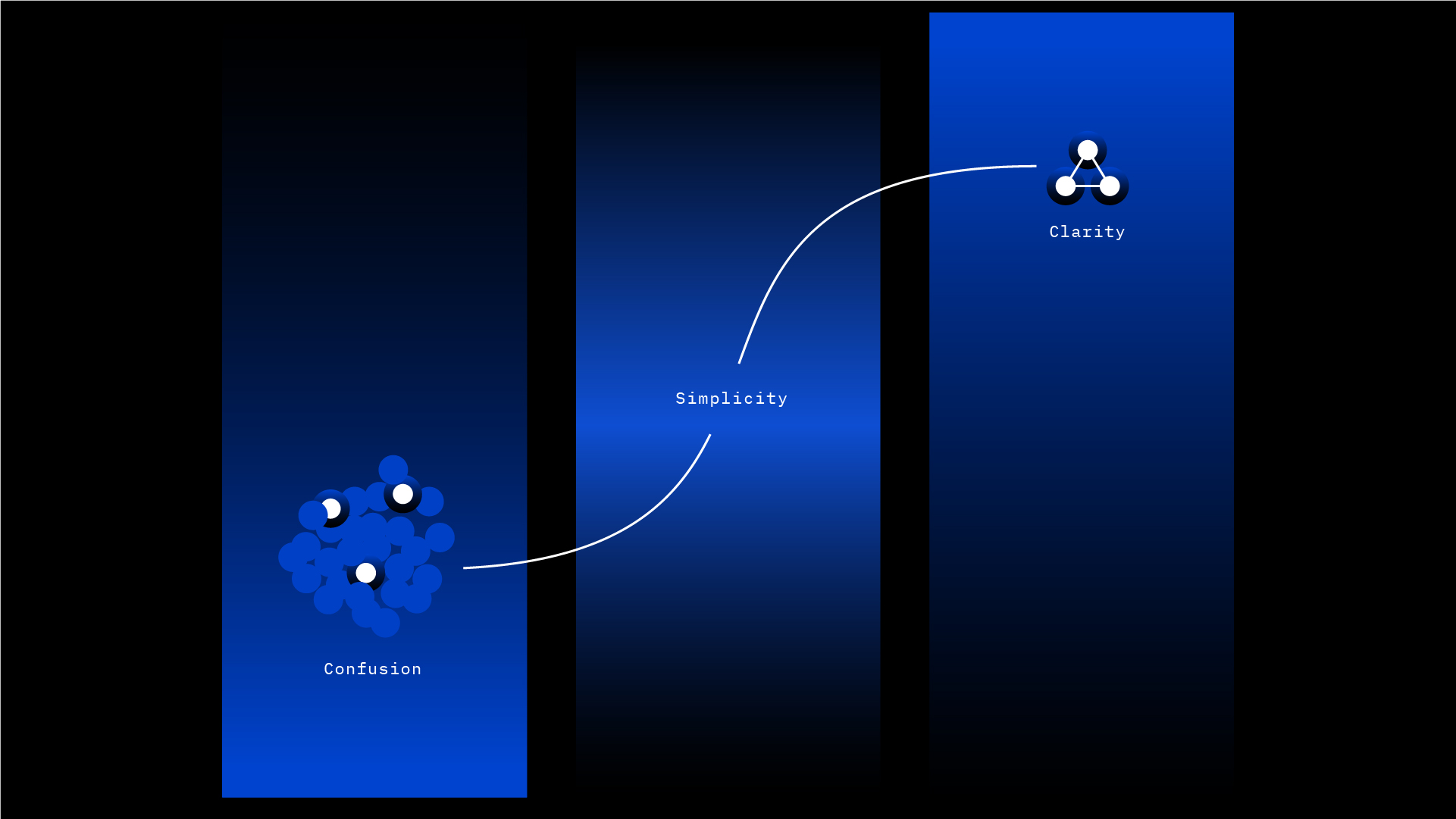
3. Simplicity = Clarity
• Too many elements = Confusion
• Fewer elements = Clear Silhouette
• Clear Silhouette = Understood by everyone
• Edit till it's simple enough for a child to draw
4. Don't reinvent the wheel
• Someone has already thought of your design (idea)
• Grab a free icon, analyze it, and remix it
• Personalize it to tell your story
• Start here: https://thenounproject.com (Icons below are from the noun project)

5. Animation brings your logo to life
• Animation enhances your story
• What was the purpose of the Newsletter OS animation?
• Setup: Envelope opening = Greeting guests
• Reveal: Come in, mi casa is your casa
• Animation = conversation with the viewer
Lastly, here's the final logo. If you've enjoyed this and would like to see the final animation, please show some love to the original thread on Twitter

Start designing and tag me. I'm here to help!
Need help with your logo or product hunt launch? Reply to this post or send me an email.

literally earlier today asked Janel where she got that fire logo 🔥 awesome thread.
Thanks, I really appreciate it. Love what you're building and using Notion. Great work!
I love it. I'll be following this thread. I am working on my own logo and that's going to be really helpful
Wonderful! Glad I could help
Thank you. Just used your advice to update the logo for my charity
Fantastic! 👍🏼