Choose Typefaces Based on Brand Personalities
Day 16 of 30 Days of Starting Up
In Day 2’s newsletter, “Quality Triangle of Startup Branding,” I advise startups to identify brand personalities that can speak to their audiences and then choose a legible typeface that expresses the personalities. I have since launched a workshop kit to help startups identify the brand personalities in 60mins in three fun steps. I am currently classifying typefaces based on brand personalities.
The tech part is relatively simple; I used Retool to build a backend that can read and write into a firebase database. Let me know if you are interested to see a review of Retool as a #NoCode tool.

The process of curating typefaces that express each brand’s personality is the meat of the work. My cofounder Hua has a more in-depth newsletter about font discovery and how to use them for branding and marketing. In her writing, she covers why certain typefaces are suitable for specific types of brands.
We have summarized a few criteria that we are looking for when classifying typefaces based on brand personalities:
Visual Characteristics
If you find typefaces all look kind of similar to each other, sometimes “identical,” you are not alone. Typefaces are supposed to be that way so that they can be easily recognized as the alphabet.
Fun story, a friend of mine was pulled over by traffic police once. The police asked what her job was, and she said she is a type designer; with the police still confused, she further explained that she designs letters. The police were even more confused and asked, “what do you mean you design letters? All the letters are already designed.”
The police got a point, the overall shapes of the alphabet are established, but there are still endless ways to render them. Type designers’ job is to explore endless possibilities, construct systematic styles to render the alphabet, and package them into typefaces. Each typeface has unique visual characteristics that differentiate them from the others; think of it as their “font market fit.”
The visual characteristics that I am looking at includes:
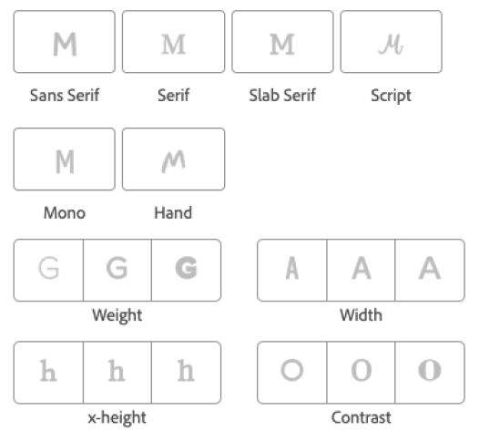
From these characteristics, I can connect the lines like:
- Handwriting font expresses casualness while serif fonts look formal
- Heavyweight font conveys sturdiness and firmness, while lightweight font conveys elegance
- Taller x-height fonts look friendlier, while shorter x-height fonts look higher class and maybe even a little snobby about it.
Historical Background
The historical background of a typeface style also informs their personality. Garamond, a typeface designed in the 15th century, carries legacy and heritage. Therefore it is suitable for universities, law firms, financial institutions, and companies identified with “Classic” brand personality. If you want to learn more about Garamond, Hua wrote an article about it.
The historical background factor is very intertwined with the visual characteristics factor; we may associate certain personalities to visual characteristics because of when the visual styles were invented. Foods for thoughts today: if Serif font was created in the 20th century and Sans Serif in the 15th, will we have different views on them? Would “Sans Serif” conveys classy and heritage, and “Serif” conveys modern and freshness? Let me know in the comments what you think!
Cultural Context and Trends
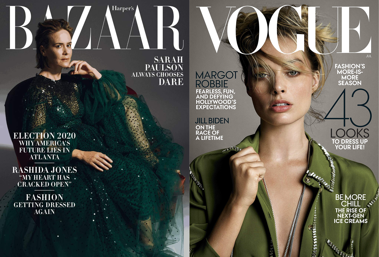
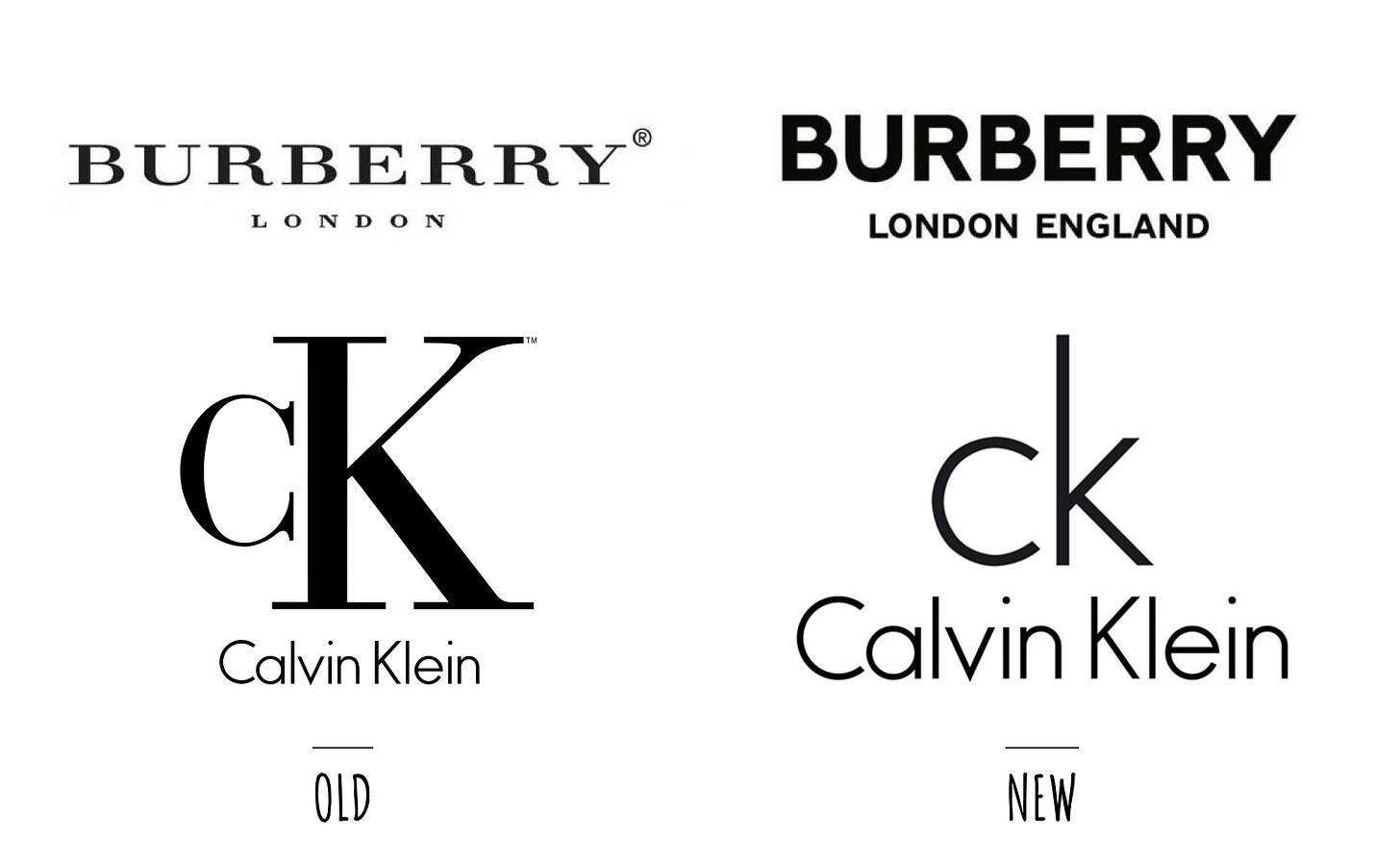
How the typeface has been used in pop culture also influences how what personality we associate them with. For example, the Didot typeface, with its signature high stroke contrast, is used by fashion magazines Harper’s Bazaar and Vogue. We started to associate its style with fashion.
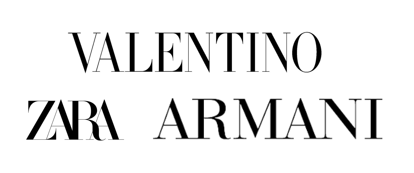
With that cultural context influencing a generation of designers and consumers, many fashion brands use the Didot style typeface for their branding. For example:
Pop culture is not static; it has a rhythm of change, which we refer to as the trend. When cultural context shifts, the brand personalities of a certain typeface will also change, unlike the historical background factor, which tends to be more stable. We already see the fashion industry start shifting to Sans Serif typefaces, and one day we may stop associating Didot typeface with Fashionable.
I am going to continue to work on tagging typefaces with brand personalities. Stay tuned for more progress! I am building my product – a brand design app – in public and share my progress daily in my newsletter. If you enjoy the content, please consider subscribing to my newsletter!

Good read!
Yep, definitely agree that it's important to convey the right message to your customers whether with visual or written means!
Interestingly enough, choosing typefaces sort of combines the visual and written ways to engage your audience.
For the product I'm currently working on (botmenot.com), I've chosen a sans-serif which I think suits my brand personality. Still having some considerations regarding the body copy though!
What I've learned from experience is that legibility, clarity of hierarchy, and appropriateness are a must when considering different typefaces, so that's what I'm sticking to.
I can't agree more! Legibility and visual hierarchy go a long way! I took a look at your product, it is looking great! I took the liberty to choose a few brand personalities that I would use to describe your line of product, and put into my database, these are the list of fonts that came out, maybe it could be helpful for you to choose typefaces for body copies (though the database was originally tagged for logo typeface, so take it with a grain of salts, not all typefaces are suitable for body copies): imgur
Pretty awesome!
I'm actually thinking of changing the font for my app (https://cinematicstudio.app).
What would you recommend for something that should pretty much say: "simple, fun, awesome, fast" ?
(I've written the words by their priority)
The only limitation I have is that the font should be free (like, google fonts).
Thanks!
I put simple and fun into my database, these fonts show up, take a look at:
! imgur
Thanks! 😁
all are free fonts that you can get from google fonts :)
That’s a great resource, wentin!!
Thanks Dennis!