Design: Minimal is not equal to intuitive

For years, I thought products with a minimal design would be easy to use. While sometimes it’s true, being minimal is different from being intuitive. And it can be confusing to use.
Intuitive design is a familiar design
A design is intuitive when a user can immediately understand and use it, without consciously thinking about how to do it. Users will feel that a design is intuitive when it is based on principles from other domains that are well known to them.
For example, when I was a kid, I’ve learned to use Microsoft Word. Then I remember the first time trying Google Docs, I immediately knew how to use it. The user interface was almost the same.
Despite having a complex layout, marketplaces like Amazone or Alibaba are intuitive. Their UI has links, buttons, navigations, and ads everywhere. A while back, I thought Alibaba’s design was a complete mess.
But once you get familiar with online shopping, it’s easy to find something when you need it. For example:
- To search for an item, you can use the top search box
- To discover items in a category, you can navigate to that category
- To find the best price or nearest shipping location, use the sorting feature
- And the site’s logo will take you back to the home page
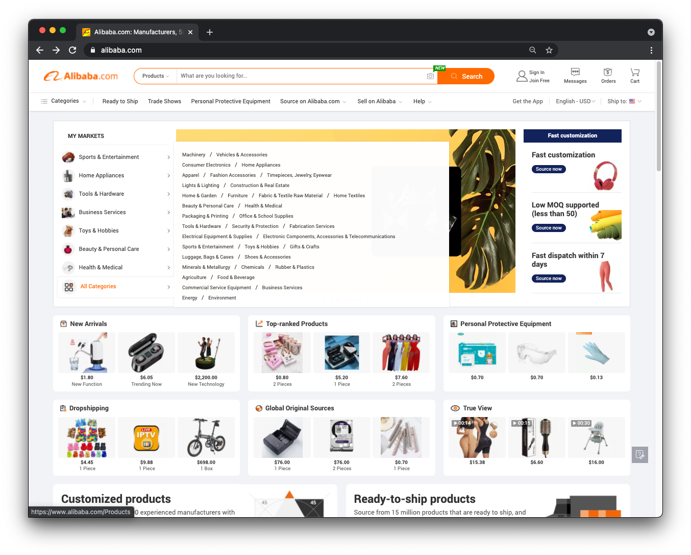
Alibaba design: intuitive, but not minimal
Minimal design removes things
Different from being intuitive, minimalism focuses on removing less-necessary elements to reduce distractions.
It’s hard to find a popular website that has a minimal but not intuitive design. Because if it were, it would have improved. Though, there are a few cases where a product feature has a minimal design but not intuitive.
For example, Twitter’s Settings page. There are many options and without a search bar, it’s ridiculous to find the one I need. The last time when I wanted to find the word-blocking option, I had to google which section it belongs to.
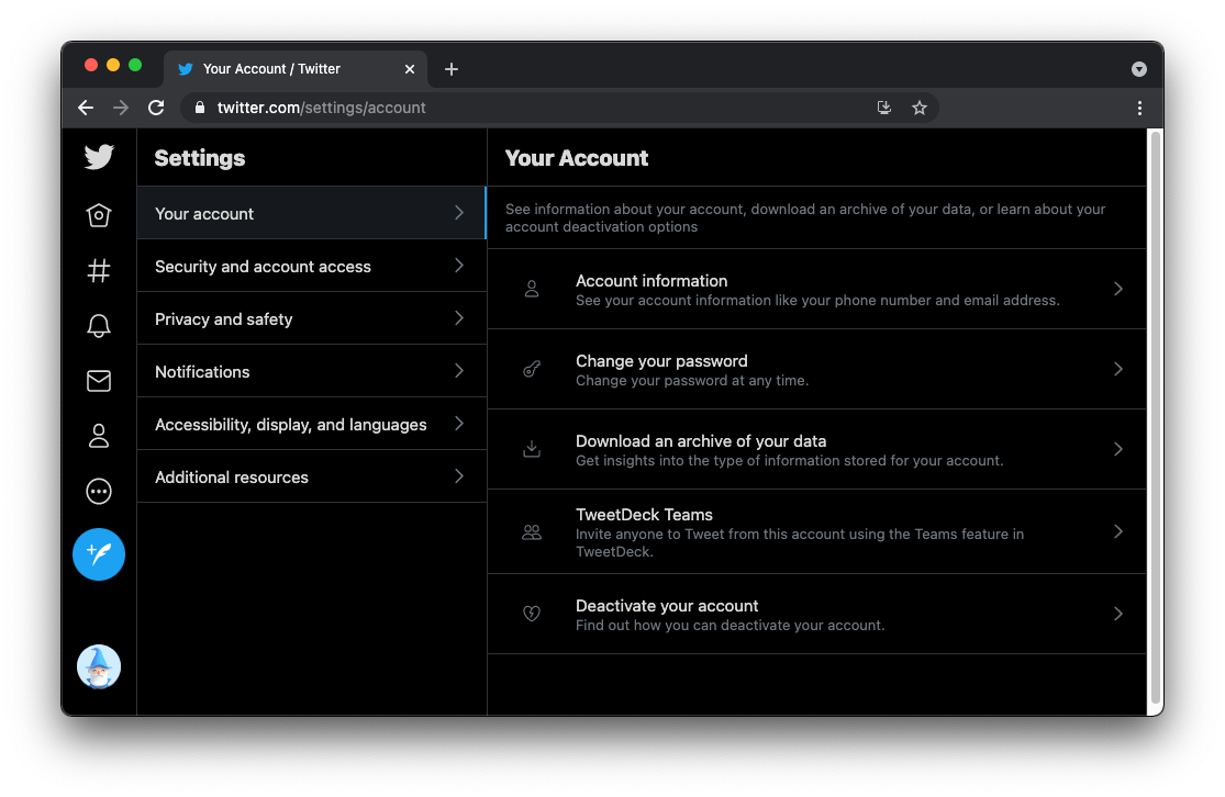
Twitter’s setting: simple, but hard to find a setting option
Another example is Google Photos’ empty album page. The UI looks dead simple, but I have no idea at the first look. Would you recognize the word SP as the album title, and an editable field?
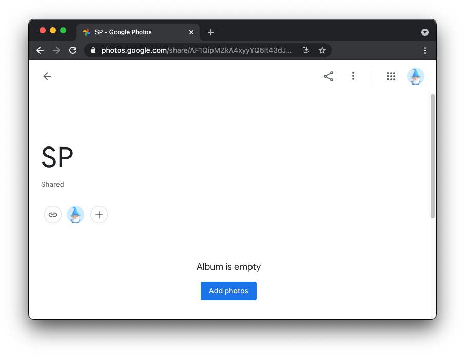
Google Photo’s Ablum on Web
Another similar example is Medium’s new post page. In 2017, I had the chance to build a blogging platform for the Vietnamese community. Our create post page was much inspired by Medium. When introduced to the users, we quickly learned it didn’t fit. The reactions we had were “How do I use it? Where is the insert image button, make text bold, etc?”.
When getting exposed to a new UI, people need guidance. While Medium’s new post page doesn’t have much, and is almost like a blank page. UX like this would confuse new users.
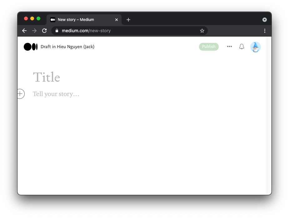 Medium’s new post page on Web
Takeaway
Minimal design focuses on removing things, while intuitive design creates a sense of familiarity and comfort. When designing, it’s important for your product to be intuitive.
Minimalism is relatively new, and sometimes it can be confusing to use. In that case, consider improving your design based on your target users. You can also improve the onboarding process, (i.e use interactive walkthrough) or having instructions for users to get familiar
Originally featured on UX Collectice and Inverr's Blog. Thanks to Fabricio Teixeira, David Nguyen, An Tran, Rahul Chhabra, Kévin Miguet, Husein Kusuma for proofreading and feedback

loved this post Hieu!! keep them coming : )
Thank you, Hua :)
Great post Jack.
It reminds me to Subastack. Simple UI, bad UX and worst text editor.
On Dev.to, when writing a post you get this tiny scrollable window... that, is quiet uncomfortable to write.
Hashnode, is bloated, and ot intuitive at all. I always vet lost.
agree 100% on substack, text editor is buggy and not user-friendly at all!
when ever I place an image, I can never find my cursor to press to go to the next line... lots of issues.
Wow, so many people use it. Never thought it'd be that bad.
have you tried quotes?
If you tab back, the whole text becomes a quote...is a joke.
😬 I avoid working directly in it as much as I can now.
I mostly copying and pasting into it directly from google doc
that's smart.
i am moving out,...
A few days ago, I saw your tweet about Substack's dinosaur-age editor. It cracked me up. I tried Dev.to before, but not Hashnode and Substack.
What platform has an editor that easy for you? (I built a simple rich text editor into Inverr and wonder, I might check it out)
This comment was deleted a year ago.
I agree. People judge a design as intuitive or not based on personal experience. And "bad design" is bad no matter what.
A good example is the Google home page. For someone who used it the first time, it can be unfamiliar but intuitive (I think because there's only 1 goal and you can't miss it).
The case I'd pay attention to is where the target audience doesn't interact much with minimal UI (especially if they're slow to adapt). That's where unfamiliar design is bad. i.e a blogging platform I worked on in 2017, as mentioned above