Feedback on my travel web app landing page
Hey guys, I would love some feedback on my landing page. I haven't launched yet, but your feedback would be super valuable to me as I sort out the remaining kinks.
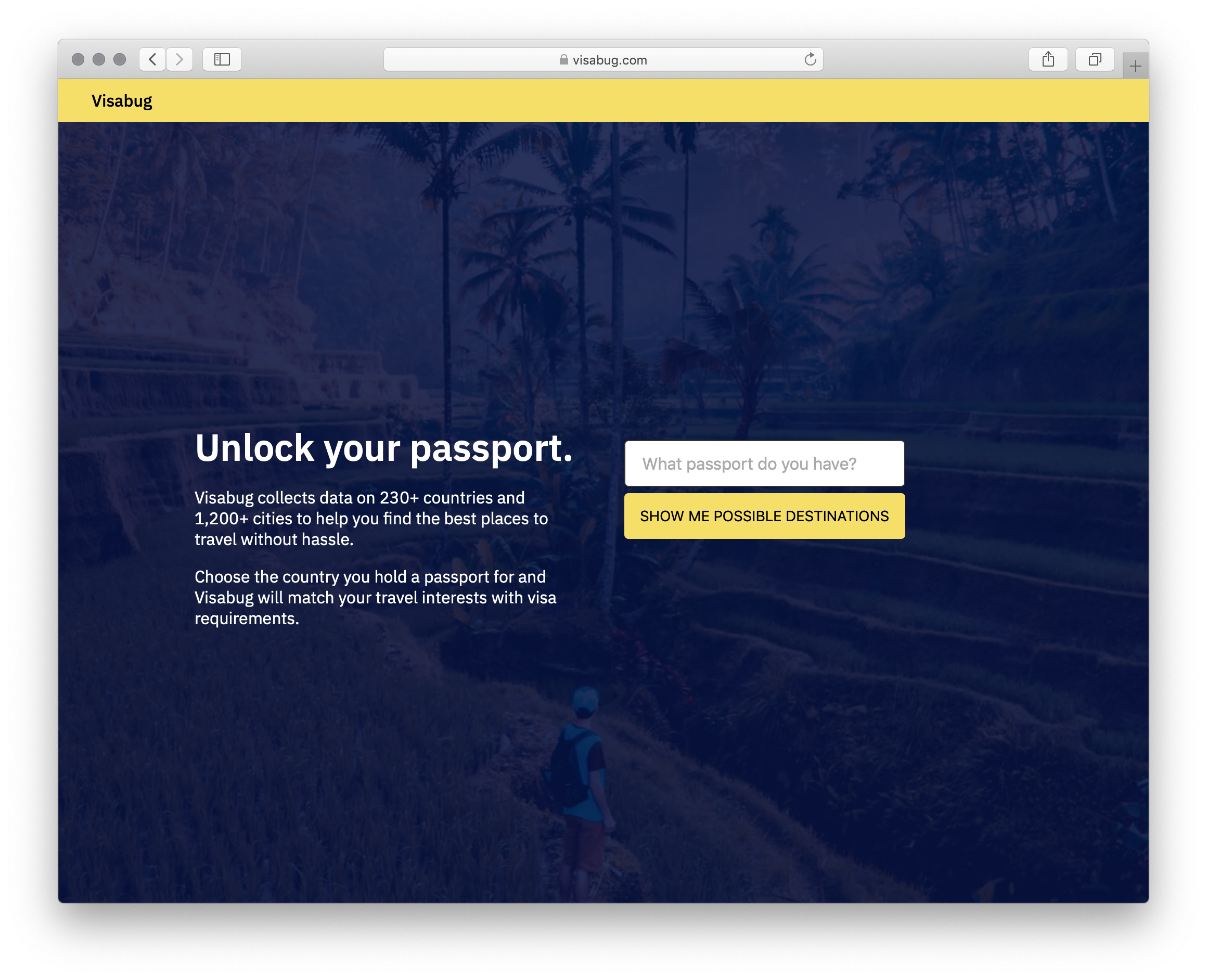
My app is called Visabug. It's at https://visabug.com. Not explaining it here, as that would bias how you perceive the landing page.
- Does the page make sense?
- Anything you would change?
- Once you actually search, does the next page flow nicely?
Trending on Indie Hackers

Sounds good.
Have you heard of visalist.io ?
He's building something similar too
Yep, I saw it! It's pretty good. I think I can do a better job though. ;-)
Damn! Way to go
This comment was deleted 2 years ago.
That's fine, nothing wrong with a little competition right?
Nothing wrong with competition. But a false mindset and arrogance make entrepreneurs fail.
I would love to see how you can upbeat the game and demonstrate you're better. Show. Don't tell.
Keep it up @hobonumber3 :)
The page inside is good. Why not add screenshot of inside to see what users will see? About and Terms could be at the top. Looks good though. Try adding visa application process if you can. List embassies where you can apply for visa. Cost of application. Etc. Good work though.
Good idea! Will adopt these. Mind doing a review for me again once I add some of these things in @tesnep?
Just let me know when. I'm also asking people here to provide some feedback for my site https://tinysnippt.dev. I'd appreciate if you could do the same for me.
@tesnep yeah, for sure. Want to create a post and link to it? I can add the feedback there.
Looks good, cool idea. Here's a bit of feedback!
Design:
Features/UX:
That's what I got time for right now, but this is pretty cool!
Thanks a lot for giving this level of feedback. It is invaluable. I will take it on and improve. Do you mind if I ask you for some more feedback in a few days after I make some of these changes @bjenkins24?
What I love about this is that I feel like its going to give me a list of great destinations that I could consider traveling to. I'm expecting it to show me the travel info I need (like immunization shots etc) and also beautiful pics with links to booking. I don't know if it does that or not but that would be my expectation. Good luck with this.
Thanks! Immunization shots are a great idea. Will try to get that data.
Without knowing anything about your site, I see "Unlock your passport"
Doesn't really tell me much. I think it would be better to use something like "See Where You Passport Can Take You"
Agreed. I'd like that better too.
Thanks guys, this helps.👍
Honestly, I think the page needs some work.
It's not immediately clear what the site is about or why people should care. The headline makes it sound like a service that helps remove travel restrictions or something.
The copy below it adds a bit more context, but it's a little light on the details. What type of data are you collecting? What makes them the best places to travel? What specific interests are you matching to? And what is the benefit to the visitor? How is it different from some other travel site?
Make it clear and specific just what your offering. Answer the questions people may have that could prevent them from moving forward.
A bit of social proof would help as well. If you have any testimonials, user reviews or ratings, add those.
Hope that helps. Best of luck.
@SeanKirby Would you mind taking another look in a few days once I iterate on this feedback?
Sure. I'd be happy to.
This is helpful feedback. Thank you very much for taking the time. I'll iterate on this.
It is a nice site.
Good idea.
Maybe you need to create some infographics on how to use visabug. Under the main section add on a customer journey.
From an SEO perspective, you aren't doing much at all. I am assuming you may be dependant on social media to drive traffic?
Thanks! From an SEO perspective, I was thinking of starting a blog and SEOing individual travel pages. For example: https://visabug.com/from/canada/to/argentina being SEOed for "Visa requirements canadian argentina"
Hmm. Starting a blog is the right idea.
However your URL structure and keyword strategy may need a little work!
If I can help just give me a shout.
All the best.
The service is cute.
The initial landing page needs some work on marketing.
Unlock you visa. - it's not a phone...
You gather data, ok cool for you..
Who is the customer? What does he want?
Something like:
"
Discover [adj] destinations to travel to.
New/excited/easy/cheap/uncommon/....
Find everything you need to know in a click like visa needed, cash or card, costs, apps used and more.
"
On the 3 pages the counties the data is something singular or nil making the text lame.
@hatkyinc What do you mean by "On the 3 pages the counties the data is something singular or nil making the text lame." Can you give me an example please?
https://www.visabug.com/from/israel/to/albania
"Popular ride-hailing services include ."
"Some popular telecom companies are Vodafone."
"Common international airlines are Alitalia. Popular domestic airlines are Blue Panorama"
This is very helpful @hatkyinc. Thanks for giving me some suggestions on alternate copy. I actually like these and will try A/B testing them out.
Would you be ok if I ask you to take another look in a few days?
This is cool!
Anyway to add data for things most people might not expect?
For example 'Not rainy season'.
I would add a bunch of data sources that might surprise people so they can also do a reverse search. i.e. I want to go to Japan and your service tells me: it is Golden Week prices are more expensive, A virus outbreak is a risk. It is rainy season in August. Oh sorry you cannot get a Visa in that country unless you _______.
Currenlty people probably need to search "Is August a good month to go to Japan?", and then read a bunch of opinions people left all around the internet.
I do not normally search where I can go, I know where I want to go and then search about it. Think this has some great potential with the data and setup you already have.
The landing page being simple is great! The image does not tell me anything about your service, pictures speak thousands of words. Maybe use humaaans to illustrate what your service does. Or a moving screen shot showing a bit in action.
PS: looking for a check too if you have time.
https://www.indiehackers.com/post/my-replacement-for-green-status-circles-04a10770a6
Thanks! I like your suggestion about the flow. I'll add some more images and also use the data to answer the questions like "Is this a good time to go". I'm glad you like the site. Going to go through yours and offer you feedback now.