FontDiscovery 🖼️ 21: How to Use Eclectic & Nerdy Font Space Mono
I'm Hua, a designer and bootstrapping founder building Typogram, a brand design tool. As part of running Typogram, I create this digestible weekly guide with fonts, colors, and design ideas to help founders, creators, and makers step up their game in marketing and get creative!
Hey There👋
How’s it going? I had a relaxing weekend with most of the notifications off on my phone. I also published a new post about branding early on. I would love to hear what you think. Hope you have a nice week.
In This Issue:
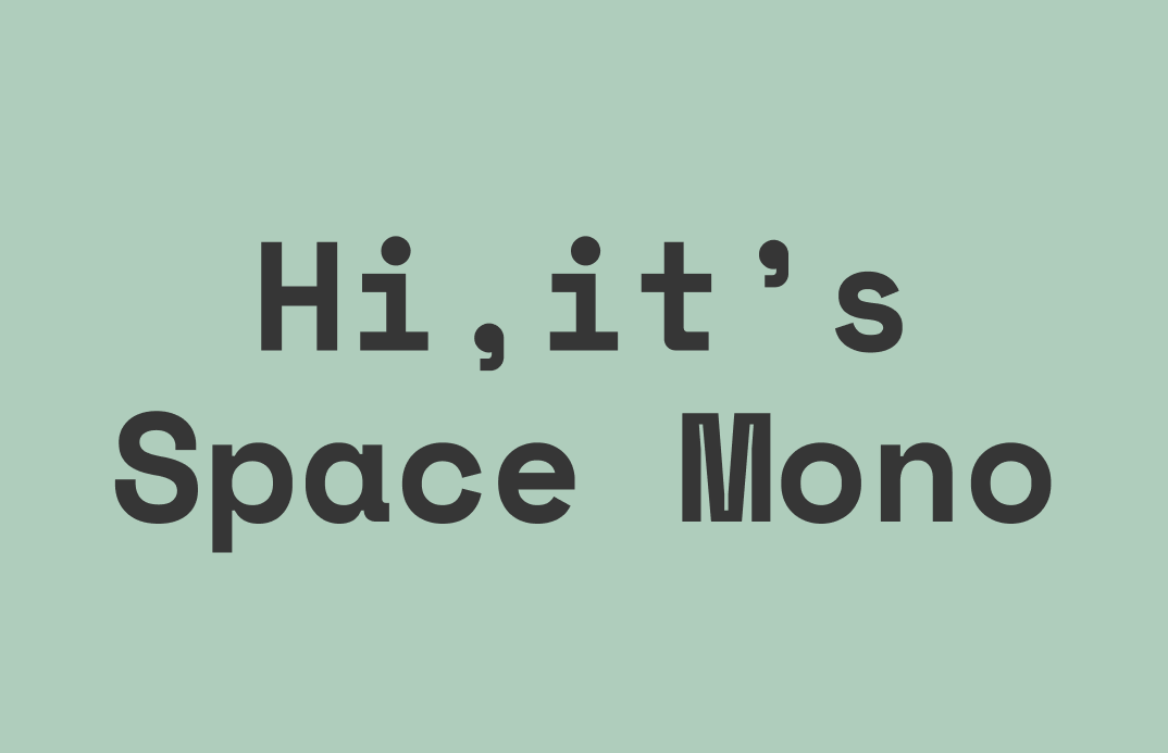
- Font: Space Mono, available here.
- Design/Marketing Idea: Center Align
- Color Inspiration: Art Deco
img: Sample of Space Mono
Font of the Week
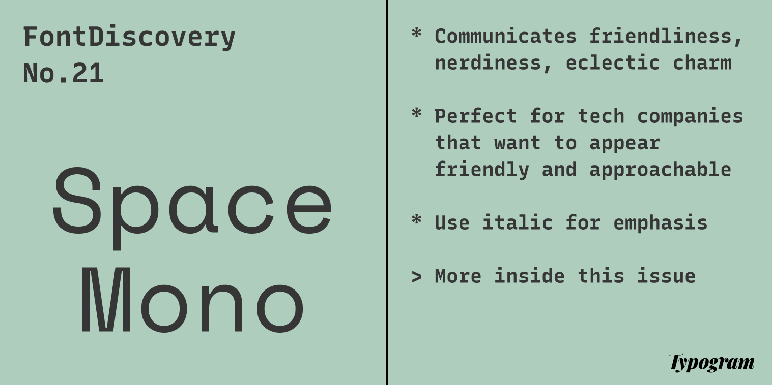
Like Plex Mono, Space Mono belongs to a category of fonts known as monospaced. Monospaced fonts are fixed-width. They are commonly found on typewriters and code editors. While monospaced fonts sound techy and nerdy, they also come across as intimate and friendly in certain contexts. Reasons could be the extra comfort to our eyes brought by its fixed-width, or remembrance of memories past when we click-clacked our thoughts to our loved ones. Either way, monospaced fonts are having a comeback. People love using them in their brands.
Space Mono is an excellent example of this. It is a cute, eclectic, friendly monospace font combining geometric perfection with the human touch. The shapes of the letters are very geometric, but the strokes have a calligraphic influence. Human touch like these makes Space Mono perfect for friendly tech brands.
Font Details
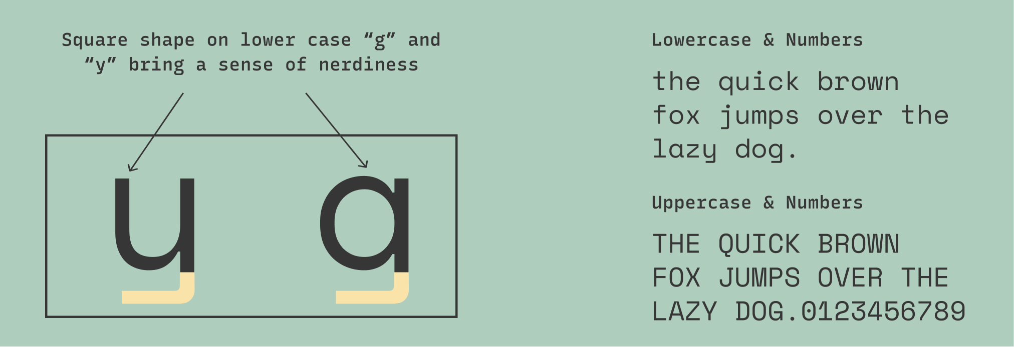
- Certain parts of the letter are very geometric, almost retro-looking
- The thick and thin strokes remind us of a calligraphic hand
- Dotted numeric “0” to differentiate from “O”
img: font details for space mono
General Usage Tips
- When using bold, add a little extra letter space between letters
- Weights and styles: regular and bold with an italic version for each weight
- Pairing: Space Grotesk is the sans serif counterpart of this font
Specific Usage Tips
How can I use it for logo?
- Communicates friendliness, nerdiness, eclectic charm
- Perfect for tech companies that want to appear friendly and approachable
How can I use it for branding and marketing?
- Multiple weights make it good for complex projects like landing pages
- It’s good for displaying numbers because the characters are in the same width

img: Data display using Space Mono. source: Google Design
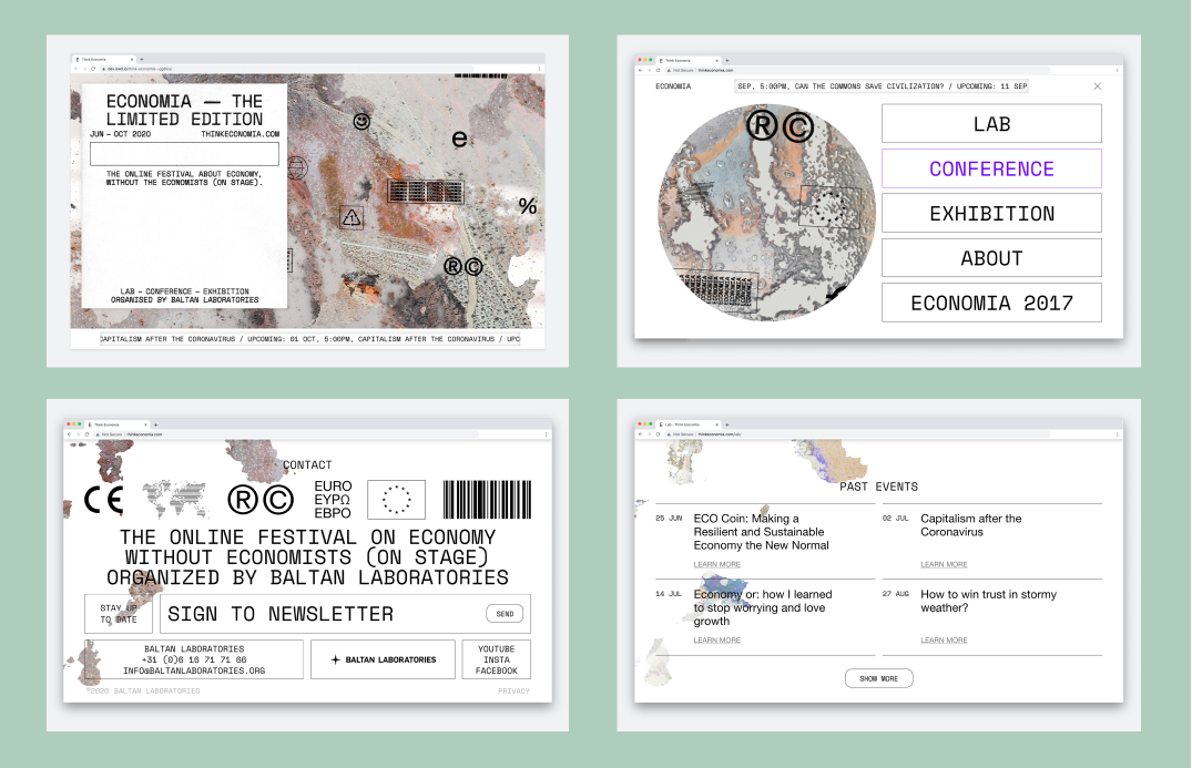
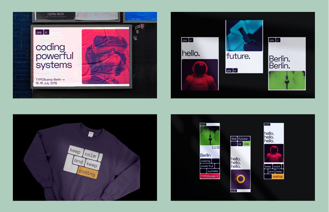
img: top–Space Mono at used as a header font for Economia festival’s website, bottom–Space Mono for CPS-IT brand identity. source: FontsInUse
Design / Marketing Idea: Center Align
Recently, I received a question about when to use center alignment in design. When you are designing something, at some point you might have to make a decision about text alignment. While there are no set rules, there are some good general guidelines when it comes to usability.
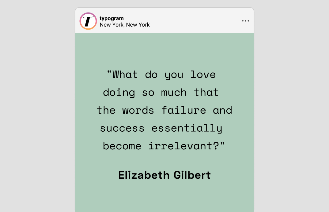
When should we use center align? For shorter text, like quotes, caption, testimonials, center alignment works perfectly. Center-aligned text is also fantastic for short, call-out marketing copies where you want to grab customer's attention right away. Lastly, center-aligned text is also popular with formal invitations and documents.
When shouldn't we use it? Avoid center-aligned text for paragraphs.
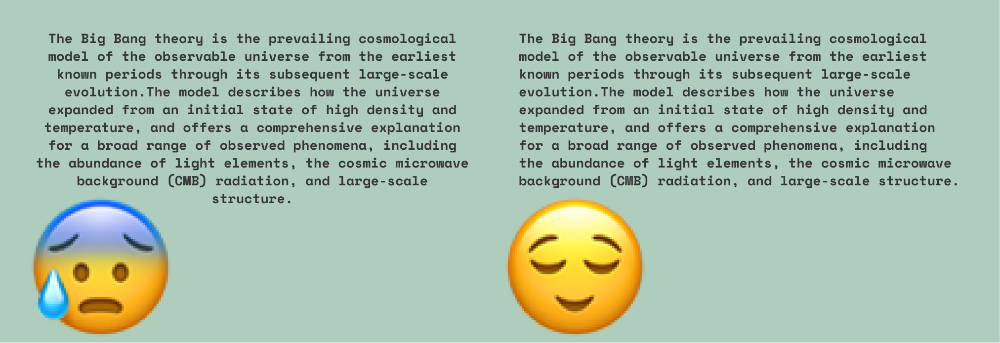
img: center-aligned paragraph vs left-aligned paragraph. Center align is harder to read because lines of text are uneven on both sides
Color Inspiration
Today we have pastel color palettes from the Art Deco district, Miami. Art Deco was active from 1910 to 1939. It combined modern styles with fine craftsmanship and rich materials. During the peak of Art Deco, it represented luxury, glamour, exuberance, and faith in social and technological progress. (Apparently, Elon Musk is also a fan).
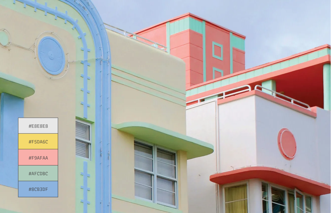
img: Miami’s art deco district. Source: afar
Creative Prompt
Can you create a visual for Twitter or Instagram using Space Mono, Center Align technique, or the color palette we featured today?
Thank You
…for reading and hanging out here this week! Space Mono is available here.
img: Space Mono Infographic
If you enjoy this series, you can subscribe here if you feel like:
Have more questions about design and fonts?
Please email me [email protected] or find me on Twitter at @HuaTweets.
You can also read the past issues on Typogram's blog.

As always, some very helpful tips. Thanks Hua! 🙏
Glad it was helpful! Thanks, Solene : )
Nice font. I liked a lot the Space Mono and the color palette was great, really nice. Thank you for the insights Hua!
Thanks Mike :D