FontDiscovery 🖼️ 22: Look stronger and with better ux
I'm Hua, a designer and bootstrapping founder building Typogram, a brand design tool. As part of running Typogram, I create this digestible weekly guide with fonts, colors, and design ideas to help founders, creators, and makers step up their game in marketing and get creative!
Hi there! 👋
Hope you had a relaxing long weekend! Did you do anything fun? comment here or dm me on Twitter what you did. I would love to hear about it! I hope you have a wonderful rest of the week.
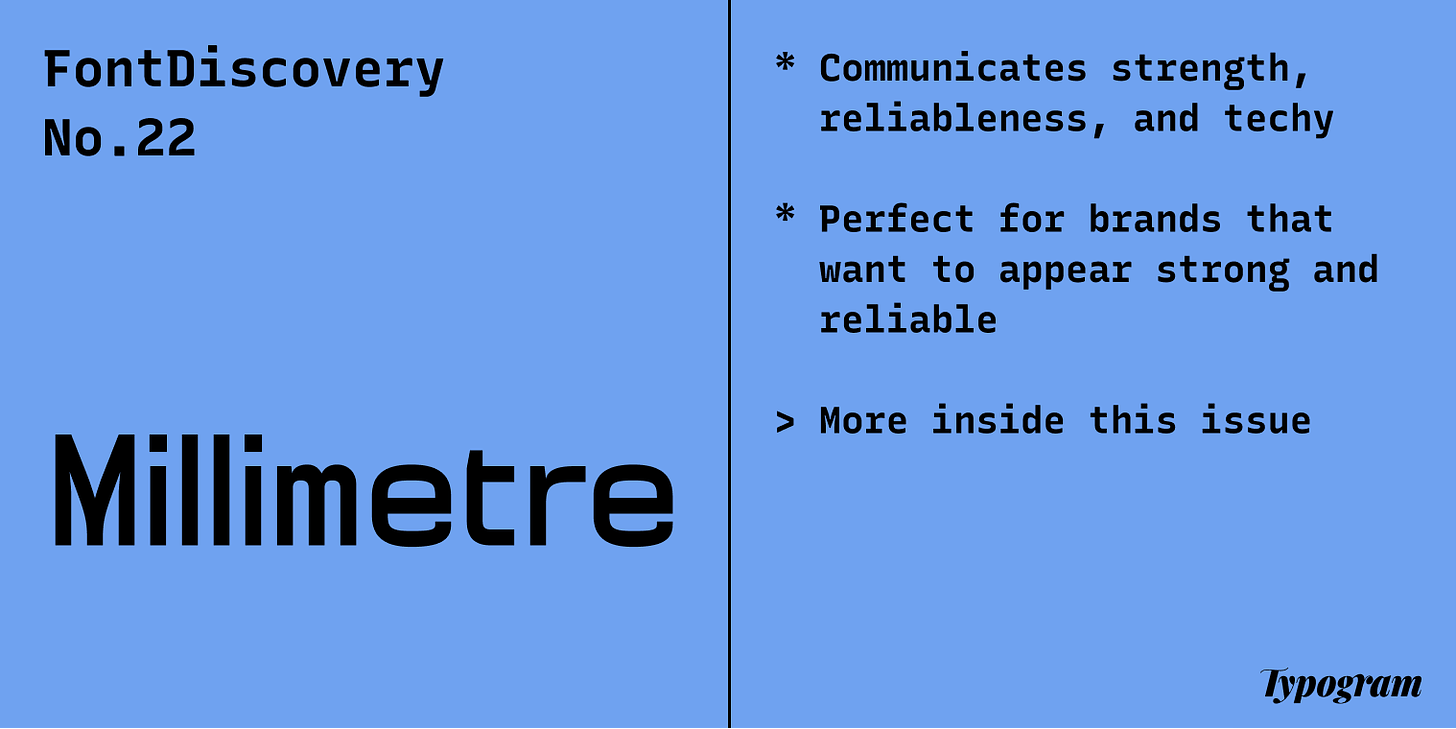
img: sample of Millimetre. Millimetre is named this way because it was constructed based on the meter metric system
Font of the Week
Future Gazing with Millimetre
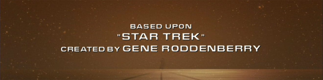
In the 1960s, Aldo Novarese created a font that became an integral part of pop culture. Microgramma and Eurostile dominated Sci-Fi stables like the Star Trek Franchise. Since then, these square-looking geometric sans serifs have defined the way science and technology brands communicate visually.
img: Microgramma or Eurostile Wide (top) and Microgramma(bottom) being used on Star Trek; source: fontshop, reddit
Millimetre is a type of sans serif called geometric sans serif (similar to Jost, which we covered previously). Instead of taking inspiration from calligraphy, geometric sans serifs are derived from geometric shapes with very little contrast in strokes. If we look carefully at Millimetre, we’ll notice the spaces inside the letter are more square than round.
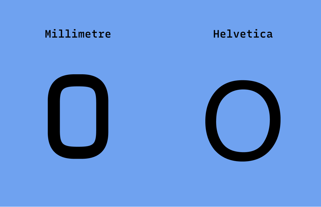
img: Millimetre “O” compare to Helvetica “O”. Millimetre is a lot more square in shape
This rectangular trait adds extra strength visually to the normally round, soft shapes. It communicates the retro-futuristic, technological, and Sci-Fi vibes pre-established by its ancestors like Microgramma. Sci-Fi, tech, and hardware brands love these square-shaped fonts because of these extra doses of stability and strength.
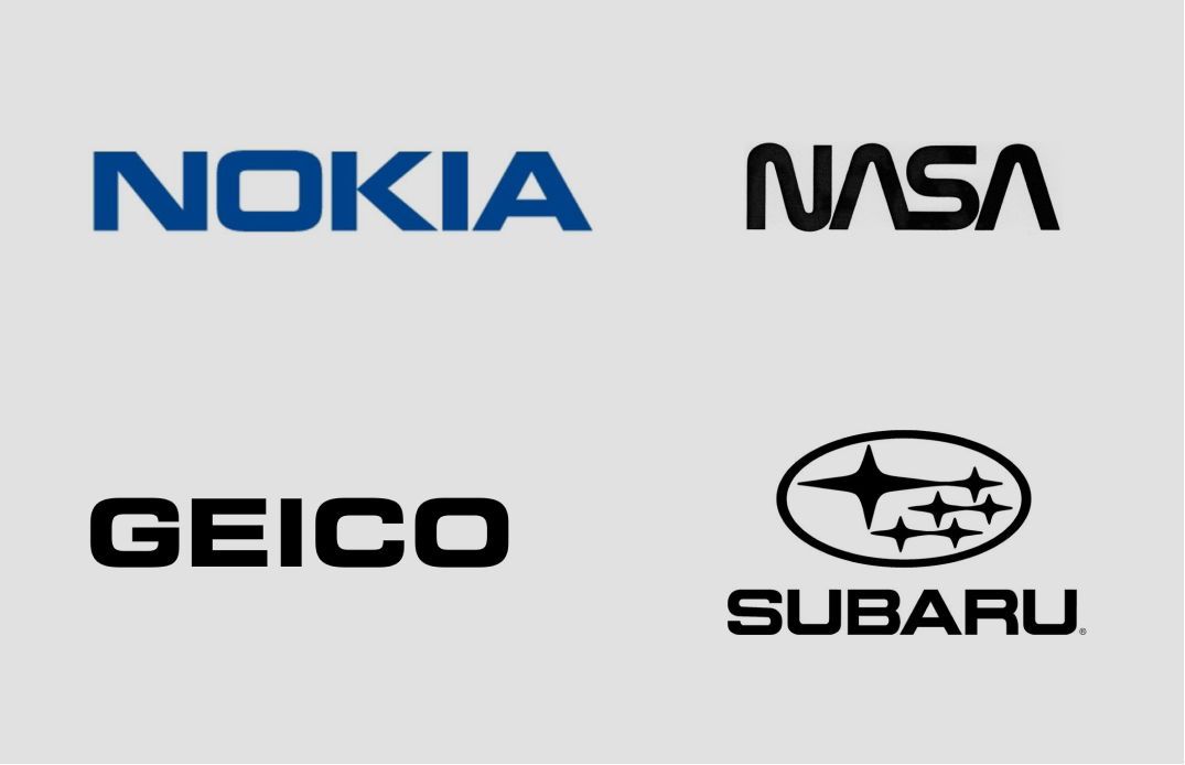
{img: companies that use square-looking geometric sans serif as part of their branding.}
Font Details
- Four weights, no italic styles
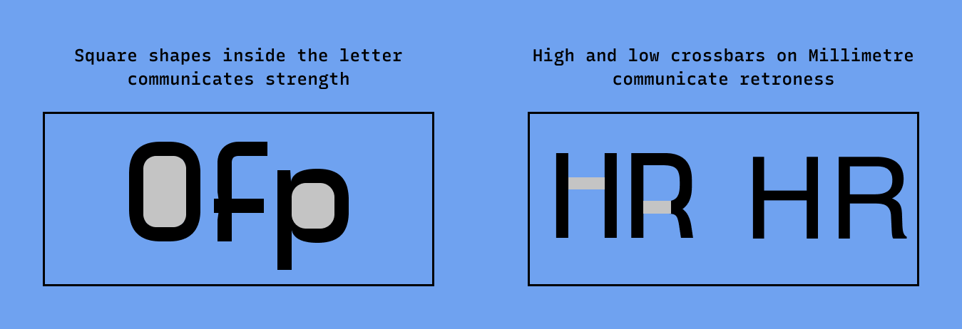
- Square shapes inside the letter communicate strength
- High and low crossbars on capital letters in light and regular weight communicate retro
General Usage Tips
- Add extra letter spacing if using the bold version
- Avoid: using this font for body size text. It is not optimized for small sizes
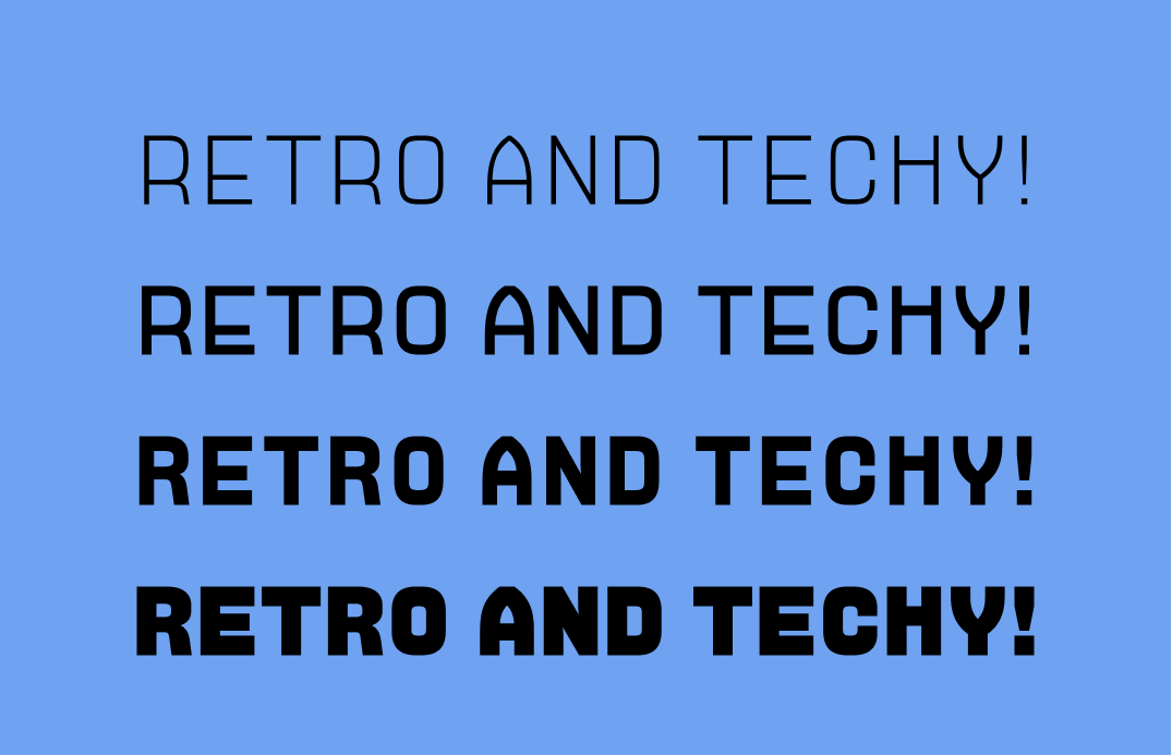
img: top–details of the font showing square shape and crossbars; bottom–various weights of Millimetre
Specific Usage Tips
How to use it for logos?
- Communicates strength, reliableness, techy, and retro-future
- Bold is more suited for logos because you can read each letter once the logo is scaled down, whereas extra bold can break down
How to use it for marketing?
- The shapes of letters of this font vary with different weights. Regular and light communicates retro more than the bold and extra bold
- You can choose to communicate retro with regular and light, communicate strength and sci-fi with bold and extra bold
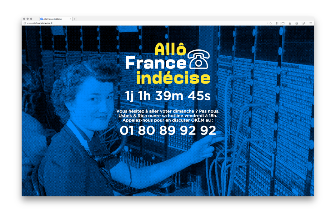
img: top–Millimetre used for election event, bottom–Millimetre used for digital art event poster; source: FontsInUse
Design/Marketing Idea of the Week
Grid as a tool
Modern design can be traced back to a movement called Swiss Style. One of the most vital imprints Swiss Style had left is the idea of using grids to create layouts for cleanness and readability. In design, “form follows function.” Layouts are the perfect example of this: different layouts suit different purposes. A layout that has space for a full-width image is better optimized to showcase your product. Similarly, layouts with multiple columns are probably better for testimonials because it allows you to bring various perspectives together.
Think more about the intent when you are choosing which layout to use for your projects. Are you trying to showcase one specific product, or are you trying to showcase multiple products? For items on the page, what are their relationships with each other and the information presented? Thinking about answers to these questions will help you create a more effective visual experience for your audience.

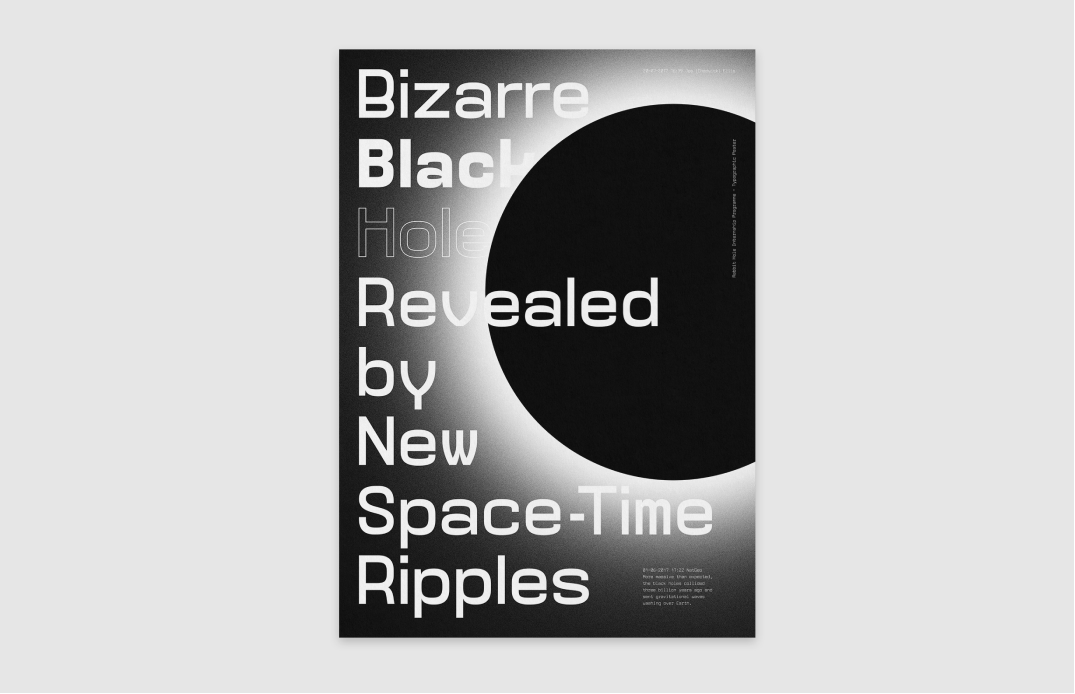
img: grid with a big placeholder for displaying hero image is great for showcasing product
Color Inspiration of the Week
Today we have a beautiful palette from Balangan Beach, Bali, taken by Andrew. Andrew is currently based in Hong Kong and works on a newsletter called Coffeehouse, where he shares nice ambient work tracks. Thank you for your contribution!
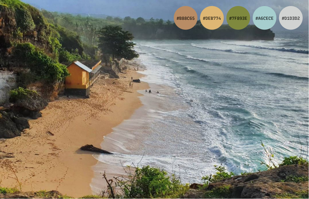
img: Balangan Beach is one of Bali's most scenic spots; source: Andrew.
Creative Prompt
Can you create a visual for Twitter or Instagram using Millimetre, grid technique, or the color palette we featured today?
Thank you
…for reading and hanging out here this week! Millimetre is available here.
img: Millimetre infographic
If you enjoy this series, you can subscribe here:
Have more questions about design and fonts?
Please email me [email protected] or find me on Twitter at @HuaTweets.
You can also read the past issues on Typogram's blog.
