FontDiscovery 27: Communicate Personal and Intimacy
I'm Hua, a designer and bootstrapping founder building Typogram, a brand design tool. As part of running Typogram, I create this digestible weekly guide with fonts, colors, and design ideas to help founders, creators, and makers step up their game in marketing and get creative!
Hi Community 👋
Tomorrow I will send out a survey to get your feedback on improving our content (if you have subscribed to this series). I would appreciate it if you can fill it out!
I also came across a handy free resource for ux design, our little series is featured on there too!
In This issue
- Theme: Intimacy
- Font of the Week: Compagnon
- Design Idea: Photomontage
- Color Inspiration: Mary Cassatt’s Paintings
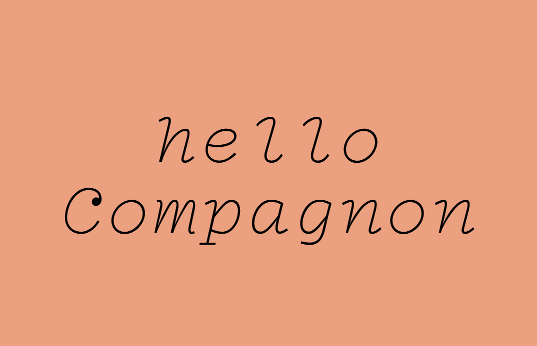
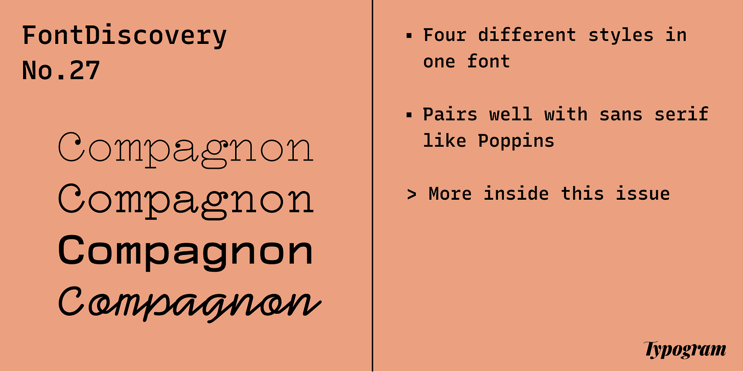
img: samples of Compagnon
Font of the Week
Write with Compagnon
Are you looking to be closer to your audience? Using a typewriter font might be a good solution. Typewriter fonts communicate a sense of openness and, sometimes, intimacy. Compagnon takes inspiration from different typewriters from different eras. It has four weights and one italic. Each weight and style is unique because each was designed based on historical references to different periods in typewriter history.
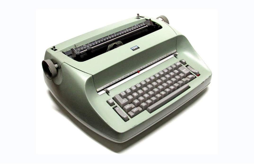
img: IBM Selectric typewriter, one of the most commercially successful typewriters IBM has ever created; source: wikipedia
Font Details
- Each weight and style is different
- Enlarged punctuations
- Ball terminals on Light and Roman versions
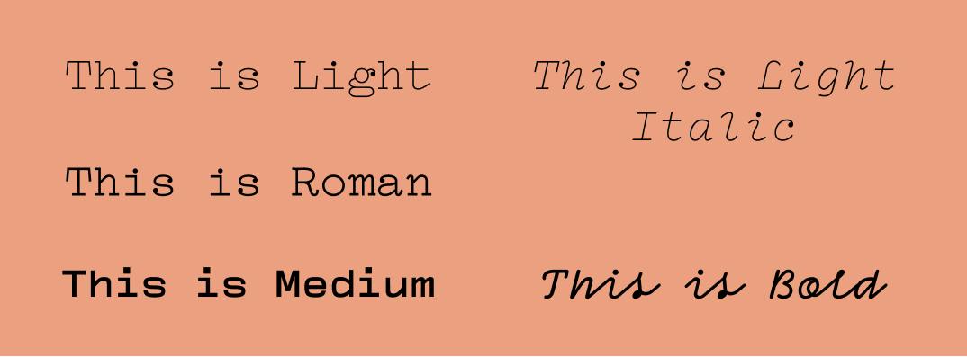
img: different weight of Compagnon
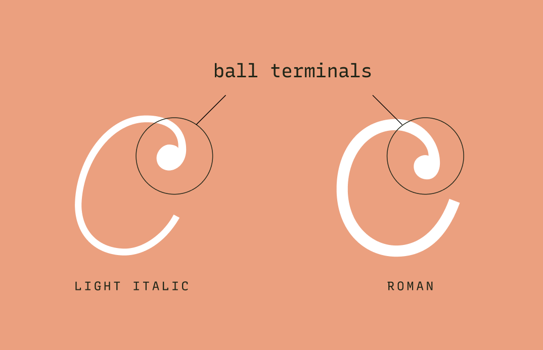
img: graphic showing ball terminals of Light and Roman Versions
Would I use this for logos?
Compagnon Roman has a quirky voice that stands out. It communicates cutesy and quirky. Light and Light Italic are thin, so they might break down when used in smaller scales for logos. Bold is the slightly odd one. It has a “handwriting” appearance, communicating more of a whimsical tone.
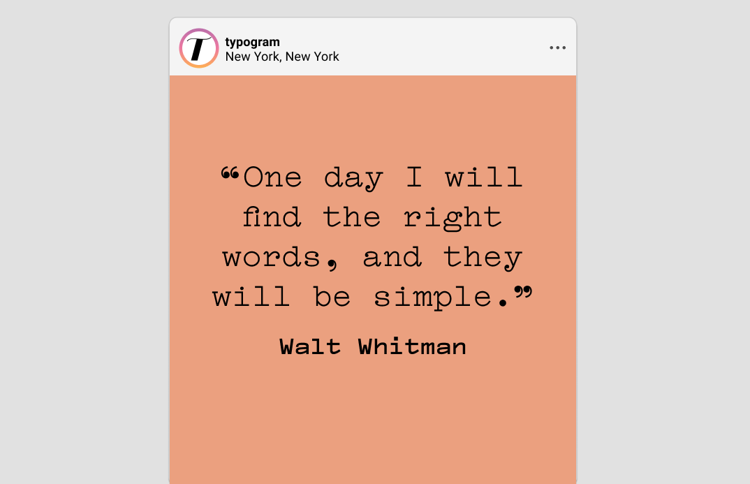
Can I use this for my marketing copy?
The Roman and Medium versions are excellent for short copies in small and large sizes. They both have cute, friendly personalities. Compagnon pairs better with a sans serif, like Space Grotesque or Poppins. Both of these have geometric traits that complement the warmth and friendliness of Compagnon very well. Light, Light Italic, and Bold are not suitable for body copy. They are all too hard to read in small sizes.
img: Poppins and Compagnon make a good pairing. Compagnon light is hardly visible at body copy size
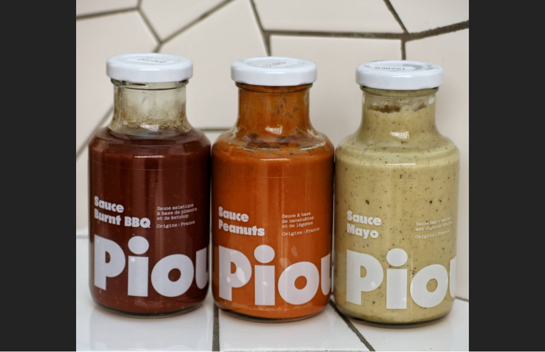
img: top: Compagnon Roman being used as description text on a brochure, bottom: Compagnon being used for sauce packaging. Source: fontsinuse
Design Idea of the Week
Photomontage
Have you ever had the experience of looking at something familiar but... not quite? The content is new, but the familiarity, either in visual or topic, pulls you in. The photomontage technique is an excellent example of this. It is the process and result of making a composite photo (sometimes seamless) by manipulating two or more pictures into a new image.
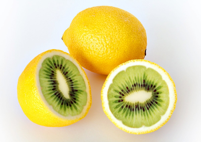
img: photomontage of kiwi and lemon created using image editing software, source: wikipedia.
Color Inspiration of the Week
Mary Cassatt’s Paintings
Here is our weekly inspiration of colors surrounding the theme of intimacy. Mary Cassatt was one of the most prominent women artists during the impressionist movement. She was well-known for painting images of women and children, doing everyday activities, which are unconventional subjects during that era.
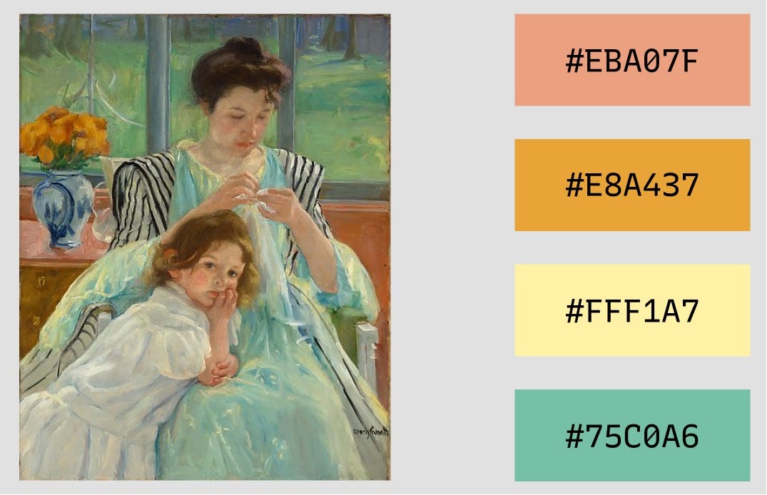
img: One of Mary Cassatt’s paintings; source: metmuseum
Creative Prompt
Can you create a visual or meme for Twitter or Instagram using Compagnon, Photomontage technique, or the color palette we featured today?
Thank you
…for reading and hanging out here this week! Compagnon is available here.
img: infographic of Compagnon
If you enjoy this series, you can subscribe here:
Have more questions about design and fonts?
Please email me [email protected] or find me on Twitter at @HuaTweets.
You can also read the past issues on Typogram's blog.
