FontDiscovery 🖼️ 31: Communicate Weird Side of Tech with Terminal Grotesque
I'm Hua, a designer and bootstrapping founder building Typogram, a brand design tool. As part of running Typogram, I create this digestible weekly guide with fonts, colors, and design ideas to help founders, creators, and makers step up their game in marketing and get creative!
Hello Friends 👋
Welcome to another issue! I hope you had a nice weekend. Today, you’ll notice a new section, Jargon Buster!. I created this section based on your great suggestions from our survey. I will experiment with it in the next couple of weeks. If you have any feedback, I would love to know your thoughts via comments.
Recently, I heard about the controversy surrounding Anthony Bourdain’s documentary. (the short version: the producing company used technology to re-create/fake Bourdain’s voice in the documentary, and some wonder if it’s ethical). So this week, we are going over some design and font elements to communicate the weird side of tech. Maybe it’ll help you catch some extra eyes on what you are working on!
In this issue
- Theme: Weird Side of Tech
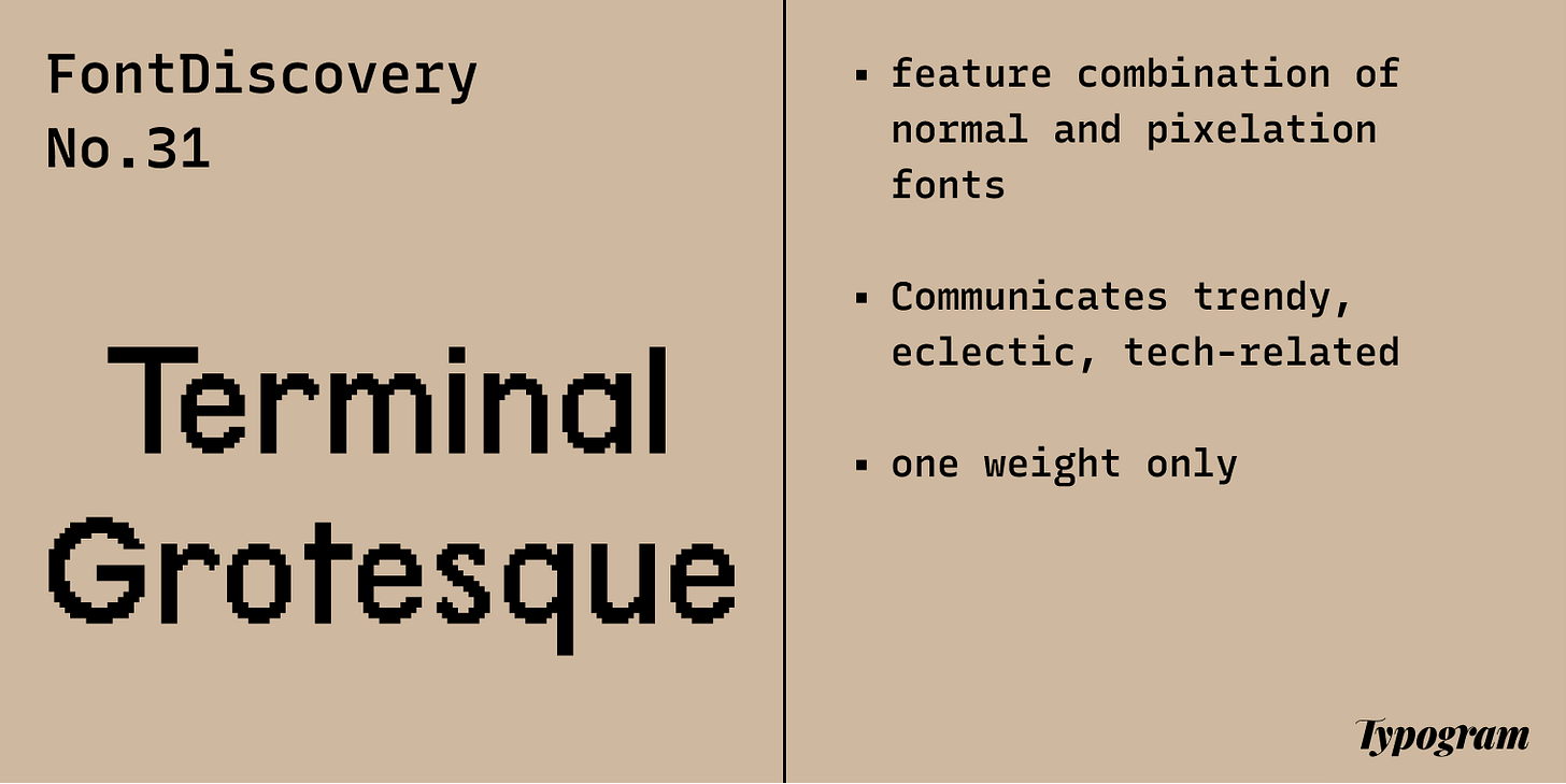
- Fonts: Terminal Grotesque
- Design idea: Know Your Memes
- Color Inspiration: Edward Tufte
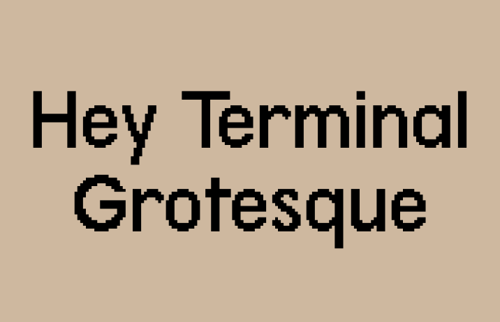
img: samples of Terminal Grotesque
Font of the Week
If Heritage Display is the geeky little brother, Terminal Grotesque is the cool, big sister with a nerdy streak. Continuing on our conversation about 8-bit graphics, Terminal Grotesque brings a nice, updated vibe to this style. If you are looking for something a bit new and weird, Terminal Grotesque might be right for you.
Font Details
Terminal Grotesque is a sans serif inspired by Futura (for a quick review about Futura, see Jost issue), which is a font that embraced simplicity, boldness, and geometric shapes. In Terminal Grotesque, the strokes are bold with very little contrast, the curves are exaggerated to emphasize geometric elements. Like Heritage Display, Terminal Grotesque has a pixelated twist. Its character set has normal, pixelated letters, and letters with both normal and pixelated traits.
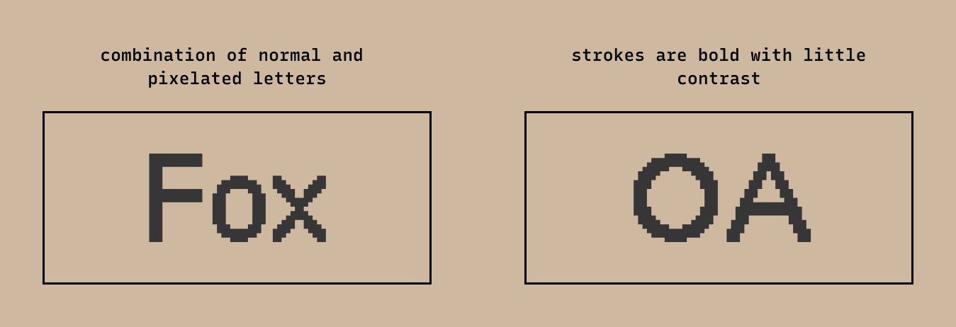
img: font details of Terminal Grotesque showing letter combinations of normal and pixelated letters and geometric details.
How to use Terminal Grotesque for logos?
The eclectic combination of geometric letter shapes and the pixelated effect gives Terminal Grotesque a trendy and edgy vibe. It’s almost like a tech evolution is happening inside this font! It is perfect for tech companies with an unconventional twist or a project about something artsy, creative, and tech-related.
How to use Terminal Grotesque for marketing?
Terminal Grotesque has only one weight. Its pixelation effect creates a vibrating texture that is legible in body text sizes and header. Having only one weight makes it a great candidate for simple projects like marketing graphics. It can pair with Space Grotesque.
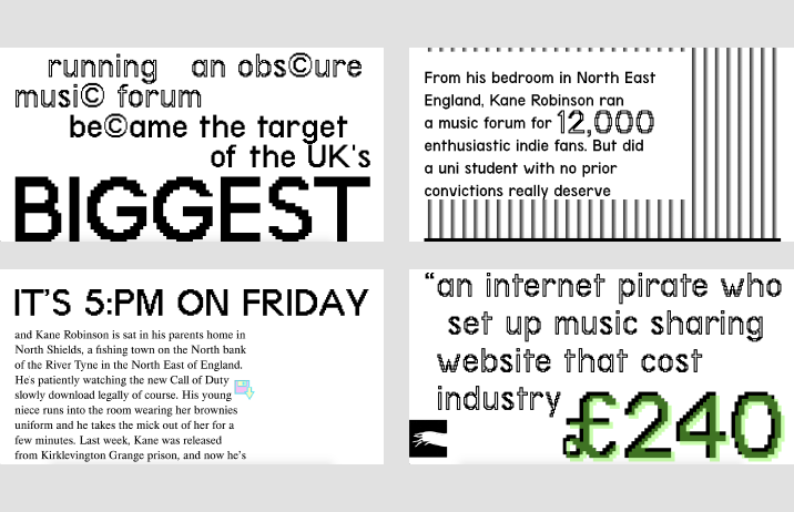
img: Terminal Grotesque being used on a magazine website; source: site
img: Terminal Grotesque pairing with Space Grotesque
Design Idea of the Week
Know Your Memes
Memes are the language of the internet. It is a unit for carrying ideas from person to person through imitable acts with a parodied and mimicked theme.
The history of memes goes way back. Here is the Expectations vs. Reality format joke in the Wisconsin Octopus, published as early as 1919. A different magazine parodied this joke with a similar illustration in 1921. More representations of this joke followed later on, creating a meme phenomenal.
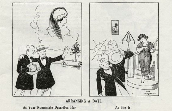
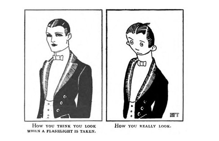
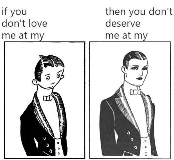
img: top –Wisconsin Octopus magazine, dated as early as 1919; middle–parody by another magazine in 1921; bottom–this joke shared in present-day on Twitter; source: BBC and Twitter, @tina_michelle9
Color Inspiration of the Week
Edward Tufte
Edward Tufte is a leading expert in data visualization. He uses the term data-ink ratio to argue against using excessive decoration in visual displays of quantitative information. He sees colors as ways to avoid information mishaps. In most of his visualizations, you will find subtle and minimal colors.
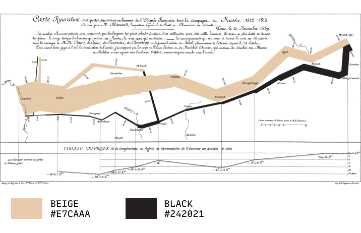
img: Chart created by Charles Joseph Minard, illustrating facts related to the French invasion of Russia in 1812. This is one of Tufte favorite examples of good visualization.
🌱🆕 Jargon Buster!
Typography
Typography is the art of arranging pieces of text via typefaces to make information legible, readable, and pleasing to the eye.
Creative Prompt
What would be your weird side of tech idea? Try creating a diagram and explain how it works.
Thank you!
Thanks for being here for another week. Terminal Grotesque is available here. It is designed by Raphael Bastide.
img: Terminal Grotesque infographic
If you enjoy this series, you can subscribe here:
Have more questions about design and fonts?
Please email me [email protected] or find me on Twitter at @HuaTweets.
You can also read the past issues on Typogram's blog.
