FontDiscovery 🖼️ 39: Get Artsy with Museo Moderno
I'm Hua, a designer and bootstrapping founder building Typogram, a brand design tool. As part of running Typogram, I create this digestible weekly guide with fonts, colors, and design ideas to help founders, creators, and makers step up their game in marketing and get creative!
Hi Everyone 👋
I hope you had a fantastic week — Welcome to issue 39! And a big hug for those of you joining us for the first time.
This week, I was busy packing, and now unpacking, for a move (hence the late sent 😅). It was nice being away from the computer and just focus on two things: getting rid of things or organizing things into boxes. I think I needed this — I feel like I was organizing my thinking at the same time. What’s your favorite way of decluttering your mental space? I would love to hear about it via reply.
Now, let’s dig into this week’s issue!
In This Issue
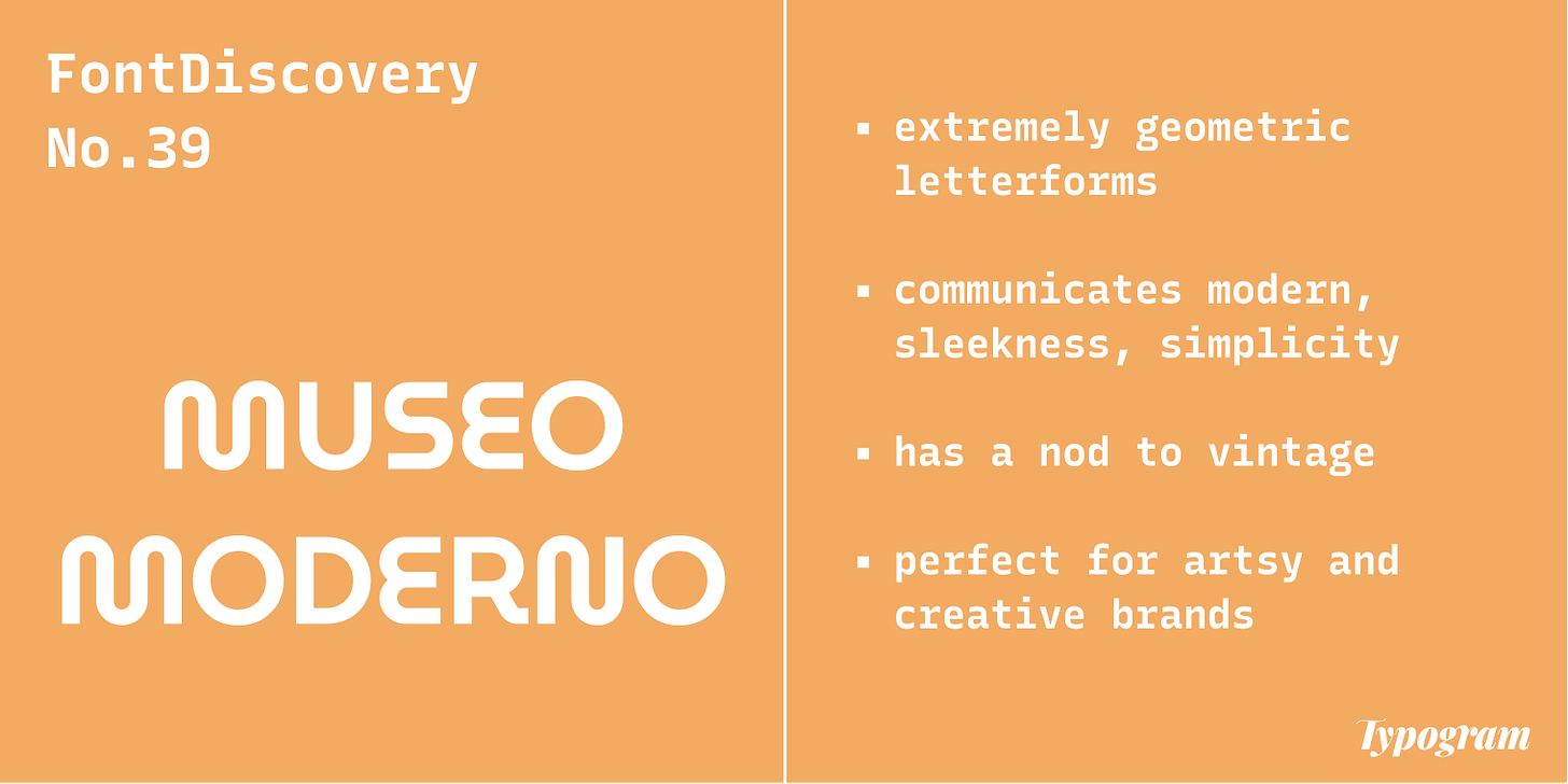
- Theme: Geometric
- Font of the Week: MuseoModerno
- Marketing Idea of the Week: Narrative Marketing
- Color Inspiration: 1968 Mexico Olympics
img: samples of MuseoModerno
Font of the Week
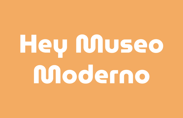
About MuseoModerno
MuseoModerno is a brand font for an art museum that showed Modern European art. The museum showed artworks with modern ideas like abstraction and geometric shapes, and MuseoModerno took these shapes into its DNA. It is now an open-source font completely free for you to use.
MuseoModerno has both simplicity and charisma. When we look at MuseoModerno we are immediately drawn to how geometric it is and appreciate the beauty of the shapes. In addition to the reference to modern art, the letterforms remind us of 70s graphics. Museo Moderno is perfect for an artsy or cultural brand that is slightly vintage. If you are working on projects about lifestyle, art, or architecture, Museo modern is perfect.
img: 70s graphics; source: IDEA Magazine
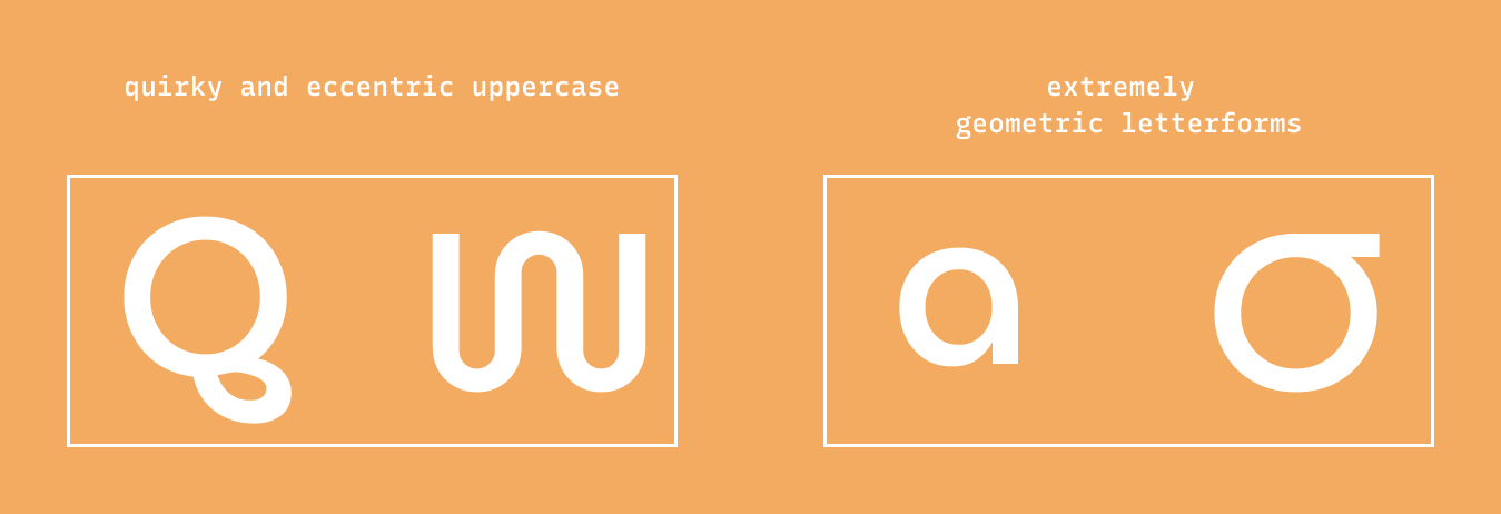
Font Details
- Extremely geometric letterforms.
- The uppercase is very quirky and eccentric.
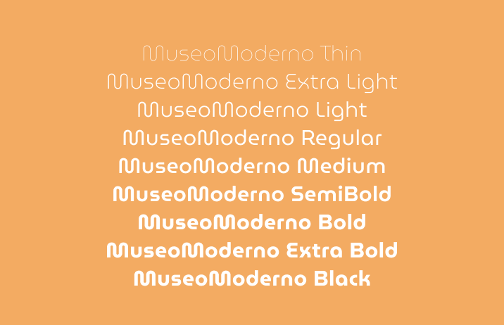
- 9 weights in normal styles
img: font details of MuseoModerno
img: different versions of Museomoderno
How to use it for Logo
This font communicates modern, sleekness, simplicity, with a nod to vintage. It can be good for a niche brand in art, architecture, or a cultural institution. Even though MuseoModerno has used it for its brand font, its quirks can definitely shine in another logo. Many companies use the same logo font while still being distinctive.
How to use it for marketing
MuseoModerno is a very robust font family with eight weights. It is best for use in display sizes, like headers and marketing graphics. Avoid overusing this font, and don't use it for body sizes. Its distinctive shapes create a rhyme that is hard to read for longer pieces of information.
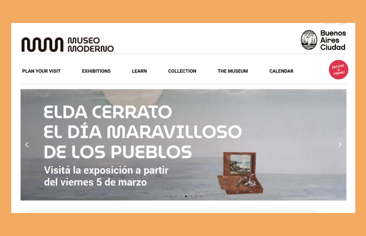
img: Museo Moderno being used for branding in Museo Moderno website; source: museo moderno museum website
Marketing Idea of the Week
Narrative Marketing
Narrative Marketing is a narrative created based on your customers. It focused on their journey, pain points, obstacles they face, and feelings they may have. Narrative-Based Marketing is all about empathizing with your customers by their sides of the story. They are the hero of this story, not the brand or product. It allows your audience to become active listeners since you are sharing their stories. As a result, they pay more attention to what you offer. A good example of a company that does this is Warby Parker in their Wearing Warby series. They created video series about their customers’ lives, paired up with blog post profiles.
Color Idea of the Week
1968 Mexico Olympics
The Olympics was held in Mexico from 12 to 27 October in 1968. The optical style graphics represented elements that embodied sports: speed, movement, and emotion.
Mustard #DDAB4A |Lake Blue #286FA0 | Petal Red #C63E42
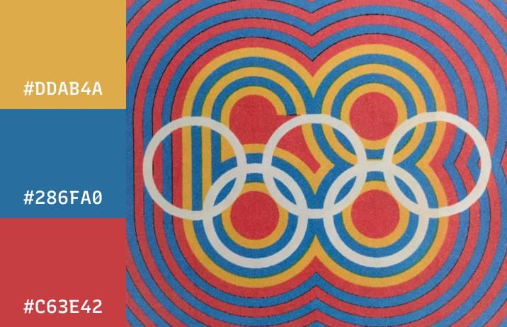
img: Mexico Olympics color pallete
Jargon Buster!
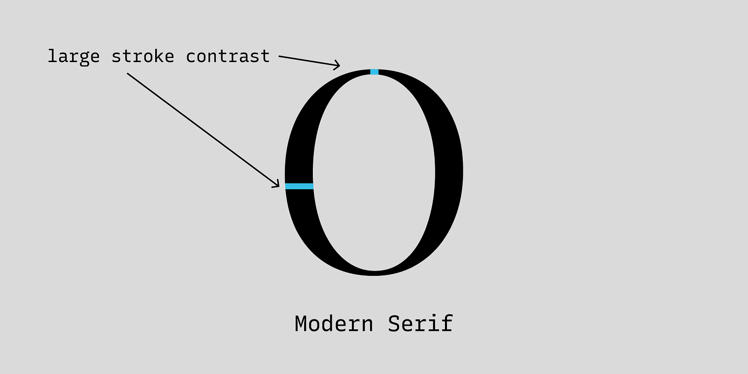
Modern Serif
First Seen: late 18th century
Modern Serifs, also called Didones have the largest contrast in their strokes and vertical stress axis. They are considered modern. You will find many Modern serifs in magazines and editorials.
- Example: Playfair Display
- Stroke Contrast: +++
img: modern serifs have largest stroke contrast
Creative Prompt
Make something with MuseoModerno. If you feel like sharing, I would love to see it!
Thank you!
Thanks for being hanging out here this week. Museomodern is available here and designed by Omnibus-Type.
img: infographic of MuseoModerno
If you enjoy this series, you can subscribe here:
Have more questions about design and fonts?
Please email me [email protected] or find me on Twitter at @HuaTweets.
You can also read the past issues on Typogram's blog.
