FontDiscovery 🖼️ 46: Fonts & Tone: Why is Comic Sans So Controversial
I'm Hua, a designer and bootstrapping founder building Typogram, a brand design tool. As part of running Typogram, I create this digestible weekly guide with fonts, colors, and design ideas to help founders, creators, and makers step up their game in marketing and get creative!
Hi Everyone 👋
Happy Wednesday! How’s your week going so far?
This weekend, my little project indiegrow hit 100 subscribers. In the beginning, I was afraid of running a daily newsletter, but it has been really fun sending it and I have been getting really great feedback. Actually, running a second newsletter is giving me many new ideas about improving FontDisocvery!
Other than that, this weekend I mostly relaxed and stayed away from the computer. How was yours? Write in the comments and let me know what you did!
In this Issue
- Theme: Fonts & Tone
- Font of the Week: Shadows Into Light Two
- Design Idea of the Week: Catch up on Metaverse
- Color Inspiration: Greater Barrier Reef, Australia
img: sample of Shadows Into Light Two
Font of the Week
Shadows Into Light Two
Fonts, Tone, and Intentions
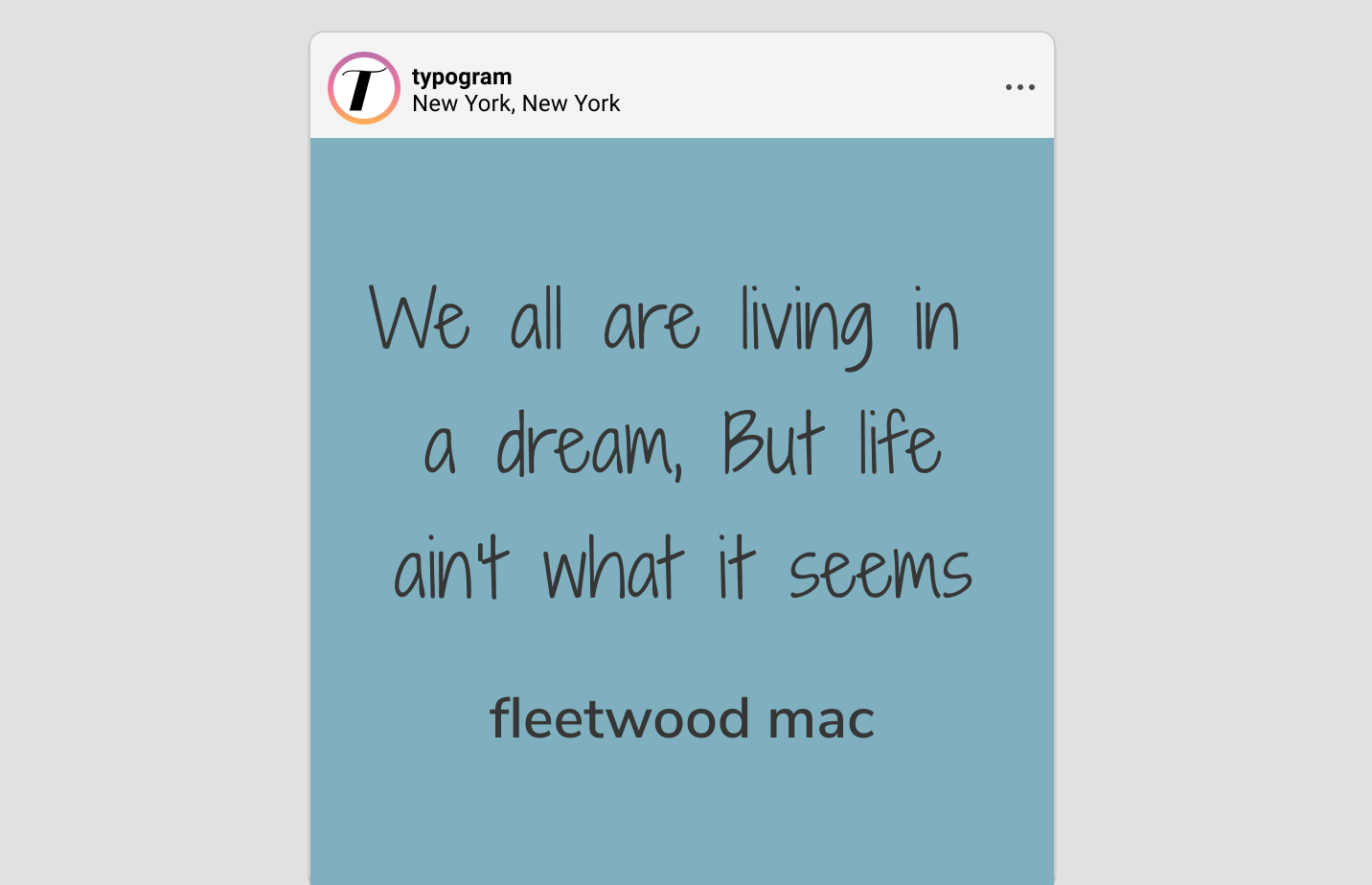
Handwriting fonts are a double edge sword. They are nice because they feel personal, but they are also tricky because each has a unique tone of voice based on their visual characteristics. When you choose a specific (handwriting) font, you have to determine whether that tone is appropriate for what you are trying to convey.
img: comparing tones of different fonts
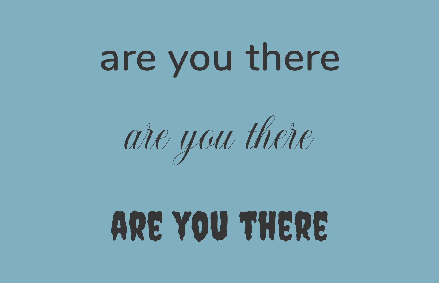
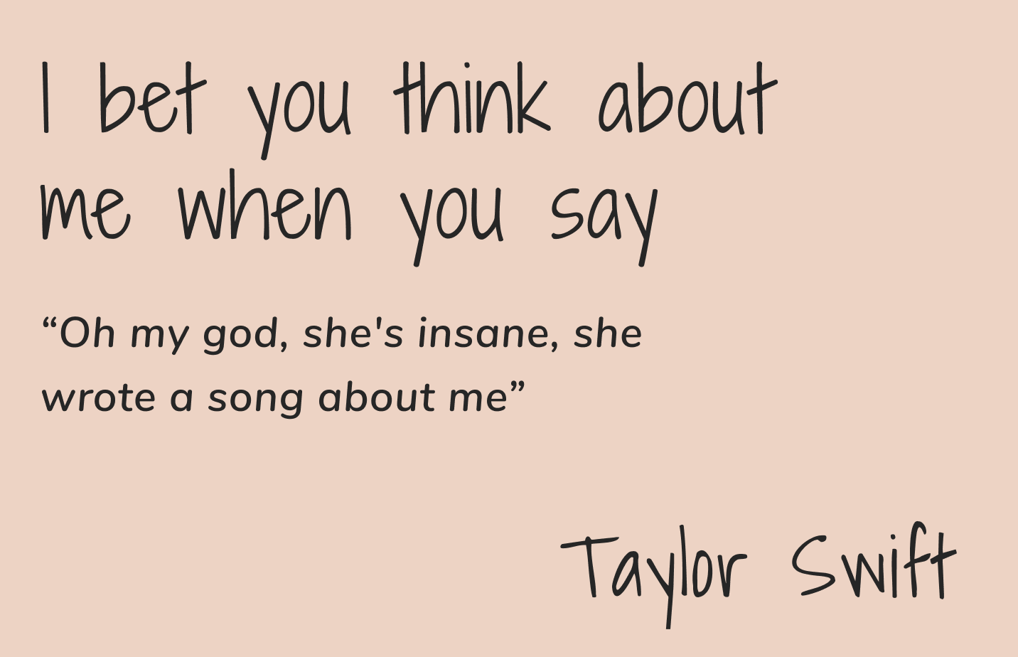
Comic Sans is one of the most well-known examples of font misuse, cultivating jokes and memes into a cult of its own. Born as a font imitating comic books lettering, it has been used repeatedly for situations it was not intended for, like resumes, research papers, and other “serious” things. Just recently, Michael Thomas, an American football player, left this cryptic message on Twitter hinting at a feud with his management. While the message is serious, it’s hard to take it seriously because of the Comic Sans.
img: Comic Sans graphic; source: twitter
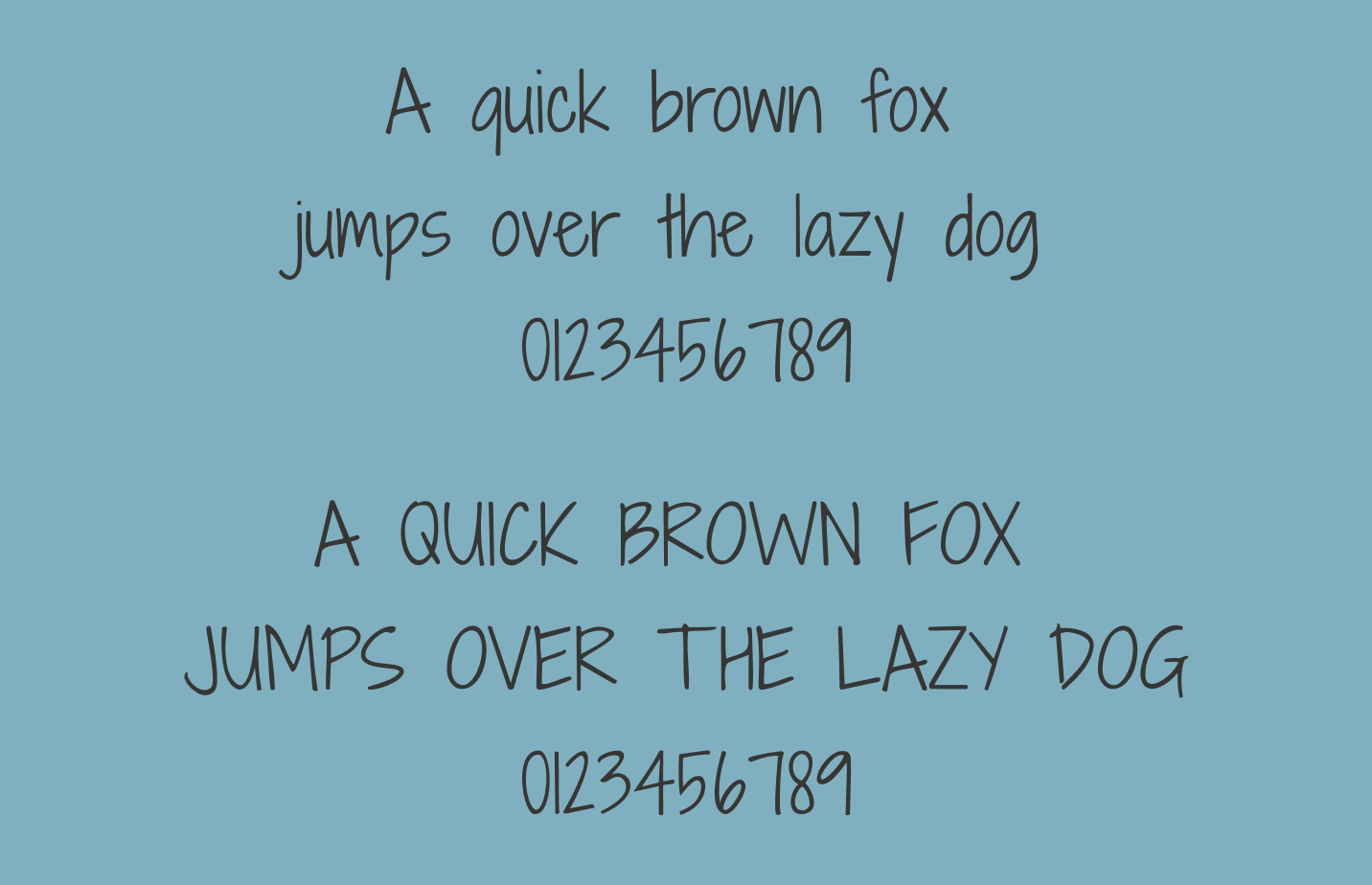
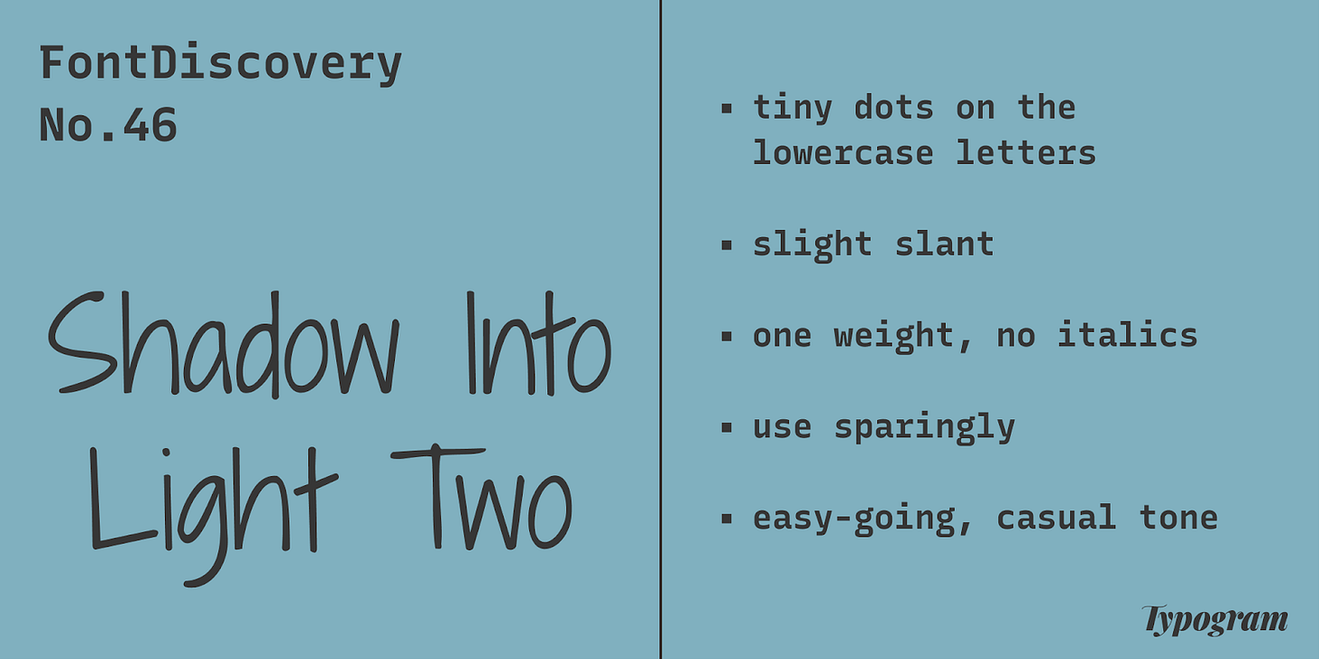
Shadows Into Light Two Overview
Shadows Into Light Two mimics clean and neat handwriting. It feels casual, intimate, and easy-going without too much fuss. Shadows Into the Light Two is the updated version of the original font, Shadows Into the Light. In my opinion, it has better readability for users due to updated spacing.
Font details
- Tiny dots on the lowercase letter “i” and “j”
- Slight slant, especially in uppercase letters
- One weight, no italics
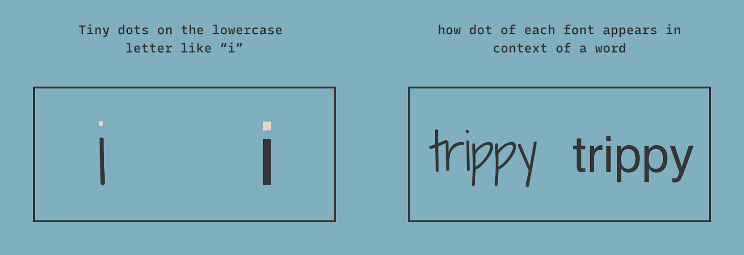
img: font detail, tiny dot
img: slight slant, especially in capital letters
How do I use it for logo?
Shadows Into Light Two is readable and brings an extra personal touch to projects. It has a clean and easy-going tone. I would avoid using this font for projects like journal and research content. Bonus tip: The tiny dots in “i” and “j” break down under small scales, so if your logo contains those two letters, it may be best to enlarge the dots.
How do I use it for marketing and branding?
Shadows into Light Two has only one weight and no italics. It is best to use sparingly to add a personal touch for marketing graphics. It can pair with a sans serif, like Nunito Sans, to showcase its tone. Regular Nunito also works this font perfectly because its rounded cap matches the round tip of Shadows into Light Two nicely. It is not most readable in small sizes. It is not the best for paragraph text.
img: font pairing between Shadows Into Light Two and Nunito
Design Idea of the Week
Catch up on Metaverse
Recently, I have been hearing a lot about Metaverse. This week, I share a couple of articles that helped me understand this concept better. I would love to hear your thoughts on this subject.
Metaverse: A Brief History
This article goes over the history of the Metaverse that ties together technology, video game, and science fiction. I was surprised to learn that Metaverse is actually a concept that goes way back - in fact, the idea and term “metaverse” is first described in Snow Crash, a science fiction novel by Neal Stephenson published in 1992.
Future of Retail? Alibaba’s Metaverse Art Exhibition for China's Black Friday
If you wonder where this Metaverse concept can go right now at its infancy, this retail experience created by E-commerce giant Alibaba could be a hint. For China’s Single Day (a massive shopping event equivalent to Black Friday), Alibaba hosted an art exhibition in TaoBao, produced and curated by its virtual employee (a virtual idol) Ayayi, where you can explore different NFTs created by big brands like Burberry. Is Amazon or Meta (Facebook) the next to do this?
Color Inspiration of the Week
Great Barrier Reef, Australia
This week, enjoy this beautiful image from the Greater Barrier Reef in Australia.
Coral Beige #E3E9F0 | Zesty Orange #F4A052 | Soft Charcoal #363636 | Warm Aqua #80B0BF
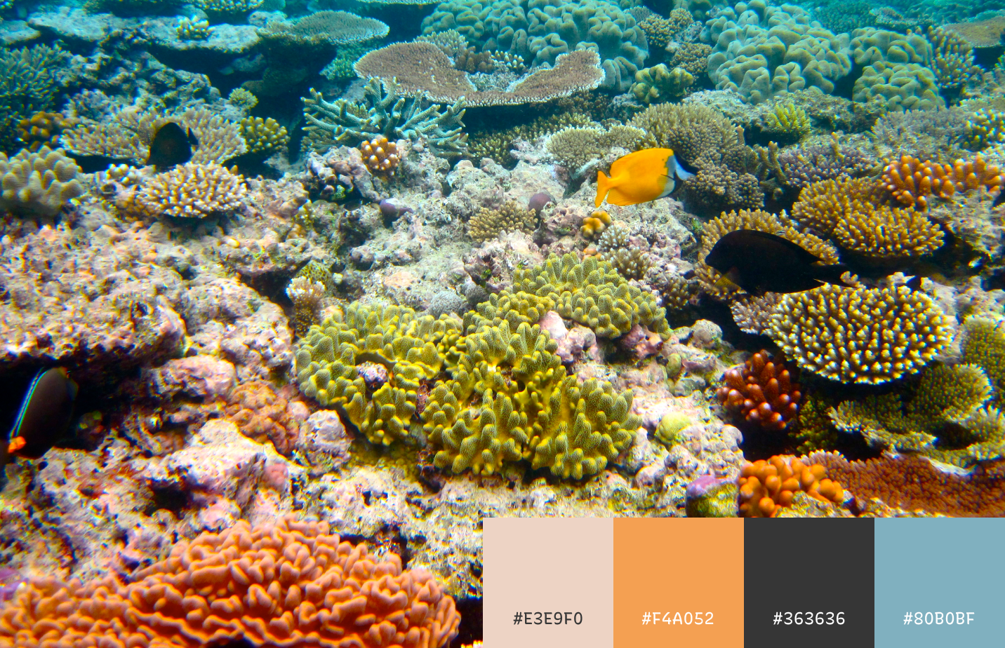
img: Greater Barrier Reef in Australia; source: flickr
Jargon Buster!
Geometric Sans Serif
First seen around 1920s
Geometric sans serif is influenced by geometric shapes, such as circles, rectangles, or triangles. The strokes also have very little contrast. Futura is an example.
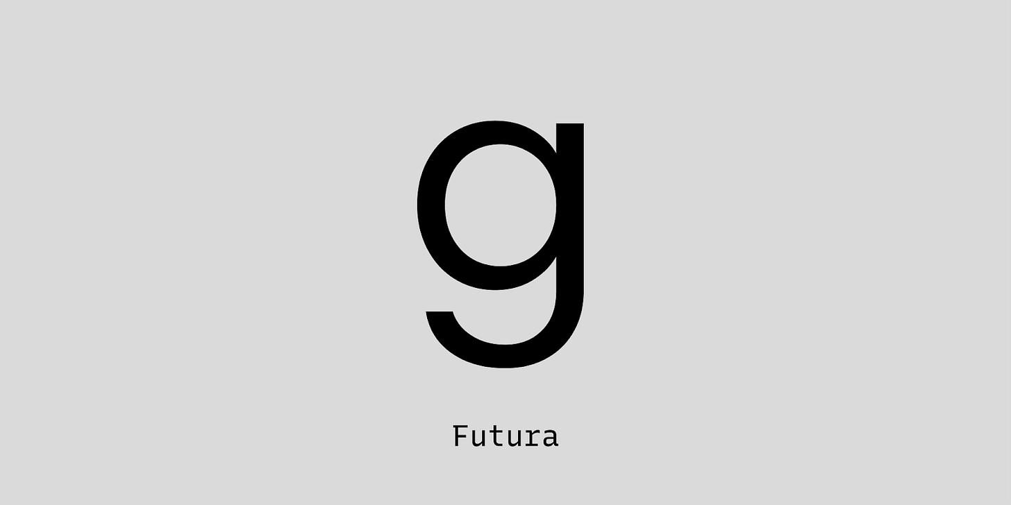
img: Futura is the most well-known example of Geometric sans serif
Creative Prompt
Try creating a social media graphic with Shadows Into Light Two!
Thank You
Thank you for reading this week! You can find Shadows Into Light Two here.
img: infographic for Shadow Into Light Two
If you enjoy this series, you can subscribe here:
Have more questions about design and fonts?
Please email me [email protected] or find me on Twitter at @HuaTweets.
You can also read the past issues on Typogram's blog.
