How to help your customer make a choice on your landing page.
Barry Schwartz in his book Paradox of Choice wrote that there are two kinds of consumers: (a) Satisifiers and (b) Maximisers.
The satisfiers are happy with picking the first thing that helps solve their needs. Maximisers on the other hand, want to find more value for their money. They are more research-oriented an try finding the best deal where they get the most value.
The common thread between both is one of choice.
Both satisfiers and maximisers make a choice as to the product or service they want to avail.
However, sometimes offering your customers that choice is not a good idea. This is because your customers are already bombarded with information wherever they go. They are mentally exhausted and might not want to look at more choices. This is known as "choice overload".
The more choices your present you customers, the more time and effort is needed on their end to understand these choices. This increases your customer's cognitive burden.
Let us see some ways in which you can reduce the "choice overload" for your customers. To do that, we need to reframe the question as "how can I better help my users choose?"
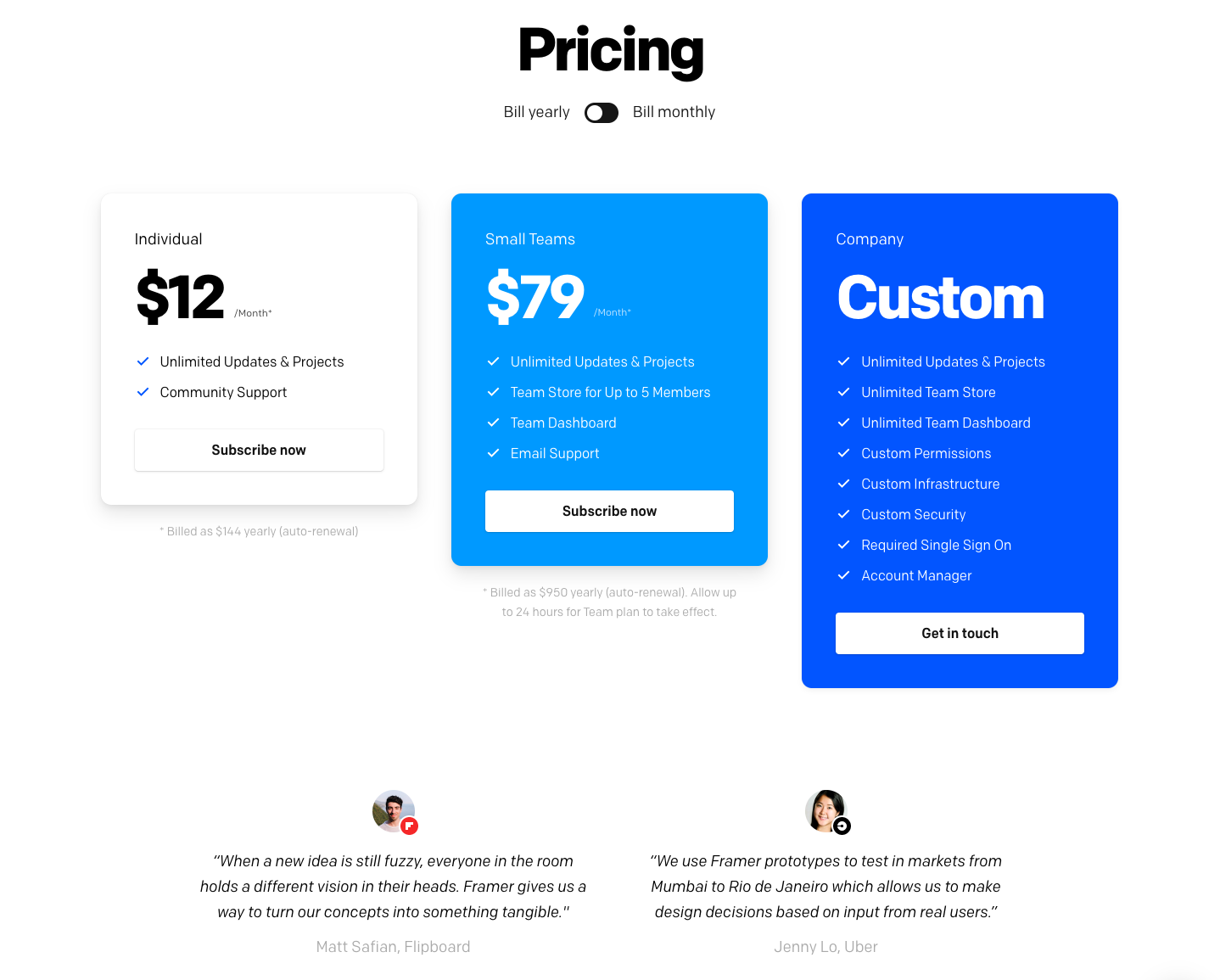
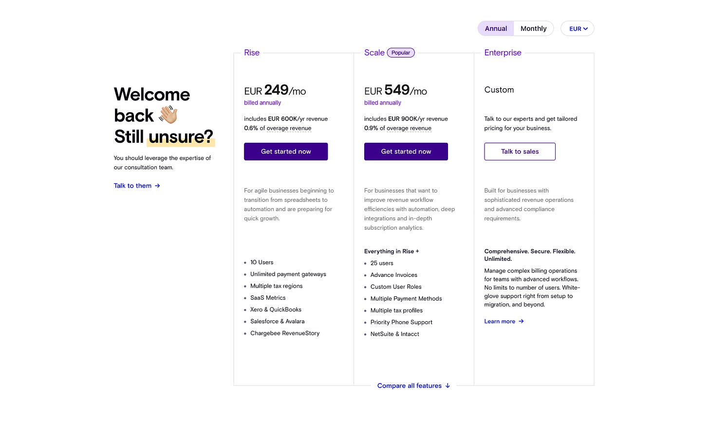
Reduce the number of pricing plans available to no more than 3
Offering a maximum of 3 pricing plans will help your visitors make better decisions and feel less overwhelmed. Research shows that customers make more effective and satisfying decisions when less information is presented or when fewer options are on offer.
Make the CTA say one thing and one thing only
Your users are bombared with choice. Keep things simple and uniform. Deliver one message what do you want them to do. Do you want them to sign up for your newsletter, buy your info product? Whatever it is, make them do that one thing across all your CTA buttons. Make sure to use a uniform color across all your buttons. This will help your customers associate a particular color with taking a particular action.
Help users visualize the after-effecs of your product
Show. Don't tell. When you're using lots of words on your page, sometimes your users might need a break. To do that, a video or a graphic or an interactive illustration might help break the tedium. Make the visual complement the preceding and subsequent copy. Let it tell the same story about your product but in a different way.
Show the features comparison on different tiers
Show how different tiers compare against each other. Make your customer "see" how they would gain by becoming a paid member. A simple comparison table will allow your visitors to see the features that will most benefit them while elimniating the unnecessary. Make your users feel comfortable and confident by providing a simple and smooth experience.
The Paradox of Choice appears to be a counter-intuitive approach but is one that puts the customer first. Once you understand the consumer decision-making process, you will begin to see that this principle is simple yet powerful.
PS: If you've read this far, consider subscribing to Market Curve - a weekly newsletter on marketing and consumer psychology.
