How To Master Mobile-First Email Design (and Why It’s So Important)
When you craft an email, you want as many people as possible to engage — to open, to click, and even to purchase.
But all of those people are on different devices. Some people view your email on a computer, others on a tablet, and others on a smartphone.
That might not seem like a big deal at first, but it means that each person is having a different experience with your emails based on the device they’re using.
And it’s no secret that user experience is the crown jewel of successful email marketing.
The question, then, is how do you deliver a consistent and compelling experience to all of your subscribers when they’re all on different devices?
The answer is a mobile-first email design.
What is a Mobile-First Email Design?
Mobile-first email design is exactly what it sounds like — it’s designing and structuring your email campaigns for mobile devices first.
This means that if something would show up fine on a desktop device but not on a mobile device, you would use whatever looks best and provides the best user experience on mobile.
This doesn’t mean that your emails should look terrible on desktop or other devices. In fact, with a mobile-first design, an email typically provides excellent experience on all devices.
Because it’s far easier for Email Clients and Internet Service Providers to automatically adapt your mobile-first design email to desktop or tablet than it is to adapt a desktop-first email design to mobile.
But… is mobile-first design really all that important?
Why is Mobile-First Email Design So Important?
According to Litmus’ study of more than one billion monthly email-opens, a whopping 54% of emails were viewed on mobile devices and only 19% were viewed on desktop.
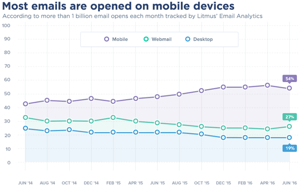
In other words, the vast majority of your subscribers are probably checking their email on their smartphones.
And if you design an email for desktop, there’s no guarantee that the email is going to create a compelling user experience on mobile.
With emails that don’t have a mobile-first design, common problems include…
Buttons that are hard to click.
Text that is hard to read.
Formatting that is too wide.
But… are those things as big of a deal as we’re making them out to be?
To illustrate just how damaging a bad email experience can be, check out some of these stats…
- 52% of people say that having a bad mobile experience makes them less likely to engage with a brand in the future (Source)
- 49% of people feel frustrated when trying to navigate a website that isn’t optimized for mobile devices (this could apply to email just the same) (Source)
- 70% of enterprise CEOs see user experience as a competitive differentiator (Source)
- 53% of consumers feel that brands fail to meet their experience standards (Source)
This means that your audience doesn’t just want a good email experience, they expect it.
And if you don’t deliver, that’s likely going to result in lower open rates, click-through rates, and even conversion rates.
So how do you fix it?
How to Master Mobile-First Email Design (Plus Examples)
Here, we’re going to walk you through five basic steps to make sure that every email you send provides your audience with a compelling experience… on any device.
1. Keep Your Subject Line To 30 Characters Or Less
Since smartphones have much smaller screens than laptops or computers, most apps, and mobile devices only show about 30 characters of a subject line (desktop shows 60 characters).
So the first thing you need to do is make those subject lines short and sweet.
For your reference, this is about what 30 characters look like…
- Want to sign up for my list?
- You can get 20% off ‘til tonight!
- I’m only going to do this once
- Did you forget something?
30 characters are still enough room for you to capture the person’s attention and encourage them to click, but it’s also going to challenge you to be a little more succinct with your subject lines.
You should also consider making full use of your email preheader… the text that shows after the subject line.
If your subject line catches the person’s interest, then they’re probably going to read your preheader before they open.
And if you don’t customize the preheader, then you’ll probably end up with some random and unhelpful text in its place.
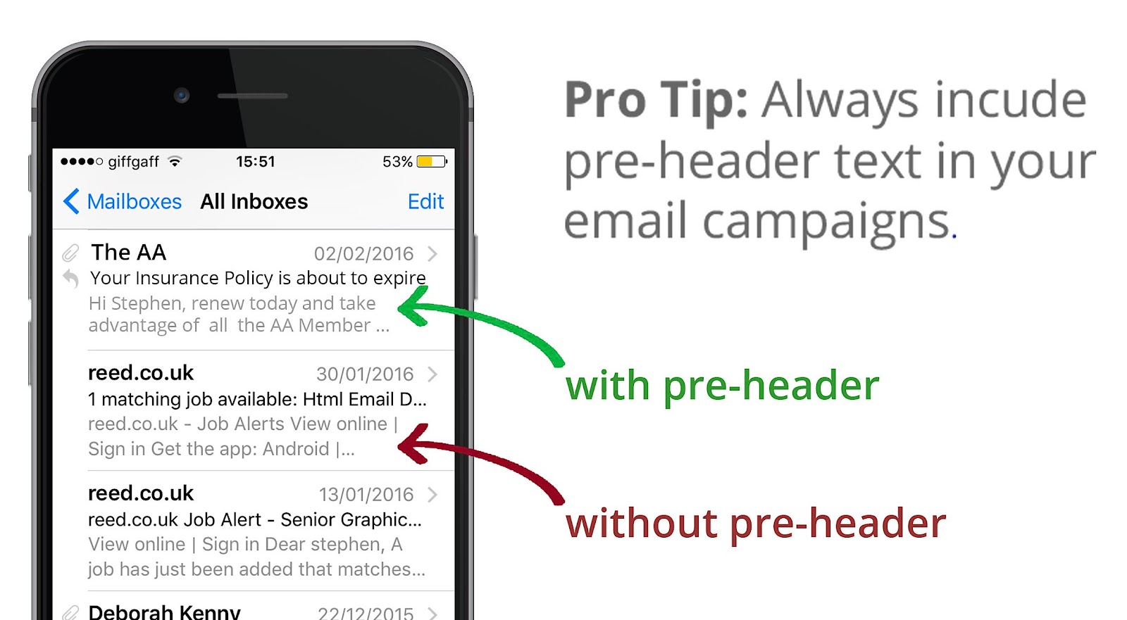
Pretty big difference, huh?
2. Make The Design Feel Like an “App”
When someone opens your email on their phone, that’s when the real test begins.
Is the email too wide for their device?
Is the text easy to read?
Is the call-to-action clear and easy-to-click?
Does the email feel cluttered or clean?
Those are all things you need to consider when designing your mobile-first emails.
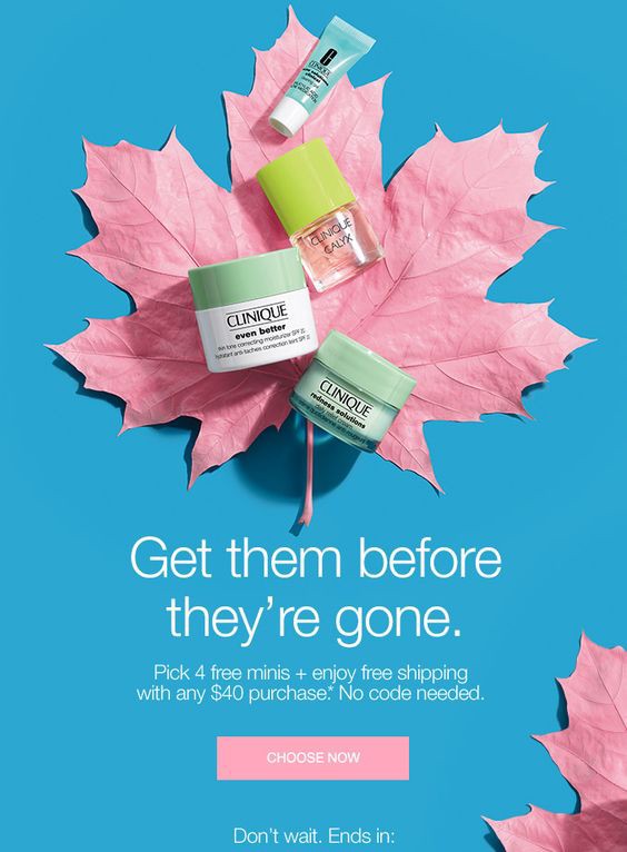
In many ways, your emails should feel kind of like an easy-to-use app. You can take inspiration from this mobile-friendly email from Credit Karma…
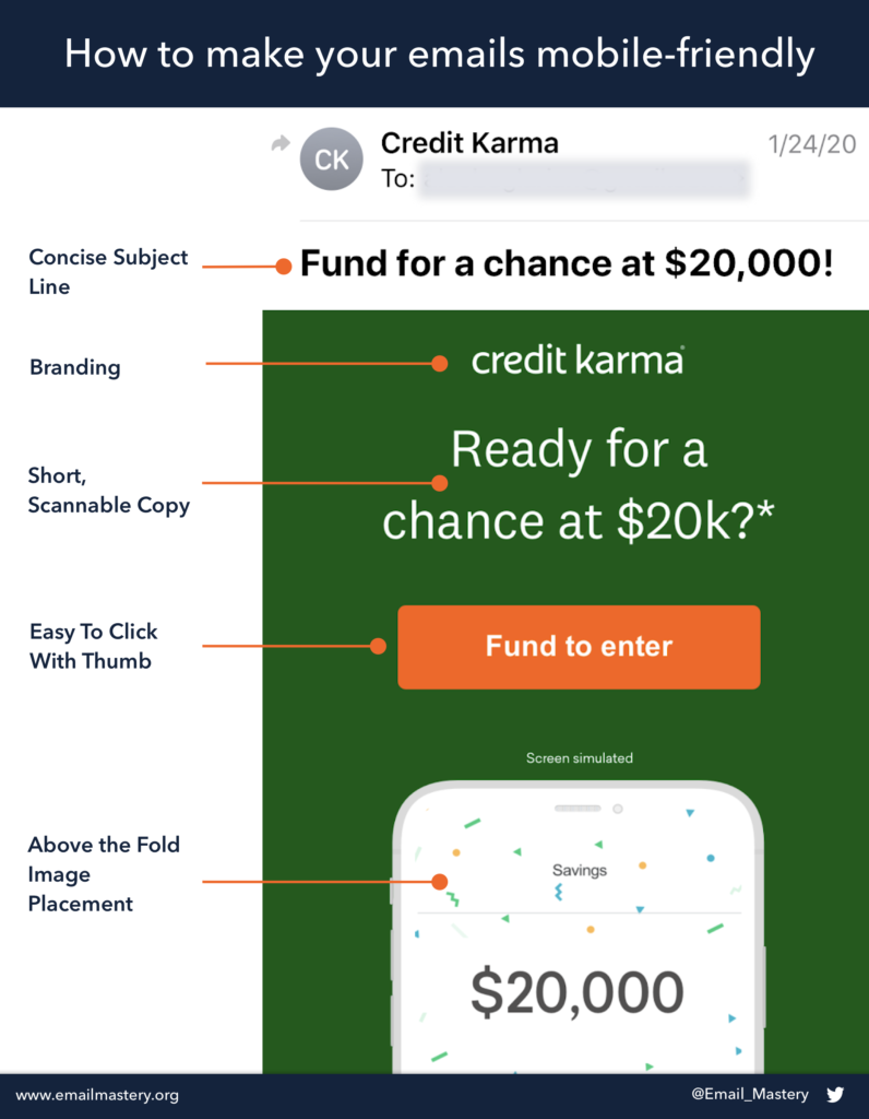
This email has an exceptional mobile-first design. It’s one column. Its width is perfect. The text is easy to read. And the entire email is above-the-fold and easy to click with a thumb.
Here’s another example from Winc…

This email also has all the most important information above-the-fold and the email is small enough that receivers don’t have to scroll too far to get to the bottom.
You don’t necessarily have to follow all of those guidelines with every email, but remember: the easier it is for people to engage, the more likely it is that they will engage.
3. Use Small File Sizes
5G is currently entering the marketplace with surprising speed, but many mobile users still have phones that only support 3G web browsing.
This means that you have to be really careful with the images and files you include within an email — the bigger the file, the slower the email will load.
And just like a slow load time results in more bounces on a website, a slow email will result in fewer clicks and conversions.
Consider these statistics…
47% of consumers expect a web page to load in 2 seconds or less (Source)
A one-second delay in page load speed can result in a 7% decrease in conversions (Source)
And it’s probably safe to assume that those consumer expectations are even more demanding when it comes to email.
Your audience expects near-instantaneous load-speed.
You can decrease the file size by using compression or by changing the DPI of your images.
There are also some turnkey solutions that optimize images for faster delivery and responsive display. These solutions are called content delivery networks (CDNs).
These CDNs essentially host your images across a network of data centers and optimize images by combining three elements: device detection, real-time image optimization, and a cache geographically close to the reader.
Some examples of CDNs are – Google App Engine, Amazon CloudFront, Cloudflare.
4. Always Send a Test Email
This is a simple step but an important one.
Before you launch a new email campaign, you should send a test email to every device (desktop, tablet, and smartphone) to make sure that it’s appearing how you intend it to appear.
You can also use services such as Litmus or Email on Acid to preview your email on multiple devices and email clients.
You can’t really know how an email is going to look until you test it (only place a little bit of trust in most ESPs “preview” features).
And this is a quick way to ensure that you provide your audience with the experience that they deserve.
5. Avoid These 3 Common Mistakes
Lastly, as a few rules of thumb, here are 3 common mobile-first design mistakes that you should try to avoid.
1. Stacked Links — Stacked links happen when you put hyperlinked text right on top of each other or right next to each other. This can make it really hard to click the right link with your thumb. Here’s what that looks like…
So try to space out those links a little bit.
2. Small Font — Everything on mobile will be smaller than it appears on the desktop. That’s why, when you’re designing your email, you should focus on mobile-first and make sure the font and text are easy to read and doesn’t feel too dense.
3. Small CTA — The last thing you want is for people to not click or convert because they can’t hit your CTA with their thumb, get frustrated, and leave. Make sure that the CTA button within your email is easy to see and even easier to click on mobile.

Conclusion
How are you going to make sure that all of your subscribers have a consistent and compelling experience with every email that you send?
The answer is a mobile-first email design.
You now know what that is, why it’s important, and even how to create emails that delight your subscribers.
The rest is up to you!
Let us know your thoughts in the comments section.
