How to use design to make your users happy —Practical guide for non-designers (part 1)

So, how exactly do you design for happiness?
There are a few aspects to this. One important one is avoiding cognitive overload. Which just means “don’t make people think so hard”.
🧠 Avoid Cognitive Overload
The first impressions of your product will be 94% design related.
People have a bias for remembering negative experiences. So if they feel sleaze or heaviness from the start of their journey through your product, then that’s the anchor you’ll have to fight against for the rest of it.
Hick’s law states that the more complexity and options you present your users with, the longer it’ll take them to reach a decision. It’s common sense, but often neglected in an effort to add “more” to a product. People aren’t obligated to stick with your product. Give them too much work, then they’ll spend their time elsewhere.
Whether it’s your website’s landing page or your app’s sign up page here’s what you need to do:
-
At the start, keep content light, concisely display your product’s usefulness, and welcome the visitor to explore more.
-
Use whitespace to avoid visual clutter—allow your product to breathe. Let the user consume at their own pace.
-
No irrelevant info —it competes with important information and diminishes its visibility.
-
Have less important information? Put it in the middle. Most important stuff at the start and end. And if the user is viewing horizontally, then leftmost and rightmost.
-
Follow design patterns that users are used to. Straying away from conventions, no matter how #creative, worsens your UX. For ex: Moving the logo from top-left to top-center makes it 6x more difficult for users to get back to the homepage of your website.
-
Give hints. Present a sneak peek of what will happen before your user takes a certain action. For ex: Saying “You won’t be charged yet” or “Credit card needed” next to a purchase button.
-
Avoid poor information architecture. This means site maps, navigation, menu items, etc. Make sure info is placed in spots where it makes the most sense. Otherwise, your users won’t easily find what they’re looking for.
-
Offload tasks from users. Look for where you can use alternatives to making your user have to use mental effort. For ex: show a picture, re-display previously entered information, set a smart default, etc.
-
Recognition over recall. Minimize the user’s need to memorize to basically 0. Necessary info, like instructions, should visible and easily retrievable when appropriate.
-
Progressive Disclosure. Break down any complexity into lightweight, consumable chunks. Webflow does this very well with their 2 min-witty tutorial videos. At first glance, Webflow can feel like being at the helm of a NASA space shuttle but their “learning at the right time” approach helps alleviate that pain.
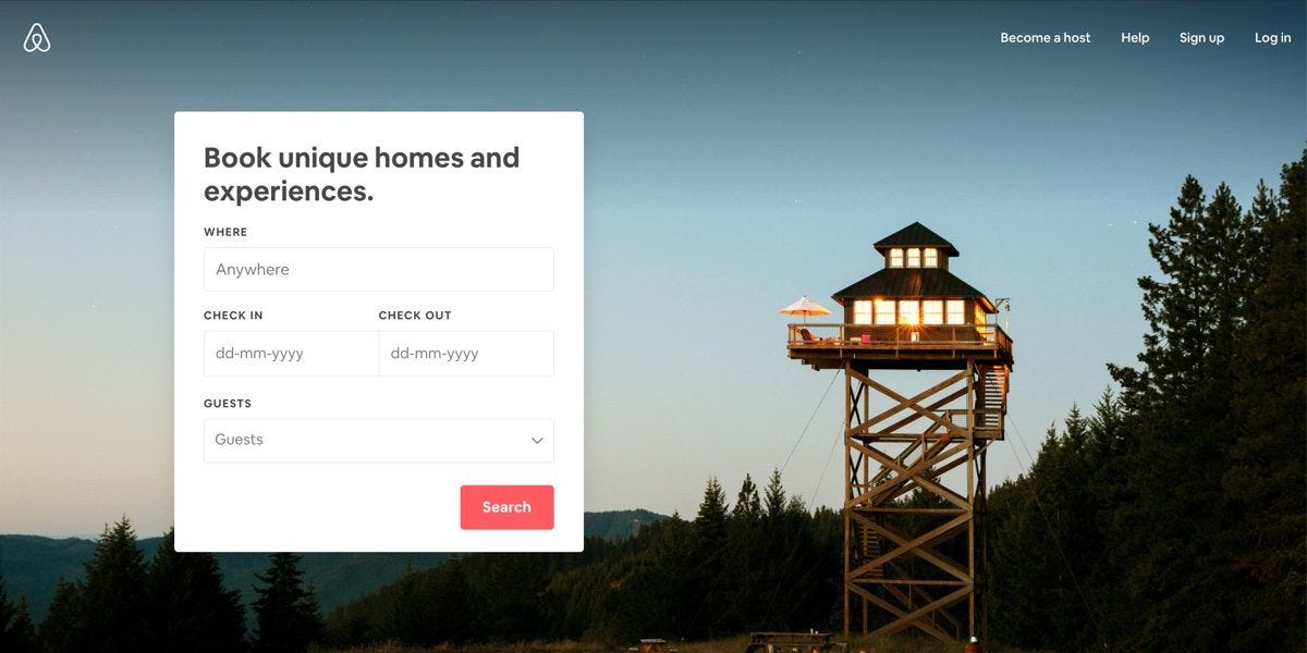
AirBnb’s website is a supreme example of avoiding cognitive overload. See for yourself.
Any tips you think I'm be missing? Let me know in the comments.
This post is from my product newsletter.
If you liked it, then you can subscribe here
Thanks for reading,
Anthony

Thanks so much for sharing this. I just realized something I regularly Google and try to read up on. I'd love your thoughts on UI/UX for data intensive and/or complex apps.
For example, you used AirBnB as an example above, that's a relatively simple action; search for a place to stay. Gmail on the other hand is data intensive and complex so they have many, many UI elements.
That’s a good point! I’ll consider that for a future issue