I created a new popup to increase email signups
Hi everyone,
A few days ago, Josh Comeau shared a cool popup he used to increase email signups by 50%.
I built the same popup for my website.

I also created a web app for fun so anyone can use it to create the same popup for his website to test it and see if it really increases the signups.
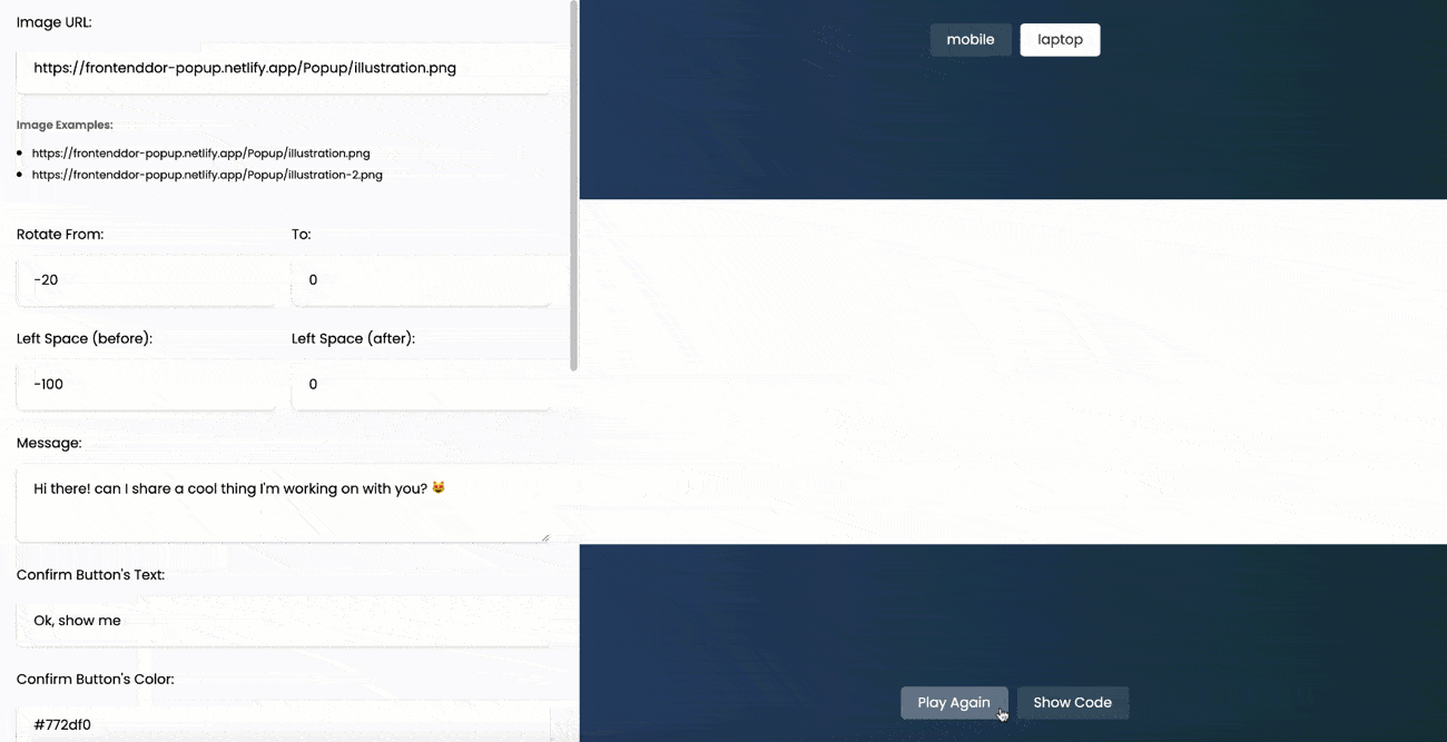
Here it is: https://frontendor.com/magic-popup/
Please let me know if you have any suggestions.
Thank you!
Trending on Indie Hackers

This is brilliant! And made me laugh.
Also gave me a bit of a Microsoft "Clippy" vibe... probably a bad thing for anyone who had to endure Clippy... but Gen Z won't have that baggage. lol
lol. so fun.
Nice :)
One question: does it pop up from the left side of the screen only ?
If so then you might want to consider switching the position of yes and no answer buttons (currently, left to right: yes - no; could be: no - yes) so that a "yes" is on average closer to the mouse position when the popup appears.
Of course this would only apply to desktop user experiences.
Also, don't write the "Yesss!" button text in red-ish color as red is cognitively associated to dismiss of popups/windows - ... or was it intentional ? ;-)
These ideas are worth an A/B test...
Exactly!
I'll make sure to fix the position of the "Yess" and its color now, but I'll make it easy to change the position to the right, top, or bottom in the future.
All that I want now is to test it and see if it really does increase the conversion rate. My blog is new with tens of visitors only, that's why I need others to test it for me.
This seems pretty cool. Signed up! I'm going to use it for typedream.com!
Nice product! I like the idea. I wish you success!