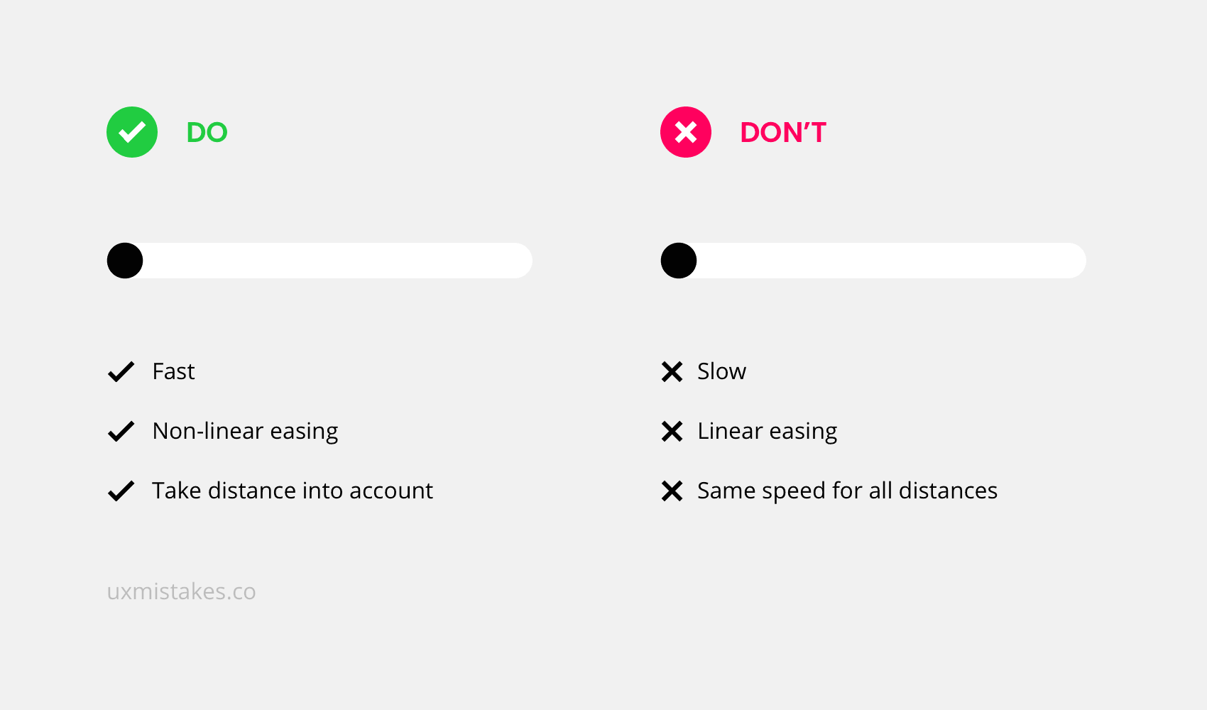
UX mistake #4: Slow Animations
Animations in user interfaces can have an explanatory role and help understand the relationship of interactive elements. But many animations are timed very poorly – most animations are simply too slow.
Take this action
Make sure your animations are snappy. As a rule of thumb: cut the duration of your animations in half until it feels too fast. Then go one step back. In addition, don’t use linear easing and make sure to take the travel distance into account.
Was this helpful? Something to add? Give it an upvote.
👉 Subscribe to the UX mistakes newsletter
Trending on Indie Hackers

Some great tips Jonas! It's been on my to-do list to update our animated GIFs on the OpinionX homepage for too long, better bump it up to this week's priority.
I'll take this one step further... I really hate unnecessary animations.
Would you hate them if they were very fast as well?
I think animations are good if they serve a purpose (e.g. a sidebar menu sliding in).
Your example above is fine too, it looks and acts like a real slider.
Sometimes I feel like designers add animations because they look cool but they don't add any value to the actual understanding of the UI, and that annoys me (though maybe that's just personal preference.)
For example, I hate it when web pages fade-in or slide-in content as you scroll down the page. That's so unnecessary and annoying and actually impedes my reading of the page.
Agree.