What's a good UX for table filtering?

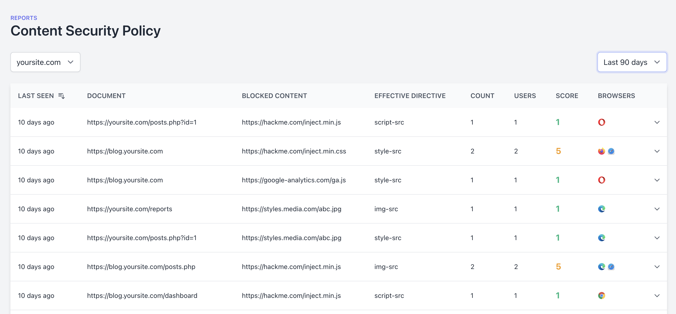
I have quite a few data tables on my web app (like the one attached) and because it can contain a couple thousand rows, I want to have an option to filter down that data. I've seen SO MANY options that I'm not sure where to go next.
What I've seen so far:
- A filter button beside the header name that pops a context menu.
- Good: doesn't take much space
- Bad: I already have a filter icon and it's not easy to identify what filter was applied unless you click on it again
- A filter row just below the header.
- Good: easy to spot what filters have been applied and easy to implement
- Bad: It can look like just another data row and adds restrictions as to a single filter per column
- An independent panel above the table
- Good: easy to implement, flexible, can be collapsed/expanded
- Bad: It's outside the context of the table, would probably end up in a lot of select/input fields. I would probably have to move the date filter into this panel for consistency
- A single "advanced" search field (SQL query builder)
- Good: very very very flexible, people can build OR/AND clauses, use LIKE, great/less than etc.
- Bad: need to be careful with SQL injection, requires SQL knowledge (my audience are developers, but not everyone knows it). It's harder to implement because as it'd required some kind of auto-complete to help people identify column names
Have you implemented something like this? Or maybe you known an app that has nailed this problem? Would love to see some screenshots to give me some ideas.
Thanks!
Trending on Indie Hackers

Build CSV export. Will solve this and many more issues.
Hi Sumbit,
Great points there. I would recommend having like a '+' button to add new conditions to your filter. Benefits:
I hope this has given you some ideas and if not, at least another option out there!
Regards,
Sam
yeah, you're right, I've seen that a few times as well. That's another option for sure, but I still haven't decided which one to go with. I might start simple and improve later.