Redesigned the entire UI in 30 days
by Justin CruzDuring the MVP development of Curate, the foundation of the user experience was creating and frequently iterated on. During this journey there were many pages that were built and thrown away, non-cohesive UX decisions and flows that were introduced which were less than ideal.
After achieving some validation from having paying customers, it was time to invest in that foundation to allow Curate to reach the next level. From the ground up, the entire app experience was updated to make using the app more efficient. It takes inspiration from SEO tools as there is a similar user experience with finding the right hashtags and finding the right keywords. It also has built in help to almost all areas of the app via hovering tooltips to help with on-boarding.
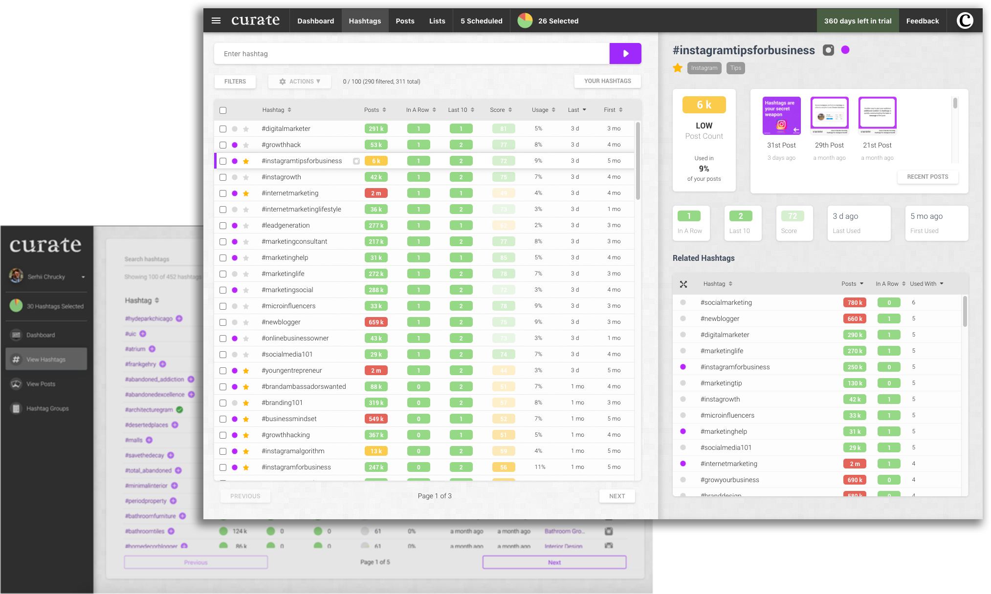
I wanted to limit myself to only take a month to redo it all so I went exactly 30 days between my first commit and my production deployment. The update really solidifies Curate and creates something that is one of a kind.
Let me know what you think!

