
Setproduct
Figma templates and design systems
Because the world requires more clear and reusable UX patterns for mobile & desktop projects

We're already working hard on a completely new Figma design system dedicated to hi-end prototyping for native iOS applications. iOS 13 native components and app templates organized into a Most design system fully compatible with Human Interface guidelines. It's named, constrained and based on native iOS apps experience.
Preview here: https://www.figma.com/file/NAD4rp1MHt5C9x1NYrN0Pe/Most-iOS-Design-System-Preview/duplicate
Pick a license here: https://gum.co/figmaios
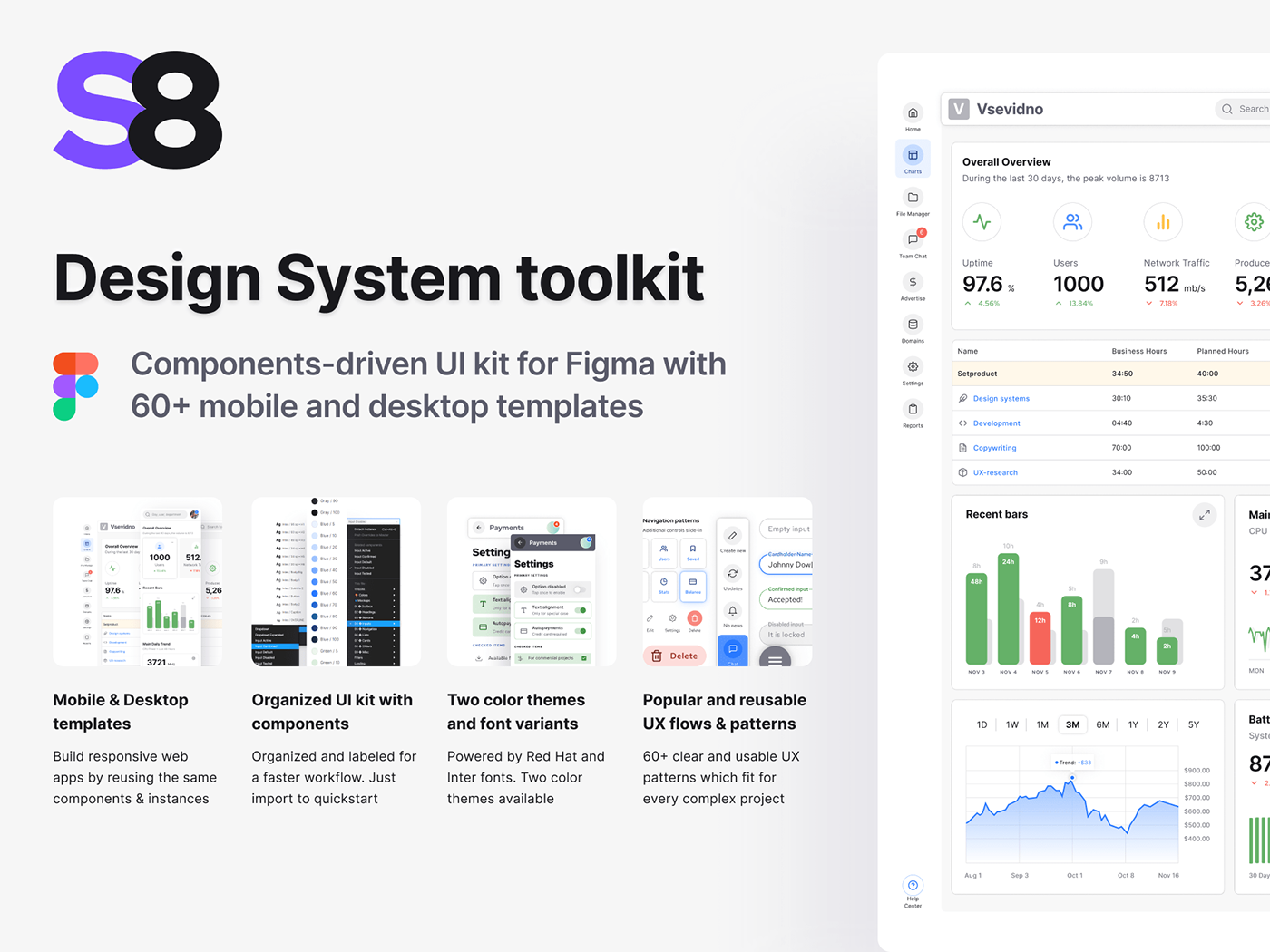
So glad to announce the recent release for S8 Figma UI kit, which was updated with +20 new templates. The components section was expanded to more than 150 components total. Organized, responsive and customizable components-driven library for Figma full of 60+ layouts and popular dashboard patterns. Check out the full presentation https://www.behance.net/gallery/90340831/Figma-UI-kit-Desktop-Mobile-Responsive-Templates
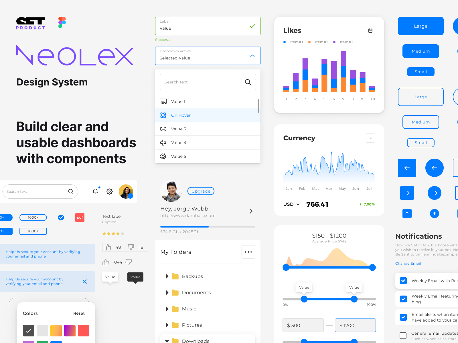
Here's the video presentation for Neolex Design System for
Figma. 2 minutes of fun, timelapse prototyping and styling components without a limit. Take a look! There are 400+ prototyping ready components and 80+ dashboard templates. Mobile and desktop.

Organized and easy-to-use dashboard library for Figma. Made of components & instances. Crafted with attention to naming and constraints. This UI kit allows to build 100% responsive apps by reusing frequent dashboard UX patterns which are included. You will discover an impressive amount of ideas served as Figma templates for mobile & desktop.
https://setproduct.com/neolex
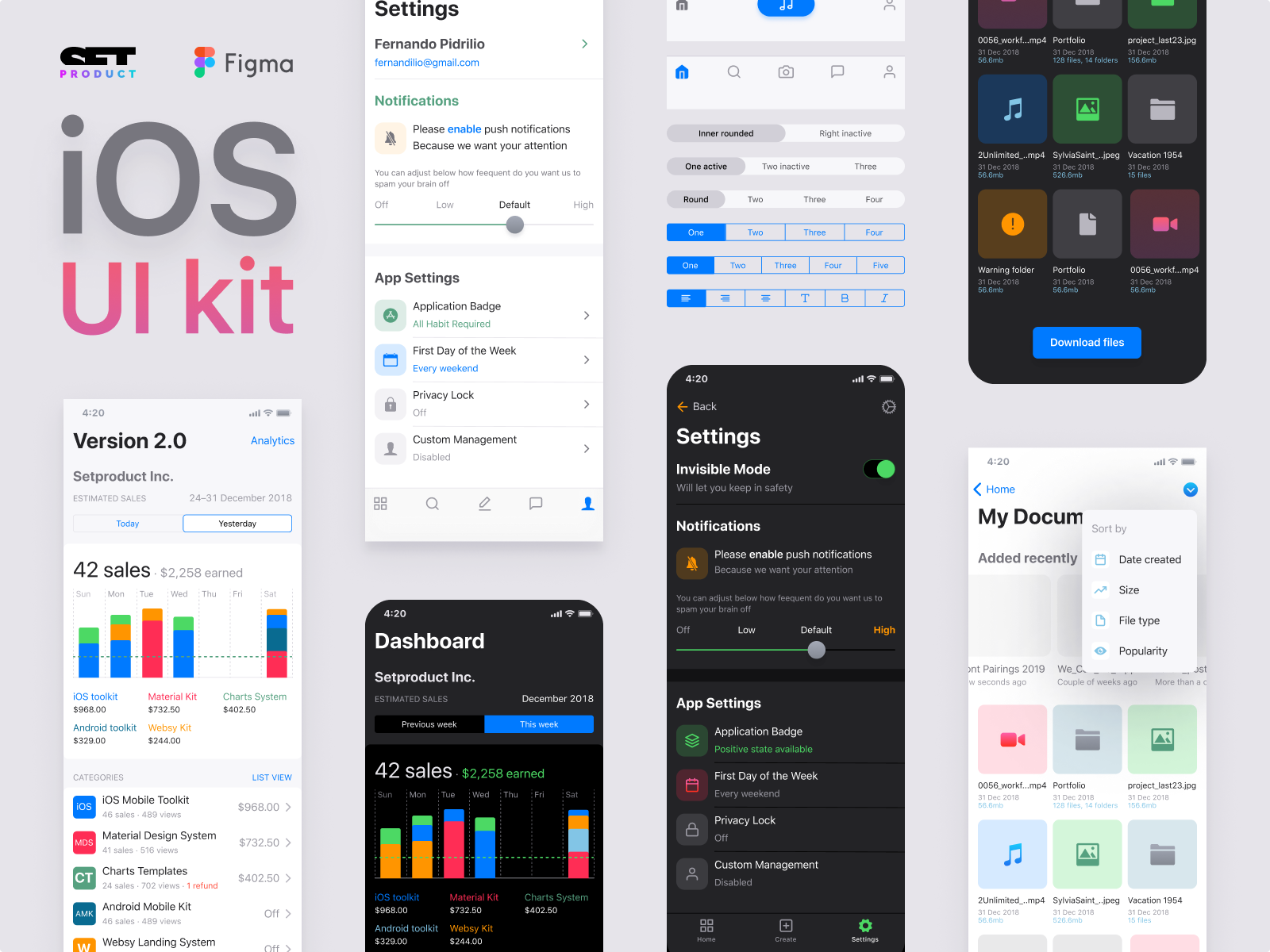
We've just started a new design library based on styled and attentively polished Figma iOS components. Will you pay $12 monthly for a library of 1000+ well-crafted UI elements ready for hi-fi prototyping?
Preview buttons: https://dribbble.com/shots/8559666-iOS-buttons-components-Rounded-Link-and-Pill-Buttons
More info: http://setproduct.com/ios
We've updated our Angular components library and now documentation more useful, clear and easier to get. You can view code snippets for each component, interact with it and toggle styles by switching radio buttons at the right column:
http://material.crionic.net/
Today we've released improved Angular components documentation for Setproduct Design System. A powerful design system where Angular components match with Figma design files. Equip your design team with Figma library, and deploy Angular components for devs. All-in-one solution for speed up the development