It's 2 AM and I just finished redesigning my landing page, what do you think?
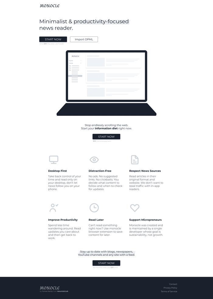
I started from scratch about 6 hours ago... time to sleep now.
Fullscreen image:
https://storage.googleapis.com/indie-hackers.appspot.com/post-images/0caf5a1263/nvBKLr1M8bZRvUW00ZH4b41bSlt2/af5ee36e-c822-c511-ce2f-9177b3c8095e.png

Is it a sketch or are you planning on add colors?
What is the hero, the text with the 2 cta's or that plus the laptop?
If the text and laptop are on hero I would suggest a couple of options:
Put them side by side so they see the laptop and cta's at the same time. I personally would text on the right and laptop on the left.
Laptop on top, pretty big and text with cta's right underneath before the fold so the users sees it all.
My 2 cents..
Edit:
I have here 2 examples that I made, if you want to you can use them, they are made with Bulma.io is just HTML and really little CSS using Bulma's CDN:
https://michael-andreuzza.github.io/Free-Bulma-Templates/templates/product.html
https://michael-andreuzza.github.io/Free-Bulma-Templates/templates/multipurpose.html
Both of them are 100% responsive.
Hope it helps
Looks good. Love the 3 CTA's throughout the page.
I'd also suggest adding some user testimonials if you have access to any. Always a great way to help build social proof for your product.
Looks good. Do you reckon people would pay $29?
It's good!
Thanks!
This comment was deleted 4 years ago