DocTemple redesign
by Jan ŚI finally made the redesign of DocTemple app (after two years)!
I took me a while and also I did the redesign by myself - put the most focus on conveying the value rather than bells and whistles.
Screenshots of:
- before refreshment
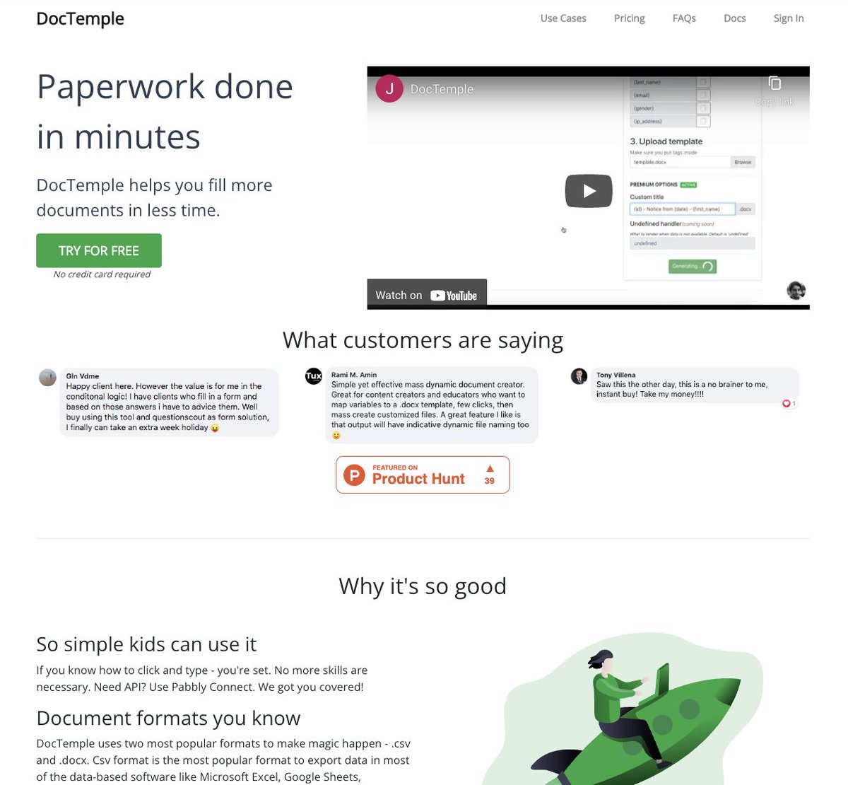
- after refreshment

What was the process?
First, I wanted to convey as clear of a message as possible. I went for straight to the point information what it does and how does it help the client.
That was the main issue I found out through other people (the hard way).
Second issue was it was kinda dull:
- basically one color all around (boring)
- secondary text was same color as main (hierarchy not preserved - eye needs anchor points for easier scanning)
- icons were okay, but I figured more colorful ones made the site more alive
Third issue was less obvious, but given it's all happening on one page: when client was logged in s/he still seen sales copy and pricing.
Redundant. What for?
Now, the first thing remaining after logging in is the tool itself and documentation right beneath.

Now, it makes perfect sense for both types of users:
- non-clients: they see the benefits, pricing, testimonials and documentation (so they know they are not on their own)
- clients: they see what they paid for, helping them focus on getting work done
Whole thing is available now at: https://doctempleapp.com/


-
1
I have some doubts about whether people would really pay for this feature. It seems that there are many free plugins that can achieve the same thing.