Homepage redesigned for simple & self-explanatory
by Kai ChewI wanted a very simple homepage and focus more on the blogs (long posts) and statuses (quick notes of my progresses and learnings).
The website was actually built with Tumblr with a custom bootstrap + materialize template. The customisation is very limited but I will try my best, given how simple to use Tumblr (and Free!), comparing to hosting some complex CMS (Yes, Wordpress is complex for me :-P).
After viewing an example by @volkandkaya, I did some changes to the homepage:
- hide blog posts from homepage
- split half-half for Headline/CTA and Hero image
Here is the result:
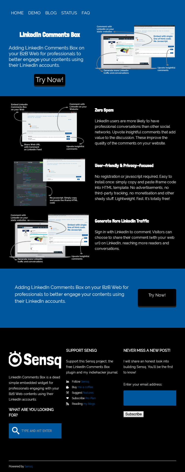
Does it communicate the values well while staying simple?


-
2
For me, I'm hit with way too many things demanding my attention immediately on landing on that page. It's not at all simple, and is instead rather cluttered. Spread the sections out, with clear call to action and clear education.
Also, as you are going after LinkedIn, a font more suited to that audience than Londrina would be called for.
-
2
Here. I spaced things out a bit more comfortably https://i.imgur.com/S6nP3iV.png also, homepage seems like it should have a logo.
Good luck with the project :)
-
1
Wow! Thanks for that!
PS: The logo is near the footer, because nobody would care in the early stage :-P
-
-
1
Noted on the font~
I had actually thought of using Palatino (Title) & Helvetica (Body) which are the safest.Not sure if the full-page screen making you think so?
Above the fold, it is just the headline and "Try Now!" CTA button.
Then, a section of 3 rows describing the main benefits.
After that, another CTA section with the same "Try Now!" button.
Finally, the footer may have a lot info and links there (cluttered) :-PDo you have any good example of simple web that may suit for this idea?
-