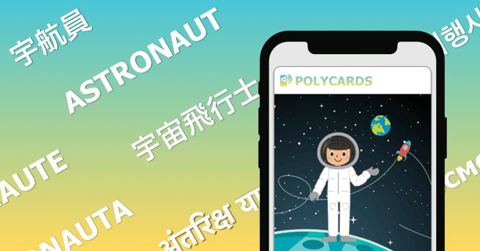
1st iteration on lading page for App for children raised multi-lingually
Hi there!
Would love to get some feedback on my Landing Page. Please don't hesitate to say harsh things, I'll really appreciate the honesty!
Will add more info in the comments, so that I don't bias your opinion on the content of the website.
Questions for you:
- Is it clear what problem Polycards is trying to solve?
- Is it clear what Polycards is?
- if you are in the target market, how does the product resonate with you?
Thank you in advance!

I guess, you should improve on the UVP. "Polycards" is the name of the app and not the UVP. In my opinion, the UVP should be the central part of your side because the name of the product doesn't really help you to understand what your product is about. I would put the logo and name of the app in the upper left corner instead.
Thank you for the feedback, you raise a really good point. Will try to come up with a good UVP!
More info on Polycards (please don't read until you have seen the website, to prevent forming initial opinions):
Polycards is an App for parents raising children in a multi-lingual home.
The idea came from teaching my own daughter Japanese, English and Portuguese at the same time, which has been a bigger challenge than expected. She has a preference for Japanese, quickly losing interest in hearing other languages.
The website has not been shared yet, until now. It's still my 1st iteration, and I'm trying to make sure the user flow is smooth and bug-free.
Thank you again for taking your valuable time to give feedback!
This comment was deleted 6 years ago
Thank you for the feedback! That makes total sense. Will work on some screenshots to add to the landing page :)