2 landing pages: Which one you like most (left or right)?
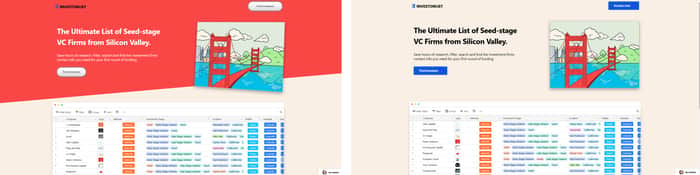
Hi Indiehackers!
I'm redesigning my website investorlist.io
Which one of the two landing page design you like most?
What could I do to make it better ?
Cheers!
Hi Indiehackers!
I'm redesigning my website investorlist.io
Which one of the two landing page design you like most?
What could I do to make it better ?
Cheers!

I really like the one on the left! But, as the commenter below said, the logo color doesn't exactly work well with the red.
Thank you for the feedback I updated it!
Initially I was quickly biased to choose the left one, but then I just zoomed both to fit them as proper websites in my browser, and I must say that I like the right one more. It's clean and relatively minimal. If you can 3d rotate the image slightly, then I'd vote for the right one!
Thank you for the feedback I appreciate it
I like the left one more, however the call to action button could improve. Also the logo should be changed in the left one.
Thanks for the feedback, I updated the logo, please look here : https://investorlist.io
What wording would you choose for the call to action buttons?
This comment was deleted 5 years ago
Thanks for the feedback, I changed the logo to a white logo, it fits better with thre red background.
For the load speed, it is tough because airtable's share.js is taking the highest time to load, not sure how to solve this yet. i'll try to improve it!
Cheers