5 short UX tips with examples you can use to improve your SaaS website
It's Jim here - this week my tips are all about making your SaaS website sexier and more believable. This way visitors are more likely to sign up and give it a try.
Estimated read time: 2 minute & 10 seconds.
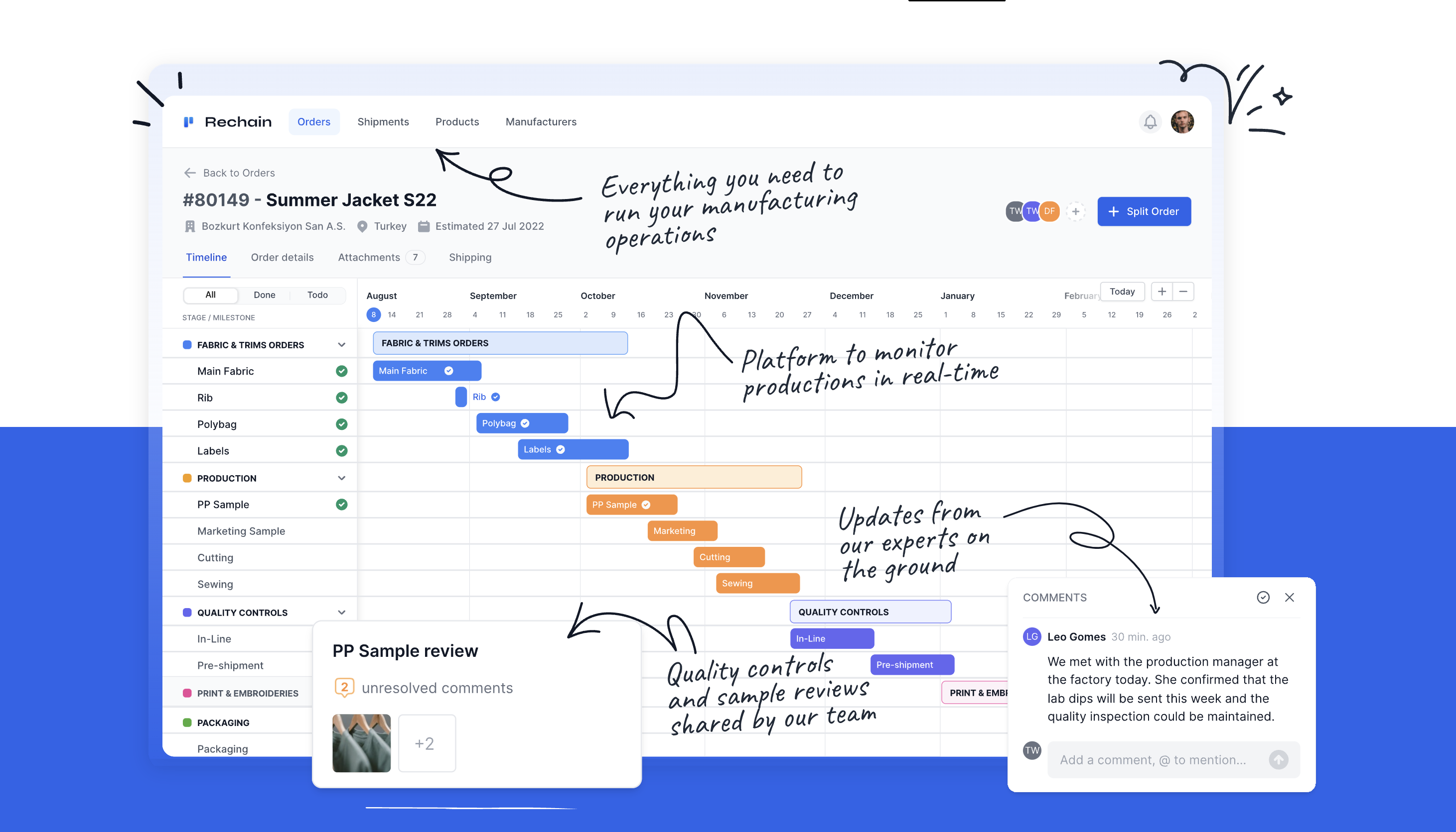
Tip #1: Show many features in one visual with annotations
"Show, don't tell".
That's a golden rule to follow in your SaaS website.
Show me your SaaS, don't describe it to me. There are many ways to do that.
One of them is screenshots with annotations. It's easy, fast and engaging and you can show many features at the same time!
Tip #2: Your content leads your UI
In your SaaS, your content leads your UI. For example:
Look at the beautiful hearts floating around the testimonials.
Content is about happy users and happy vibes. The UI should visually reflect that, and heart shapes is one way to achieve that.
Of course there are many more ways that I will share in the next weeks. Keep an eye on my tweets or DM me if you have a good example to share!

Tip #3: Be specific on what you offer
Be specific and then try to be some more.
That's rule #1 for your SaaS website content, and marketing content in general.
Here is an example from Travelperk a SaaS making $50M of ARR.

Tip #4: Make your social proof short, exciting, and specific
Social proof is one of must-have components in your SaaS website.
Avoid making it boring with classic testimonials.
Try to make it short, exciting, and specific.
Here is an example from Basecamp.

Tip #5: Add some motion in your UI and make it sexy
UI motion, is a great way to make your SaaS website stand out.
In detail, it's a great tool to use when you're presenting your product features and don't want to show the whole SaaS UI.
Here is how Typefully is doing it, and truth to be told it looks pretty sexy.

See you next week — Jim
Join 1005+ indie makers getting better at SaaS UX design

UX for SaaS is no different, SaaS UX design best practices:
Great tips with great examples. Thanks!
Thanks a lot Elle! :)