5 UX Mistakes Many Hackers Do
Week 5 of UX mistakes, a weekly newsletter that helps developers avoid UX mistakes. This is a summary of the last 5 newsletters.
1. Making It Hard to Close Pop-ups
Popups can be a good way to show meta-information or to confirm an action. Unexpected pop-ups are pretty annoying and making them hard to close will make your users mad. Pressing the close icon or cancel button should not be the only way to close a popup.
Take this action
Make the clickable area of the close icon at least 40 x 40 pixels and hide popups when the user clicks on the background or presses the escape key.

2. Restrictive Password Rules
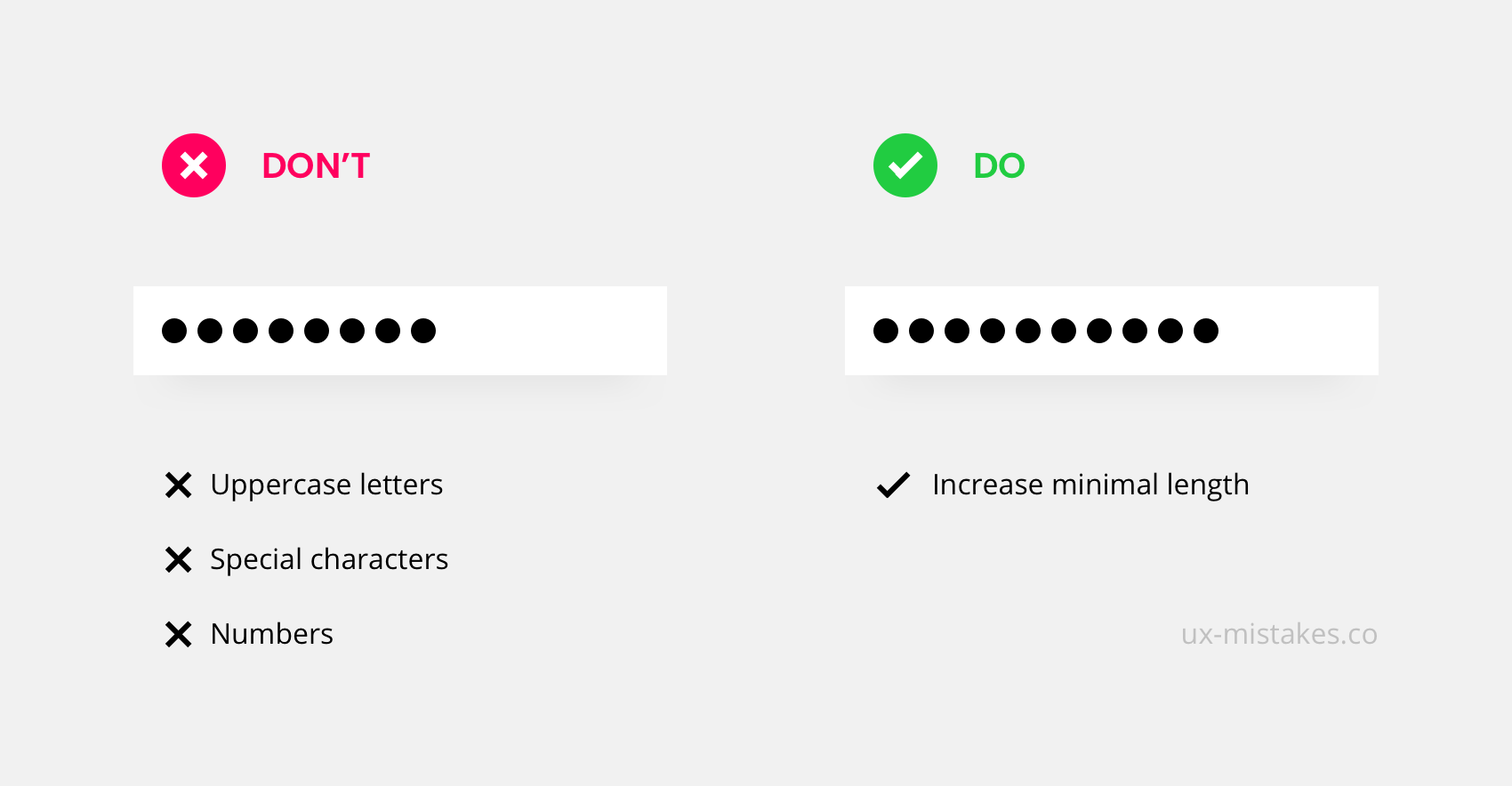
We are all supposed to have a super safe password for every service we use. For this, products started to introduce password rules that demand very specific features like numbers and special characters.
But password security checker show: a short 8-character-password with a special character, upper- and lower-case letter, and a number is usually less safe than an 11-character-password with lowercase letters only. This means we can simplify password rules for a better user experience.
Take this action
Do not demand special rules for passwords other than a high minimum length.
3. Radio-Buttons or Drop-Down
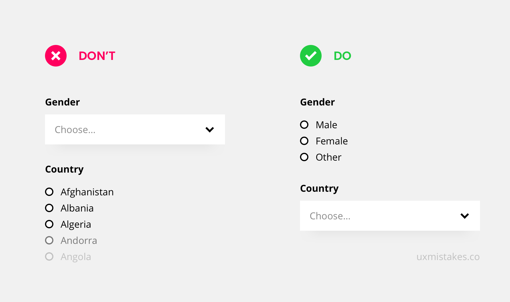
For single-answer-questions in a form, you can either place a drop-down or go with radio-buttons. A list of radio-buttons shows all possible answers but can take a lot of space if the list is long.
Use Radio-buttons for a few options like the selection of gender. Use Drop-downs for many options like a selection of a country.
Take this action
Check your forms. Make sure to use radio-buttons for up to 4 options. With 5 or more options, it is often better to go with a drop-down.
4. Slow Animations
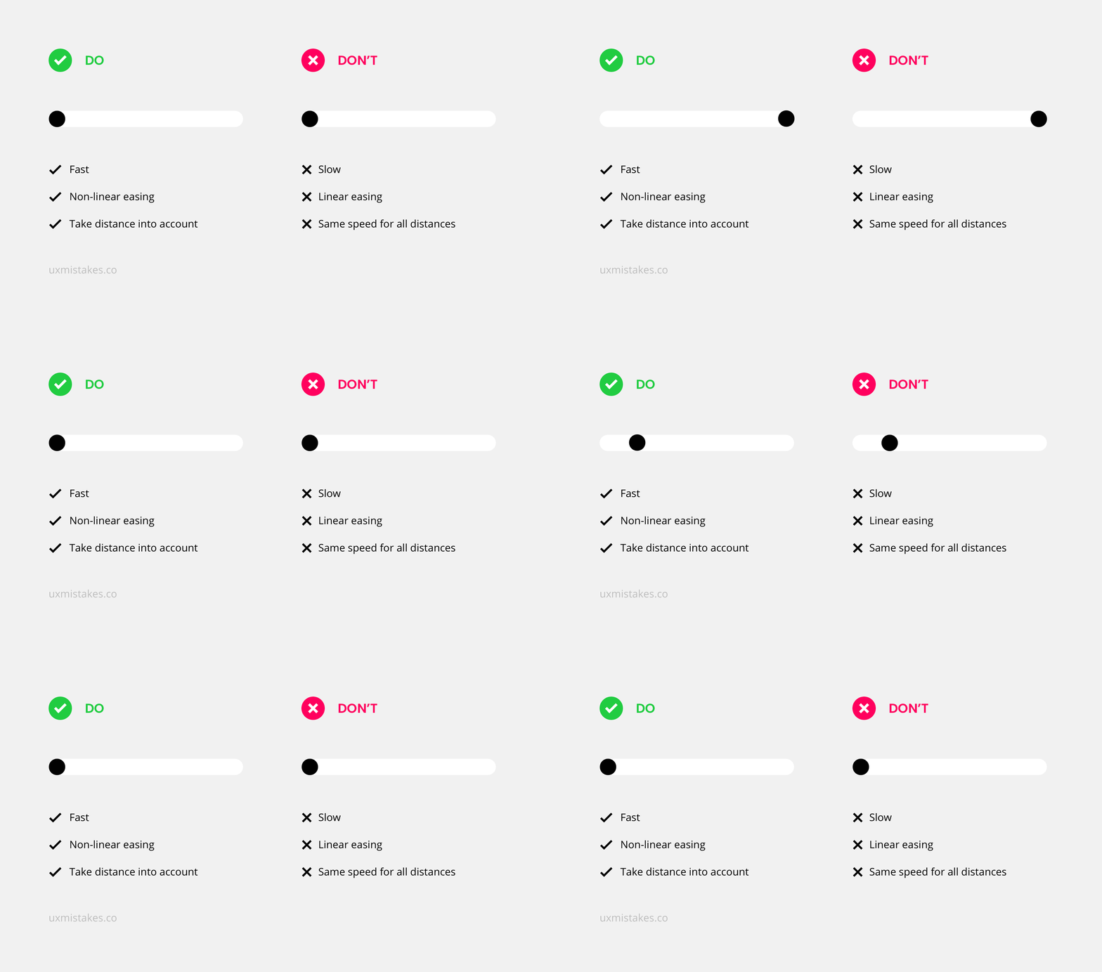
Animations in user interfaces can have an explanatory role and help understand the relationship of interactive elements. But many animations are timed very poorly – most animations are simply too slow.
Take this action
Make sure your animations are snappy. As a rule of thumb: cut the duration of your animations in half until it feels too fast. Then go one step back. In addition, don’t use linear easing and make sure to take the travel distance into account.
5. Wrong Input Field Types
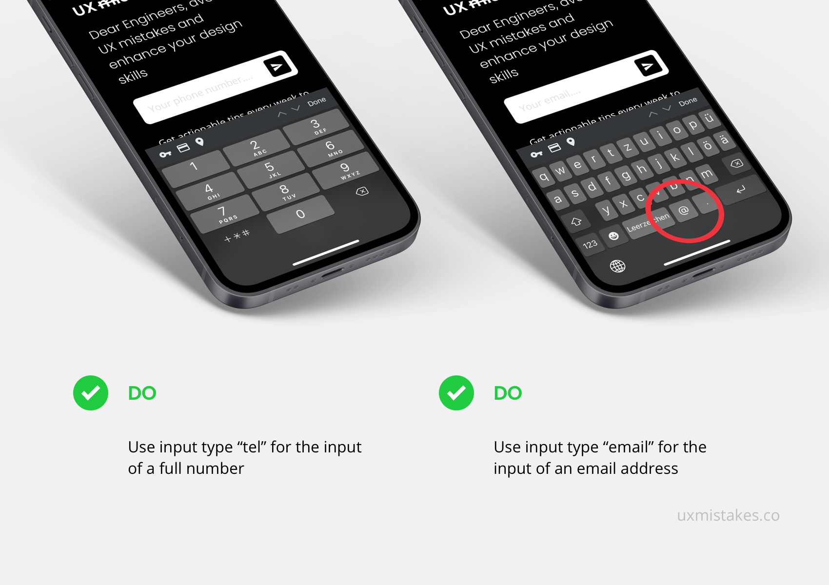
Text fields have a type that set the expected input like an email address, date, password, or phone number. Setting the wrong type is a common mistake and can result in unexpected side effects. Android and iOS triggers a specific keyboard based on the type of input fields.
Take this action
Check all your forms on a mobile device. See if the expected keyboard is triggered. Bonus: follow conventions when setting the name attributes, to make autofill work properly.