What is your first impression and how do you feel when you land on our website?
What is your first impression and how do you feel when you land on our website? https://plutio.com
#landing-page-feedback
What is your first impression and how do you feel when you land on our website? https://plutio.com
#landing-page-feedback

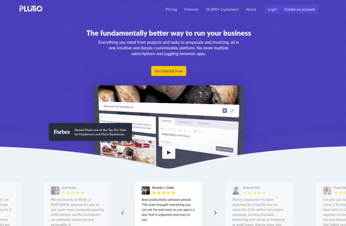
Website looks good, but I would change the copy.
If a visitor doesn't understand what your product is about within 3 seconds he will bounce away.
"The fundamentally better way to run your business" means nothing.
Header=highlight the benefit
Subheader=what it is, how it's done, who is it for
Generally speaking it looks very solid and well done, definitely builds trust when landing on the page.
But IMO there's too much going on.
the video changes scenes very fast and I don't like this weird perspectives => I don't get anything out of it, I would probably leave the website instantly after seeing it
there's way too much social proof. I mean I get it, it looks like people are using it. You don't have to throw someone at me every second line, as I'm not going to read it anyway after the first one.
First impression: neat design.
I understood what the product does so the messaging was clear.
However I felt there's something missing which ties these different tools together. Perhaps a presentation more like Zoho.com where they have a name for each app, and maybe it makes sense to use the word "suite" to clarify even further.
Good luck!
I am a UX newbie but here is some feedback from my side. Hope it helps you.
Just like @alx_gr , I felt that too much is going on . Bottom ticker is moving fast. Video perspective is weird like Windows screensavers. Somehow, the navigation bar looks very dull (may be it is the colour scheme ? Need a whiter white perhaps ?)
What if the likes of 'Manage your projects and tasks' become the focus on the landing page and then let me navigate to more detail elsewhere in the page ?
What if the social proof is moved down the page in the same section as "Finally, everything in place"
One good reference could be (and I have no affiliation at all) : www.notion.so
You have had much better taglines over the last few months. Something like "All in one business manager for small businesses" would be more self explaining. Otherwise I like your creativity. Maybe you should try to run "alternative to ... " pages to compete with other business management tools in search engines :)
I'll give you my brutally honest train of thought as I open the homepage:
This comment was deleted 7 years ago