A landing page about landing pages :)
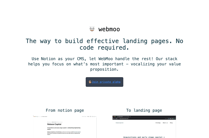
https://webmoo.co/
I'm working on a project called WebMoo. It's a landing page builder using Notion as a CMS. What do you think of the WebMoo landing page? How clearly is the value proposition and what objections do you have to using?

I think leading with ease is good, but I'm not sure that the rest of the page pays that off. How is it easier than any of the other no-code solutions out there? In fact, if the user doesn't currently use notion, then it could actually be harder since they'd have to learn two solutions.
Try to emphasize what makes your solution unique and explain how that translates into benefits for the user.
You should also try to anticipate questions, concerns or obstacles that could prevent uses from trying this. For instance, what sort of layout features does the user have? The example and the landing page itself are very basic and appear to be limited. Is it SEO friendly? Are there features to support that? What kind of integrations are there? How does the solution capture leads for the user?
I agree with @dmontooth about the CTAs. Try to choose one thing you want people to do and make that the focus of the page. You should also make your CTA stand out much more. Try using an attention-getting color for the button with a bolder font and repeat it once or twice throughout the page.
Best of luck.
Here are some additional thoughts that occurred to me after posting my initial feedback.
Since this is for an alpha stage and your audience is likely to be a smaller segment of people who need landing pages (current Notion users), you may be better off creating a more targeted personalized landing page that you direct targeted traffic to than a traditional landing page.
What I would do is identify your best potential customers and reach out inviting them to join the private alpha. Then you can make your landing page CTA the RSVP. You could also play up the exclusivity of it. If you have the capability, it would also be good to personalize the page with the prospects' names.
With this approach, I would also focus on selling the opportunity at initial access and feedback over the product itself, although you would still explain what it is, features, benefits, etc.
Hopefully that makes sense.
Thanks so much Kirby! I've tried to be more benefits focused and also improve the CTA with the new version @ https://webmoo.co
Hey @sagarnyc
Here are some thoughts:
I think your true value proposition is buried under a headline that doesn't really sell this the right way to the right people.
I think your headline should be:
"From Notion to Landing Page".
Reason being, that's what your product does, but also, you need Notion to make this work. Given that, you want to target Notion users and show them how easy it is to turn a Notion page into a landing page.
I would follow that up with a subheading that simplifies how it works. Something like:
"Create your page in Notion. Connect Webmoo witn Notion. Publish your landing page"
Your content after that should flow simply.
I would go straight to a "Here's an example" section and include the current one you have with a screenshot of the Notion page.
Don't say "Examples" of Webmoo sites since you only have one right now. A single example relays the value still.
I would remove the "Webmoo is getting better..." section and put that on a subpage. It distracts from the main objective as it stands now.
I would also remove the story section. It's cool to see that this is a personal thing for you and you want to help others but it doesn't tell me to take part.
You have two distinct calls to action that seem to go to the same place. One tells me to Join a private alpha and the other tells me to get landing page feedback. What is the one thing you want people to do on your landing page? Stick to that message.
Finally, I recommend running an accessibility check. Your call to action buttons have accessibility issues because the contrast between the text color and the button color it too low.
Good luck! If you want some help, let me know.
@dmontooth great feedback and thanks for offering your help.