Add Background to Product Images Without Slowing Down Your Shipping Cycle
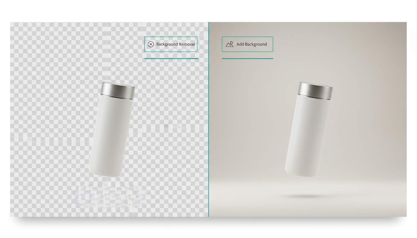
If you’re building an e-commerce brand (or any product-led business), you’ve probably felt the tension between “good visuals” and “getting things out the door.” Clean, consistent images lift conversion, but organizing shoots, matching lighting, and building a reusable style system can eat days you don’t have.
That’s why founders and makers keep coming back to one simple workflow: add background to a solid product photo, then standardize outputs for listings, ads, and social. Done right, it’s not about “making it pretty.” It’s about reducing decision fatigue, speeding up production, and keeping your catalog visually coherent across channels.
A practical starting point is using an add background tool that lets you keep the product consistent while you iterate on the scene. You’ll move faster when you treat backgrounds like a modular layer—not a one-off design task.
Below is a straightforward approach you can use whether you’re a solo founder shipping your first SKU, or a small team managing a growing catalog.
Why “add background” is a growth lever (not a design indulgence)
Early-stage teams often think visuals are “nice-to-have” until the funnel tells a different story:
Your ads and thumbnails compete in milliseconds. Background clarity affects scan speed.
Marketplaces reward consistency. A coherent visual style reads as “real brand,” not “random seller.”
You need variants. Seasonal promos, bundles, and new angles shouldn’t require a new shoot every time.
When you can add background to image quickly, you get three wins: faster creative production, fewer reshoots, and a repeatable system that scales with your catalog.
The prerequisite: start from a “background-ready” source photo
Before you add anything, you need a strong base image. Not “studio-perfect,” just usable:
Product is sharp, not motion-blurred
Clear edges (avoid hair-thin details unless you must)
Neutral lighting (extreme color casts will fight every background you try)
One dominant subject (multi-product shots are harder to keep consistent)
If your source photo is messy, you’ll spend your time compensating downstream. Get a clean input once, then reuse it.
Step 1: Do background removal first (even if you plan to add one right back)
This sounds counterintuitive, but it’s the simplest way to stay in control.
Background removal creates a clean separation between subject and scene. That separation is what lets you test different contexts without degrading the product edge or accidentally “baking in” old shadows.
If you want a quick baseline, use a dedicated remover first. Here’s a free background removal tool you can run before you experiment with new scenes.
Why this matters: once the subject is isolated, every background becomes a reversible layer. You can build a mini “creative pipeline” instead of doing manual edits every time.
Step 2: Choose the right background type for your goal
Not every image needs a lifestyle scene. Most teams get better results by picking the simplest background that supports the intent.
Marketplace catalog (Amazon / Shopee / Lazada / etc.)
Use plain, clean backgrounds with consistent brightness. The goal is legibility and compliance, not story.
DTC product page
Use subtle gradients, soft shadows, or minimal scenes that reinforce your brand tone (premium, playful, technical, natural). Consistency beats novelty.
Ads and social
Here you can go bolder: seasonal colors, promotional themes, or contextual surfaces. But keep the product dominant. The background should “frame,” not compete.
A useful rule: if your background is the first thing your eye lands on, it’s too loud.
Step 3: Add background to image with a repeatable prompt structure
If you’re using AI-assisted backgrounds, the fastest way to reduce randomness is to standardize your inputs. Makers often get inconsistent outputs because their brief changes every time.
Try a simple structure:
Scene type: studio / lifestyle / abstract / seasonal
Surface: marble / wood / matte white / soft gradient
Lighting: soft diffused / bright top light / warm evening
Color palette: 2–3 colors max
Mood: clean / premium / playful / minimal
Camera notes: keep angle consistent, no tilt, no extreme depth blur
Example (keep it plain and direct):
“Minimal studio scene, matte light-gray background, soft diffused lighting, subtle shadow under product, clean premium look, keep product scale and angle unchanged.”
This kind of brief makes it easier to compare variations and build a library you can reuse across SKUs.
Step 4: Match lighting and shadows (the part that makes it look “real”)
Most “edited-looking” images fail because the product and background disagree on physics.
When you add background, check three things:
Shadow direction: Is the shadow going the same way as the background lighting implies?
Shadow hardness: Soft lighting → soft shadows. Harsh lighting → harder edges.
Color temperature: Cool background + warm product lighting creates a cheap composite feel.
If you can keep these aligned, your images will feel intentional even when they’re produced quickly.
Step 5: Build a small background library (so you’re not reinventing every week)
Indie teams don’t need a giant design system. You need a small set of defaults.
Create 10–20 reusable backgrounds:
5 for marketplace-friendly catalog
5 for product pages (brand-consistent)
5–10 for ads (seasonal / promo / thematic)
Name them by use case, not aesthetics:
“Catalog-Light,” “DTC-Premium-Gray,” “Ad-Summer-Sale,” etc.
When someone on your team asks, “What background should we use?” the answer becomes a dropdown, not a debate.
Common mistakes that waste time (and how to avoid them)
Mistake 1: Changing the product angle across variations
Your background variations only work if the subject stays consistent. Use the same base photo whenever possible.
Mistake 2: Over-styling early
Early-stage brands often try to “look big” with complex scenes. Simple, consistent visuals outperform chaotic creativity.
Mistake 3: Using high-detail backgrounds at thumbnail sizes
If the image is mostly seen at 200px wide, texture becomes noise. Go cleaner.
Mistake 4: Skipping background removal
If you’re repeatedly fighting edges, halos, or leftover shadows, you’re paying an editing tax every time. Isolate once, then iterate.
A lightweight workflow you can ship this week
If you want the quickest implementation, do this:
Choose one hero product photo per SKU
Run background removal
Create 3 background sets:
Marketplace clean set
DTC brand set
Ads set (seasonal/promo)
Export consistent sizes (square + 4:5 + 16:9)
Document the “default brief” you used, so you can repeat it
That’s it. You don’t need perfection. You need repeatability.
Closing thought
The best content pipelines aren’t the most creative. They’re the ones that reduce friction while keeping quality stable.
If you’re trying to ship faster without letting your visuals fall apart, treat “add background to image” as a modular system: isolate the subject, standardize the scene rules, and reuse what works. Your future self—and your conversion rate—will thank you


thank you
This is really practical advice.
I’ve definitely been in that spot where you spend more time fixing product photos than actually shipping the product 😅
The idea of treating backgrounds like a modular layer instead of a one-time edit makes a lot of sense.
Also agree on the “simple beats fancy” part — clean and consistent images usually perform better than over-designed ones, especially for small brands.
Building a small reusable background library is such a smart time-saver.
This statement resonates deeply, especially how it frames background work as a lever for growth, not a step to polish. ~
E-commerce taught us a valuable lesson: product photos in their rawest form appeared ‘honest’ but quietly capped CTR. After the background and lighting were standardized, the conversion increased significantly without changing the copy and pricing. Similar products and traffic, only clearer visual intent.
A few things that aligned with our experience.
The Uniformity is more important than beauty; having images that are not perfect but consistent is better than having variety that includes different colour palettes.
Unappreciated Elements: Shadows When they were completely removed, it made the products look flat and cheap. Controlled shadows give a sense of depth and trust.
By doing this upstream (one clean source image), we saved much more time than fixing variants later.
I second the motion “don’t over-engineer.” We’re tempted to chase photorealism, but speed + consistent have won every time for us.
Just wondering if you saw larger gains on listing pages or PDPs? Less overall scan speed. To our surprise, it was the category pages where things clicked.