App Icon Feedback
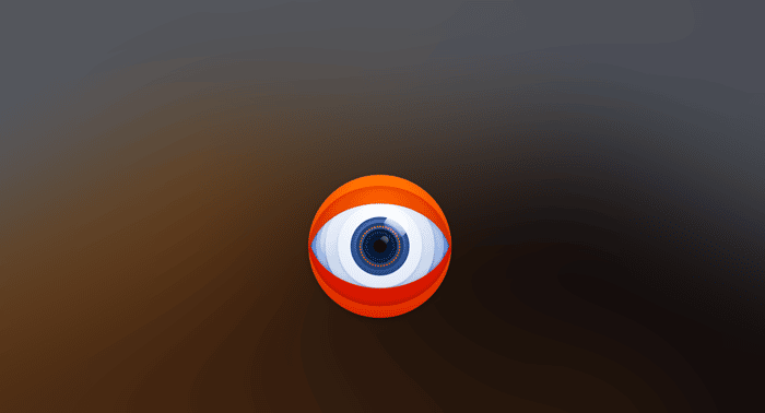
I recently acquired Breaks for Eyes (https://breaksforeyes.app) , a Mac app that reminds you take breaks and look away from the screen. The previous developer did a great job making it simple but elegant. The app itself is very well designed, and I'm proud to own it.
I also really liked that the Icon was very polished. It fits in with the highly polished Mac icon crowd, which I think is really important for an app on the Mac App Store, which has a much smaller/niche audience than the iOS App Store.
I'm curious what this community thinks of the icon. I've received some feedback that it can come off as a bit creepy/big-broth-esque, which I do understand, but I want to gauge some more feedback before doing a rebrand.
I should note that this is a toolbar app, so the icon is really only ever seen in the App Store, not often on your computer.

Seeing a small eye in the toolbar would probably be disconcerting. We pattern match what we see, and eyes are high on that list, so that might be distracting/disturbing.
That’s a good point Ryan, thanks!
I liked.