Are my screenshots helpful or hurtful?
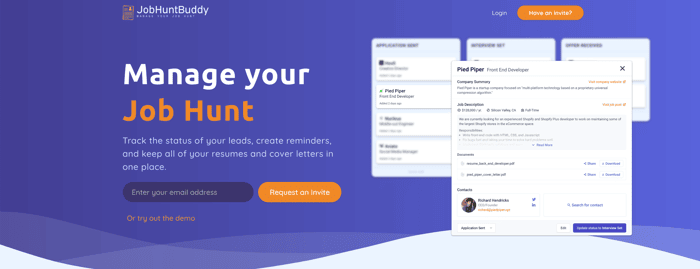
I've been tinkering with my landing page again and recently introduced a demo. Now that people have an easy way to explore the app should I cut back on all of the screenshots with 'dummy data'?
I'd like to have more skeleton style graphics instead of real screenshots, but quickly discovered that's beyond my design skill 😆
Any other feedback on the app/landing page is also very welcome.
Aside: I sent out the the first batch of beta invites this morning, so if this is something you'd be interested in you can use 'TRY-JHB' to create an account.

You might want to think about framing the screenshots a bit better. Try to provide a little bit more contrast between the copywriting and screenshots.
Clearly the product itself is going for a clean design with a decent amount of text. That's great, but the close alignment, similar sizing, and lack of colour contrast (particularly on the white strips, ie. "Find the right person" "Keep all your documents"), does make it seem like a lot.
I'm in favour of the screenshots, fwiw, but I do agree it feels busy right now.
One another thing-- I find your pricing a little confusing, and I'm not sure if you are emphasizing the right thing. The pro mentions 60 leads. Only 60? What happens if I want 100?
I would also consider testing an emphasis on the basic plan. As a first time visitor to your landing page, I don't really care what can happen at the highest tier, and I'm probably not going to make a decision to go straight to that one. You MIGHT be able to talk me into the basic plan. But at least drawing my attention to that one will stick in my brain when I opt for the free one.
I personally like it. It has authority and proves the product is a real thing. Sometimes I look at landing pages that don't share the product and question if its a real product
Thanks. I recently got some feedback saying it was 'too busy' with the amount of text in the screenshot next to the marketing text. So I wanted to get more opinions
No, they're great - not everyone is going to try the demo!
In fact add an extra Call to Action at the bottom with a very powerful contrast re-inviting people to try the demo themselves!