Balancing needs of new and existing users on homepage?
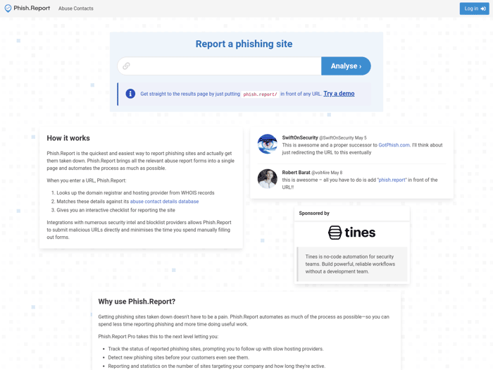
I'm redesigning the homepage for https://phish.report and I've got a conundrum...
I'm struggling to find the right balance between "marketing" and the page being useful for users. So currently it's a mess
The workflow for many users of the site is to:
- Open https://phish.report
- Paste the phishing site they want to report
- Click "Analyse"
This suggests a sort of search engine UI with a big search box and not much else.
But for new/potential users that's terrible: it doesn't tell them anything about how the site works or why they should use it.
Is it possible to balance these two?
Or could I render different pages depending on whether someone is logged in?
A really key part of Phish Report is making it as easy as possible to report phishing so I don't really want to add friction e.g. like many SaaS where you need to go to a separate page/subdomain to actually use it

Like most sites have a dashboard when you're logged in and just marketing stuff to convert viewers into customers when you're logged out, your aim should be to explain clearly what are the benefits that I get as a user from using your site.
It's not clear to me what exactly happens when I submit a site, the demo returns 404 errors as alerts when I click on submit...
Food for thought: consider making a video or animated series of screenshots that show what exactly I get from submitting a site