Before → After: Hero revamp / Dittto
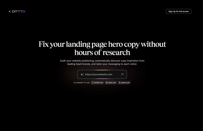
The ask: Can we make the hero section more engaging?
Sure thing.
Here's what I came up with. For all the visual people you'll definitely enjoy the slider presentation, and for all the readers here's a short list of what changes have been made:
❍ Lightened the background color a bit, so we have a few more shades of grey to play with. Replaced all full white elements with slightly greyed colors to reduce the contrast between them. This makes it easier on the eyes & allows different shades of gray to work well together.
❍ Above the heading, I added an animation element with a toggle. It's meant to be the decorative visual element here that should primarily contribute to the WOW effect. First impressions count, don't they? This element should showcase the main feature of Dittto even before going into the app. But it's important it's displayed after the heading text with a delayed appear animation, so the user's attention isn't drawn to this element right away, before reading the heading text.
❍ The header CTA needed to stand out a little more. Gradients to the rescue.
❍ Spaced out the elements and gave them room to breathe. Text sizes have been increased for easier reading and scanning.
❍ I mixed & matched the two types together more often. In addition to playing quite well, they gave off a more relaxed and playful vibe.
❍ Put some decoration elements in the background to fill in the blanks.
❍ The bottom section is bigger in general. It's quite important for users to get this info & for them to be able to click each pill. Tried to make it more obvious for users.
This was a really fun one to do since the branding had character and edge.
Let me know your thoughts.

I really like it. Good job. There’s so much power in storytelling.
Loved it this comparison! It's amazing how storytelling can change our users perception. Really thanks for sharing!!!
What a great job crafting a more engaging hero section! Not only did you provide better visuals, but the overall user experience is improved. You should be proud of your work!
I absolutely love the new design!
Interesting approach btw, listening closely to your clients needs is crucial :)
Thanks! IMO it's very hard to get both sides happy. You really need to listen closely.