Before/After: I redesigned my SaaS dev subscription site for better clarity
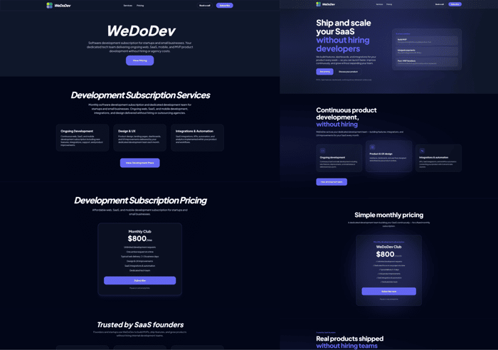
I redesigned my SaaS dev subscription site WeDoDev.
Goal: make the value clear to founders in 5 seconds.
Before → After
– new UX
– clearer positioning
– stronger hierarchy
– conversion-focused layout
Would love feedback from SaaS founders.

The before/after is night and day. The old version looks like it was designed for other developers. The new one is designed for buyers. That distinction matters more than most people think.
Biggest improvement IMO is the hierarchy. In the old version my eye had nowhere to land. In the new one there's a clear visual path: headline → value prop → CTA. That's what converts.
One suggestion: consider adding a single concrete number or result above the fold. Something like "200+ projects shipped" or a specific turnaround time. Social proof or specificity in the hero section can bump conversion rates significantly.
The biggest shift for me is actually in the hero messaging.
The old version introduced the company, while the new one immediately communicates the outcome: shipping and scaling a SaaS without hiring developers. That framing makes the offer much easier to understand for founders.
It feels more like a product promise now rather than a company introduction.