Before & after website update
https://themesberg.com/
Hello guys,
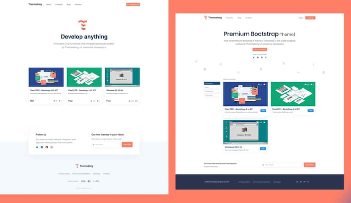
We have updated our homepage and thought we would post a before & after comparison photo. What do you think, does it look better?
The second screenshot is the old one.
Current homepage: https://themesberg.com/

I think the new one is way cleaner. I can see that the Products page still has the old layout, though, where the left filters seem undersized for the whole geometry and scale of all the other elements. The same goes for the login/register button in the header - I think making it bigger will help harmonize things a bit more.
Other than that, I think everything is cool.
That's why we ask for feedback, it's always great to get a different perspective. We'll make most of your proposed changes. Kudos!