Best Shadcn Switch Components for React Developers
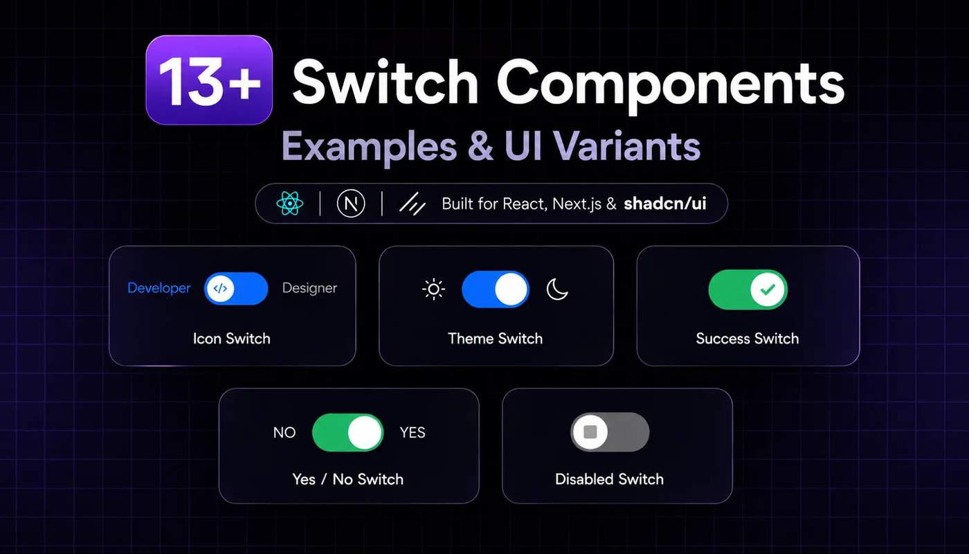
Switch components are a common UI for controlling basic settings such as light-dark mode, privacy preferences, feature flags, and account options. A well-designed switch makes the current state clear and lets users change a setting without extra steps.
Key takeaways
Explore 13+ switch styles with icons, labels, descriptions, colors, themes & different sizes.
Learn how to install and customize Shadcn Switch with CLI, MCP & Manual Code.
Understand the difference between Switch, Checkbox, Toggle & Radio Group.
Use disabled and invalid states to show when a switch cannot be used or needs attention.
All the below Shadcn Switch components give developers a reusable foundation for building small interactions with React and Next.js. With Tailwind CSS, TypeScript, Base UI, and Radix UI, you can customize switch states, sizes, colors, labels, icons, validation states, and layouts to match different application requirements.
Why developers use Shadcn Switch components
Developers can use them for account and profile settings, notification preferences, dark and light mode controls, feature flags, privacy options, admin permissions, form preferences, and SaaS configuration panels. Their clear on/off behavior makes it easy for users to understand the current state and update settings without adding extra interaction steps.
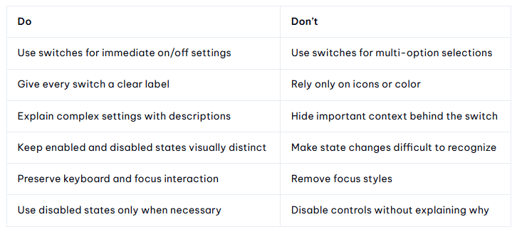
Do’s and Don’ts
The best switch isn’t just visually attractive.
Its state, label, and behavior should make the result obvious to the user.
How to install Shadcn Switch
All the below switch components can be added to a React project using several installation approaches.
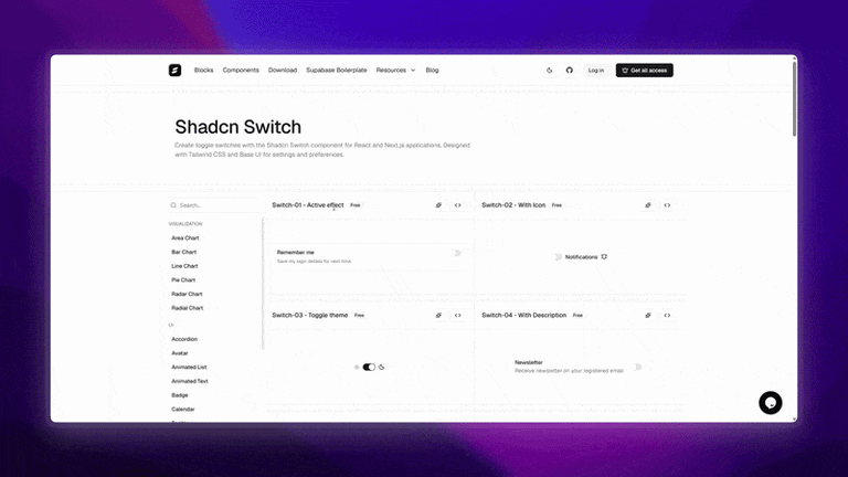
Developers can choose the method that fits their workflow:
CLI installation: Install all the below components using pnpm, npm, Yarn, or Bun.
Code copy and paste: Add the component source directly to the project.
Copy prompt: Use a prompt-based workflow to generate or add the component.
Shadcn MCP: Use the Shadcn MCP workflow to discover and install the Tooltip component through an AI-assisted development workflow.
Here are the best shadcn switch components
This guide covers practical switch patterns for settings, theme controls, feature flags, preference panels, forms, and accessible application interfaces, including custom effects, icon-based switches, theme toggles, choice cards, disabled and invalid states, different sizes, and RTL support.
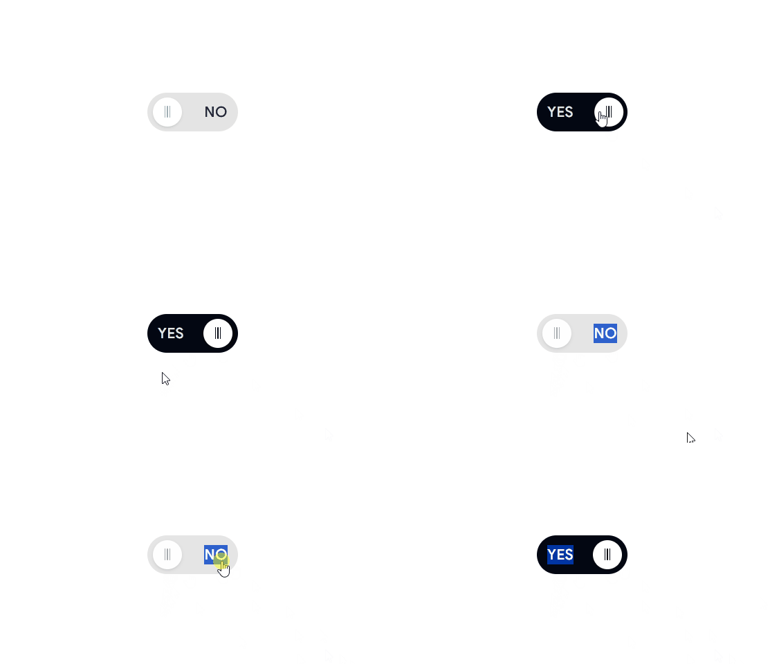
Labeled Switch
A compact switch with visible labels that clearly communicate the current Yes or No state.
Use cases:
Confirmation settings
Form preferences
Feature enablement
Account settings
Best for: forms, settings panels, and binary configuration controls.
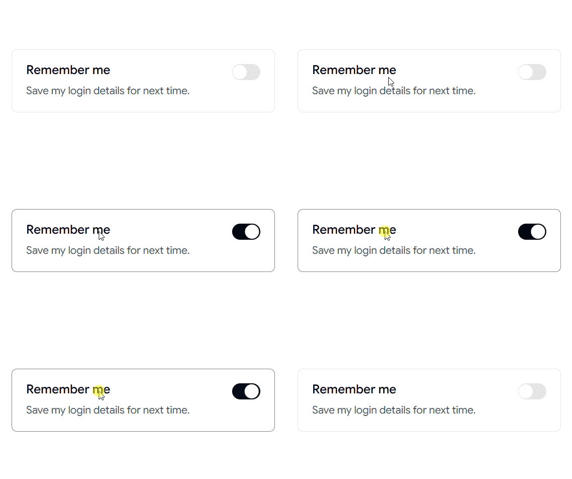
Active Effect Switch
Smooth visual feedback when the switch changes state.
Use cases:
Interactive settings panels
Feature activation controls
Dashboard preferences
Notification settings
Best for: settings pages, interactive dashboards, preference controls.
👉 Read the full Article Here → https://wrappixel.com/blog/shadcn-switch

