Building in Public: Why generic templates kill first impressionsThe Reality
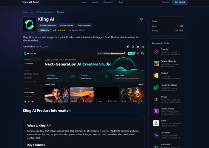
I spent the last 14 hours stripping back the UI of https://seekaitool.com/. Standard UI kits are fast, but they feel "cheap" for a premium AI directory—I’m pivoting to a custom Dark Slate + Glassmorphism aesthetic.
The Deep Dive
Most AI directories look like clones. To stand out, I’m obsessed with tactile feedback and depth. I moved away from flat backgrounds to a layered stack: a deep #0f172a base with semi-transparent card overlays using backdrop-filter: blur(12px).
The biggest challenge? Contrast vs. Aesthetics.
To keep it accessible without breaking the "glass" vibe, I’m using a subtle neon border glow for active states. Here’s the Tailwind snippet for my primary card container:
<div class="bg-slate-900/40 backdrop-blur-md border border-slate-700/50 hover:border-cyan-500/30 transition-all duration-300 shadow-[0_0_15px_rgba(6,182,212,0.05)]">
</div>
I’m also refusing to use system fonts. Integrating a high-legibility sans-serif that maintains its character under heavy blurring is hard, but it’s the difference between a "tool list" and a "product experience."
The Ask
For those of you building "Dark Mode First" apps: How are you balancing the aesthetic of deep blacks/slates with WCAG color contrast requirements? Do you sacrifice the "cool" factor for accessibility, or is there a middle ground I'm missing?
