Can we get some feedback on our UI and some tips on how to improve it?
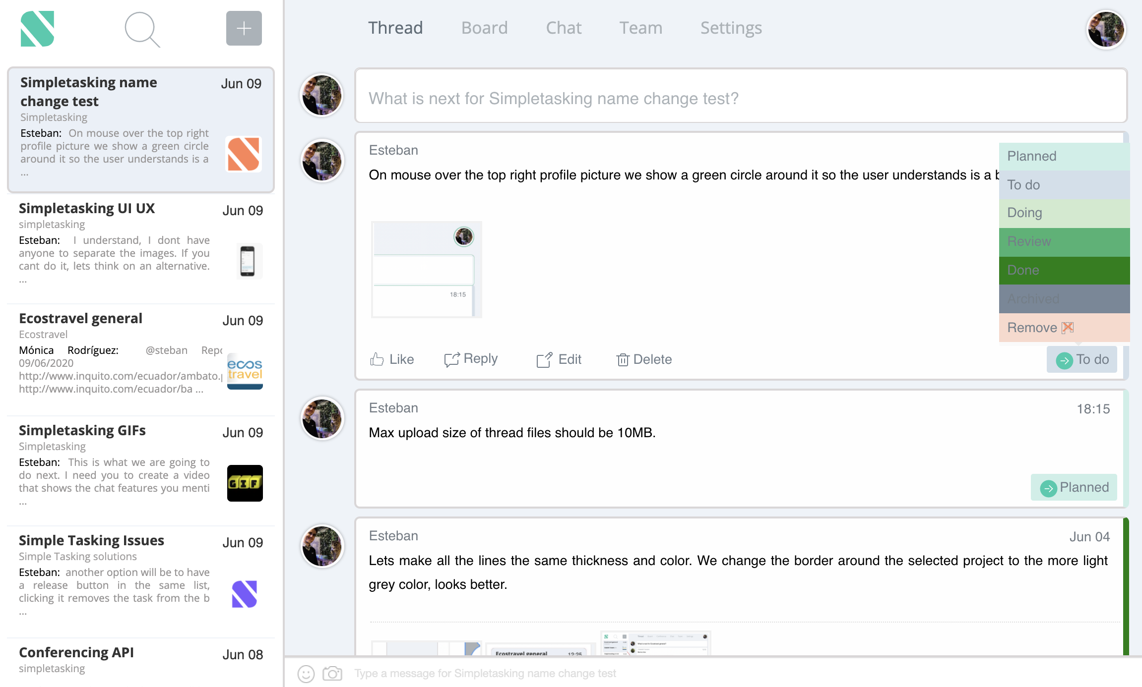
Hello everyone, we are getting close to launching our product. Always looking to improve how things look and work. We could really use some feedback on how to improve our UI. Here is how it looks:
Thank you!

## Big changes:
The color highlights on the right of each cell are very pretty. I also like the color contrast between the white of the cell and the blue of the background. I think that might give you enough contrast, so I'd say you should either do away with the borders you have around each cell and separating the three sections of the page (left bar, detail view, and message input). At very least make them MUCH thinner and lighter (like a single pixel of black at 10% opacity) because right now they feel a little "wireframey".
I think you can give yourself a bit more whitespace by shrinking the user avatars. Right now they're so big they seem to bridge the list on the left and the items on the right, if you make them about 20% smaller and keep them right-aligned to the items on the right, it'll give you a little more breathing room.
What's the difference between Remove and the other states such that it alone gets an icon? What is the different between Remove and Delete? If remove is a state, maybe rename it. If remove is an action and it's different from Delete, maybe put it in that button row with the other actions (maybe even put edit/delete/remove under a "..." menu since they're heavier and less common).
Some of your buttons seem weirdly BIG (the top left search icon especially, but basically everything on the top row) while others seem weirdly small (the message input along the bottom. I think your per-card actions are a good size, though, so maybe standardize your text sizing and whitespace to that size? The Refactoring UI book has a good comment about this where size of item should stay roughly the same but text weight and transparency should be used to set up your hierarchy.
The text labels on your different task states are very hard to read. Either you should make the colors for Review, Done, and Archived much lighter or you should switch those text colors to white.
## Nits:
Your vertical margins are not aligned - check out the "What is Next" field where the top margin is bigger vs the cells in the left hand list where the bottom padding is bigger.
The text size from the content of each update to the buttons along the bottom are close but not equal, which gives it a weird uneven feeling. Again, I'd recommend making those the same font size and just using font weight or color to set up your hierarchy.
Thank you Hizack! we made a few updates since that screenshot, this is how it looks now:
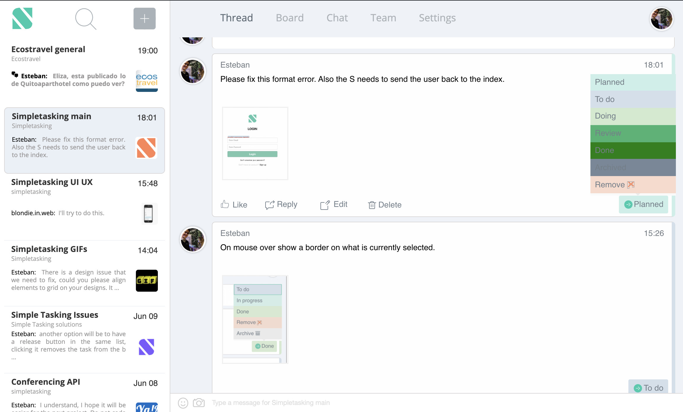
I think we will also change the bold font from the project name on the first column to Font weight 500.
Going over your list, great feedback, already working some of the issues. Will post back a reply with the new version.
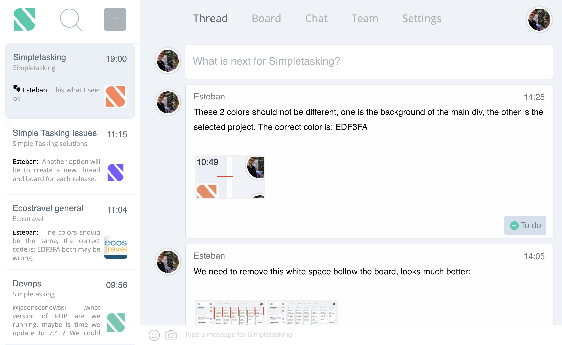
OK, Here are the results. A few changes, not sure I like it better.
This comment was deleted 6 years ago
One more:
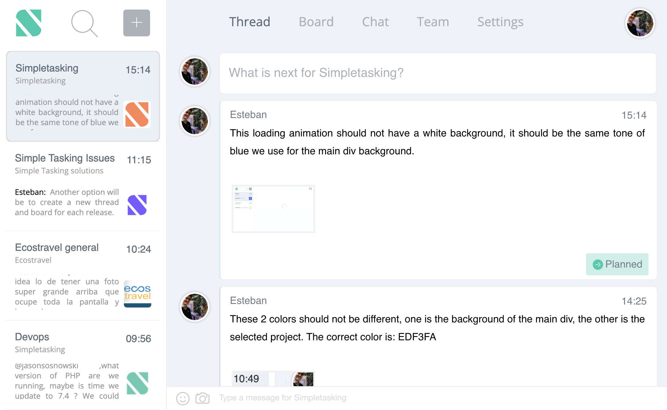
small change:
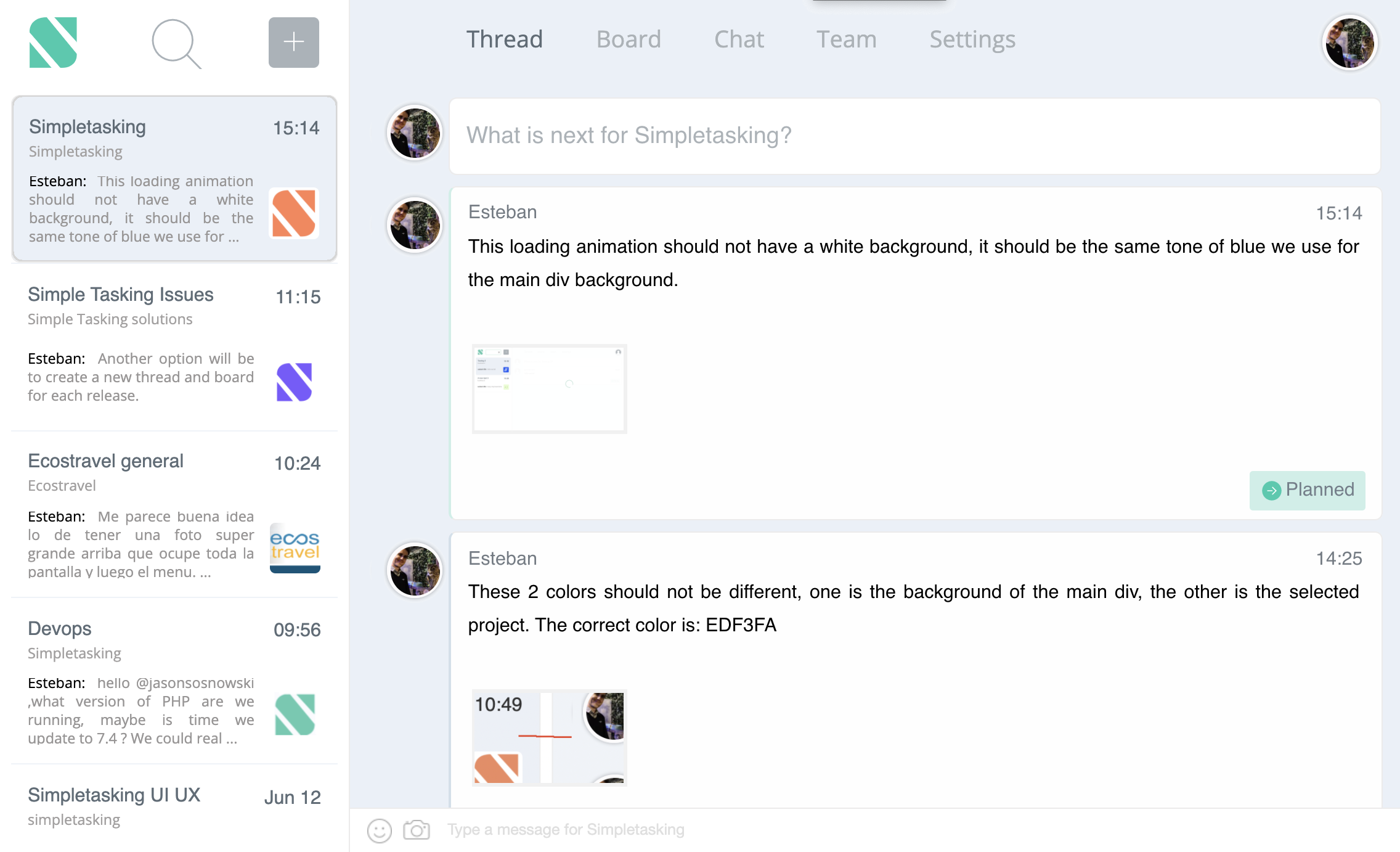
Thanks for sharing the process as you worked on it! I'm especially liking how the lighter borders look.
is it two input fields up and down?
yes, the one at the bottom sends a chat message, while the one at the top starts a thread. Users can decide whether or not to enable chat for a certain project. You switch projects with the column on the left.
I guess there's room for improvement in this case. its had to understand at a first glance, I suggest to think of a simpler design where user can easily understand without any research. I'm not an expert but that's how I feel.
It is good advice, I'm thinking on removing the project column and doing something closer to basecamp.