Can you roast my landing page?
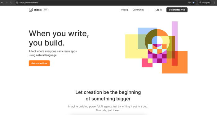
We’ve made a big update, evolving from a screenshot tool to an AI agent creation tool (long story, but feel free to ask in the comments!). Let me know what you think of the text content, UI/UX, illustrations, and everything else. Also, share whether you can understand what the tool is for just by only viewing the landing page.
If you want to dig into the tool itself, I’m all ears for your thoughts. All constructive opinions are welcome!

Hey @BobChen!
I ran this through the Strike Analytics analyser and here is what the AI has identified!
Title: Lack of Clarity in Value Proposition
Subtitle: Users may not immediately understand how Trickle benefits them.
Description: The Trickle landing page lacks a succinct and immediate explanation of how the product uniquely addresses user pain points. While it features a sleek design and mentions key features like automation and integrations, there is no clear statement upfront on how these benefits translate into value for the customer. This could lead to confusion or drop-off, especially among first-time visitors unfamiliar with similar tools. Research from product analytics guides highlights the importance of a clear value proposition to improve initial engagement.
Title: Reduced User Acquisition and Conversion Rates
Subtitle: The unclear value proposition affects user acquisition and engagement.
Description: If potential users do not quickly grasp the product’s value, they are less likely to proceed with sign-ups or further engagement. This confusion is particularly detrimental at the top of the funnel, where clarity is crucial for retention. Industry benchmarks suggest that a confusing value proposition can significantly decrease acquisition by up to 30% and affect retention, impacting the bottom line by limiting conversions.
(let me know if you want me to send you a PDF report with the solutions included!!)
Nice
Unfortunately, I think there is a lot of improvement needed.
First, I would rework all of your headings. They are too generic and unclear. Take the headline, for example (When you write, you build.). Build, what? If I saw this without the context you provided in asking for an evaluation of the landing page, I'd have no idea what the product is.
The same is true for headings like "Let creation be the beginning of something bigger" and "Make your ideas come into reality." Those could be promoting just about anything.
Just as important, why should the user care? What's the benefit to them? How will it solve their pain pints? How does it make your product a better option than the alternatives?
The graphic in the hero area doesn't add any clarity, either. I get that you want to have something "above the fold" to add some interest and avoid nothing but text, but it is just taking attention away from the messaging.
Second, I think the objective isn't clear. Is the goal to get people to sign up and start creating agents or to use the existing agents that have been created? The page seems to be split between the two. Maybe that's intentional since this is a home page and not a dedicated landing page. And that's fine, but it won't do either as effectively as if you focused mainly on one.
Third, it's a little light on the details. Potential customers will want to know how it works, what types of tools/capabilities the product has, what the learning curve is, etc.
I hope that helps.
This comment was deleted a year ago